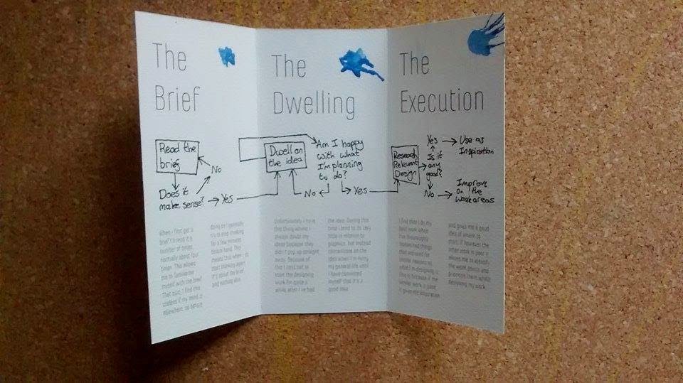
Today I painted over some of the rough printouts of my leaflet on the watercolour paper to assess how they effect the final product. I bought some watercolour paints yesterday so I can do a better and more consistent job this time round.
I started off with the green one paint. I found that to get the colour the right sort of saturation that I wanted, the weight of the paint initially made the structural integrity of the paper go out of the window, it was curling everywhere.
On top of this, I found that thickness of the paint meant that some of the body copy was wiped off. Taking this into account I decided to use considerably thinner paint for the blue experiment.

The paint used for the blue experiment was a lot thinner than the green paint was to avoid taking the ink of the paper. Whilst this was successful, the paint was that watery that you could hardly notice the blue apart from in the fold creases.
As you can see, the paper naturally opened up after it had been painted whereas before the creases stayed pretty firmly shut.

I took a different approach and tried adding splatters of colour in the corner of each page, but I found this clashed pretty badly with the fairly minimal design across the other aspects of the leaflet, so in the end product I'm going to just stick with no colour.


No comments:
Post a Comment