We were briefed to come up with an idea for an independent magazine and think about how it would run and what sort of content it would feature.
Concept
We decided to base ours on Beer after Liam and I had a conversation on Sunday about not being able to find Brooklyn Lager on tap in many places in Leeds.
Aesthetic
We decided to call it Brewer based on the idea of making beer and as a reference to my surname. Liam and Jamie did some branding quickly for it and we went for the B in a sticker as a logo with magazine covers that were roughly the colour of different types of beer with white at the top of the page to represent the froth.
Content
Articles about different beers that are hard to find in pub, breweries that make those beers and the pubs that have those beers on tap. This could include interviews.
The adverts would be for alcoholic drinks, gigs and festivals, as this keeps within the cultural realm of the magazine, making the adverts relevant.
We could also use the magazine to give publicity to our own events which, alongside an online presence, could help build a small community around the magazine.
Strategy
We would release three issues a year, in September, December and April to align with when students would be returning to Leeds after Summer, Christmas and Easter.
The magazine would be free as it would be aimed at students, who don't have disposable income, it would be distributed in student pubs such as Dry Dock, The Library, Old Bar, Bierkeller, Brudenell Social Club and Hyde Park Pub.
Money would be made through advertising and merchandising, as we could sell beer mats and glasses with our branding on it. We could also ask some sort of financial donation from the subjects of the articles in return for the exposure.
We could also potentially save money on printing costs by getting it printed at the Eldon pub in return for exposure, as it's currently not a particularly 'studenty' pub. This would also give the magazine the gimmick of being about beer that's printed in a pub.
Showing posts with label Studio Task. Show all posts
Showing posts with label Studio Task. Show all posts
Thursday, 19 March 2015
Saturday, 21 February 2015
Real World Problems Workshop
Health & Fitness Topics
Scientifically Proven Facts About Weight Loss (Forbes Online)
The above clip discusses how overweight people sometimes lack the confidence and motivation to attempt to lose weight, and this is the problem we decided to try and address.
We decided that a solution to this would be a gym that had a minimum weight requirement for memberhip, as this would stop people feeling intimidated by more athletic-looking people, and build confidence to do more exercise in public.
The graphic response for this would be the branding of the gym. We'd use yellow because of how it's bright and has positive connotations. The font would be Times New Roman because of how it's average, which is the weight that we want people to aspire to be, as well as the serifs providing a sense of stability. We'd use it in italic to suggest movement.
- 50 Shades of Grey fitness workout
- Sugary drinks lead to earlier periods in girls
- People spend too much time sitting down
- Drug resistant malaria strain
- This Girl Can Campaign
- Plain packaging helps smokers cut down
- Memory gaps in graduates is a warning sign of a stroke
- Katie Hopkins got fat for 3 months to prove she could lose it
Scientifically Proven Facts About Weight Loss (Forbes Online)
- Cutting calories by dieting is much more effective for loosing weight than improving the amount of exercise. "If you want to achieve a 300 kcal energy deficit you can run in the park for 3 miles or not eat 2 ounces of potato chips.". Exercising also makes you hungry which makes you eat more anyway.
- Regular exercise is needed though, as it keeps your metabolism from slowing down, which keeps down the rate at which we gain weight.
- After gaining and loosing weight it is harder to maintain the same weight than it was to maintain the weight before you gained and lost it, which means that it's much more effective to make sure you don't gain weight than it is to lose it.
- The idea that some diets are better than other diets for losing weight is a myth, any diet will work as long as it's stuck to.
- It doesn't matter what you eat when you're on a diet as long as you're counting the calories. Eating 500 calories worth of salad will have the same direct affect on your weight loss as eating 500 calories worth of chocolate.
- Allowing yourself to get hungry makes you more likely to make poor decisions regarding diet and exercise, and so it is more effective long term to make sure you don't starve yourself.
Katie Hopkins - The fat project
Katie’s daily diet (6,500 calories)
8am: sausages, bacon, fried egg, hash brown, fried bread; half litre mars milk
10am: 40g macadamia nuts; croissant
12pm: half tub Pringles; one can full fat coke
2pm: Dairy Milk; half litre Mars milk; chicken, bacon and mayo sandwich, white bread
4pm: half litre Mars milk; Galaxy
6pm: fish, chips and peas; half pint full fat Lemonade; chocolate cake and double cream 8pm: tea; half tub Pringles; cheese on toast
10pm: 1 litre Mars milk
Working it all off: Katie’s daily diet (1,500 calories)
1 hour run 3 times per week and 20,000 steps per day
8am: porridge with skimmed milk; pumpkin seeds; banana
10am: salty popcorn
1pm: quinoa salad; Milky Way
4pm: hummus and pitta
6pm: chicken and salad; jacket potato; yogurt
8pm: tea; fruit juice
Katie Hopkins Quotes
Too Fat to Work Quotes
- Lazy and lack ambition.
- Changes a persons first impressions.
- Would someone put you in front of a client?
- Do you look dynamic or disciplined? Highly efficient?
- Sickness issues are a big risk with over weight people.
- We lost £16.8 billion because of sickness.
- Over weight people know you have to give a good first impression and they choose not to change themselves.
Can You Be Big and Happy Quotes
- Fat people that are happy are in denial
- No discipline
- Less healthy, more prone to type 2 diabetes.
- Influencing things like 'Plus size range for children' - 3-16. In shops like M&S & BHS, Sets an example to children.
The above clip discusses how overweight people sometimes lack the confidence and motivation to attempt to lose weight, and this is the problem we decided to try and address.
We decided that a solution to this would be a gym that had a minimum weight requirement for memberhip, as this would stop people feeling intimidated by more athletic-looking people, and build confidence to do more exercise in public.
The graphic response for this would be the branding of the gym. We'd use yellow because of how it's bright and has positive connotations. The font would be Times New Roman because of how it's average, which is the weight that we want people to aspire to be, as well as the serifs providing a sense of stability. We'd use it in italic to suggest movement.
Thursday, 5 February 2015
Design Thinking Task
Design Thinking is a thought process which emphasises asking the right questions in order to identify the problem. By doing this it gives you a more informed opinion on what the best solution is to the problem, rather than choosing a solution arbitrarily.
The task was to find a way to encourage people in the UK to eat cooked insects, because they're a sustainable food source and incredibly high in protein.
Using the design thinking strategies with identified that no-one in the UK eats them because there's no market for them. There's no stereotypical person that eats them, so we suggested selling them on their novelty, and championing the quirkiness of it, and decided that an ornate Thai-inspired food cart for places such as street food festivals would be a good way to create a market for them, as people who're interested in quirky food would become more aware of the benefits of eating insects.
By coming up with a brand for the cart, it makes it easier for insects to be sold in supermarkets as awareness slowly starts to be raised, because the sort of people that will but them will recognise the brand from the food markets and festivals, and buy them on the strength of the brand. This will then slowly grow eating insects into a more common thing.
The idea for the brand we came up with was Moph, coming from the word Entomophagy, which is the technical word for eating insects. It also plays on the idea that a moth is an insect. The style of the branding had to be clean to rid insects of their dirty connotations, and the m is taken from the Thai alphabet to have some more oriental connotations.
Wednesday, 4 February 2015
Blogging Workshop
Task 1 - Re-writing a post from OUGD504 in the third person to give it more weight.
During the production of the menu cards, there were quite a lot of vectors that were used that will be used again in the playing card design for consistency within the project.
After some experimentation with the same sort of layout as the recipe cards it became clear that this sort of look was immature and needed to be changed as it looks like a book cover.
Looking back at the websites that sold different packs of cards, the backs of cards are more decorative than anything else. The vectors of the raspberry, tomato, pear, peach, chilli and grapefruit were arranged to create this pattern as a staring point. The honey, maple syrup and bacon were left out because the size of the card lends itself to a 4 x 6 grid, and these 6 toppings have in common that they are food in their natural form, which kept a pretty obvious concept throughout them. Whilst, visually at least, this is an improvement, it no longer looks very pancake-specific, especially without my logotype. Whilst the style of it works with the menu and recipe cards, it wouldn't be fit for it's purpose without them putting it in context.
To get round this I made a vector of a pancake to use in combination with the others. This works excellently on a conceptual level, as it shows that the main thing is pancakes, but everything else can go with them, hinting at what the website is about.
After uploading this to the website, this is the preview that came up. It looks fit for purpose based on the other designs produced for this project and other examples of backs of playing cards.
I started off with the green. I found that to get the colour the right sort of saturation that I wanted, the weight of the paint initially made the structural integrity of the paper go out of the window, it was curling everywhere.
On top of this, I found that thickness of the paint meant that some of the body copy was wiped off. Taking this into account I decided to use considerably thinner paint for the blue experiment.

The paint used for the blue experiment was a lot thinner than the green paint was to avoid taking the ink of the paper. Whilst this was successful, the paint was that watery that you could hardly notice the blue apart from in the fold creases.
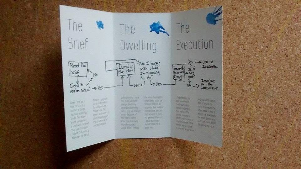
I took a different approach and tried adding splatters of colour in the corner of each page, but I found this clashed pretty badly with the fairly minimal design across the other aspects of the leaflet, so in the end product I'm going to just stick with no colour. I also think that not using the blobs of colour is more contextually appropriate and doesn't communicate the right messgaes, given that the context of this brief is to explain myself, and this sort of randomness doesn't occur in my thought process very often.
Task 3 - Re-writing a post from OUGD504 where a series of small design decision have been made in a way that summarises the accumulation of the decisions.
During the production of the menu cards, there were quite a lot of vectors that were used that will be used again in the playing card design for consistency within the project.
After some experimentation with the same sort of layout as the recipe cards it became clear that this sort of look was immature and needed to be changed as it looks like a book cover.
Looking back at the websites that sold different packs of cards, the backs of cards are more decorative than anything else. The vectors of the raspberry, tomato, pear, peach, chilli and grapefruit were arranged to create this pattern as a staring point. The honey, maple syrup and bacon were left out because the size of the card lends itself to a 4 x 6 grid, and these 6 toppings have in common that they are food in their natural form, which kept a pretty obvious concept throughout them. Whilst, visually at least, this is an improvement, it no longer looks very pancake-specific, especially without my logotype. Whilst the style of it works with the menu and recipe cards, it wouldn't be fit for it's purpose without them putting it in context.
To get round this I made a vector of a pancake to use in combination with the others. This works excellently on a conceptual level, as it shows that the main thing is pancakes, but everything else can go with them, hinting at what the website is about.
After uploading this to the website, this is the preview that came up. It looks fit for purpose based on the other designs produced for this project and other examples of backs of playing cards.
Task 2 - Re-writing a post from OUGD504 where a design decision has been made on personal preference or aesthetic comparison.
I painted over some of the rough printouts of my leaflet on the watercolour paper to assess how they effect the final product. I bought some watercolour paints yesterday to do a better and more consistent job this time round.
I started off with the green. I found that to get the colour the right sort of saturation that I wanted, the weight of the paint initially made the structural integrity of the paper go out of the window, it was curling everywhere.
On top of this, I found that thickness of the paint meant that some of the body copy was wiped off. Taking this into account I decided to use considerably thinner paint for the blue experiment.

The paint used for the blue experiment was a lot thinner than the green paint was to avoid taking the ink of the paper. Whilst this was successful, the paint was that watery that you could hardly notice the blue apart from in the fold creases.
As you can see, the paper naturally opened up after it had been painted whereas before the creases stayed pretty firmly shut.

I took a different approach and tried adding splatters of colour in the corner of each page, but I found this clashed pretty badly with the fairly minimal design across the other aspects of the leaflet, so in the end product I'm going to just stick with no colour. I also think that not using the blobs of colour is more contextually appropriate and doesn't communicate the right messgaes, given that the context of this brief is to explain myself, and this sort of randomness doesn't occur in my thought process very often.
Task 3 - Re-writing a post from OUGD504 where a series of small design decision have been made in a way that summarises the accumulation of the decisions.
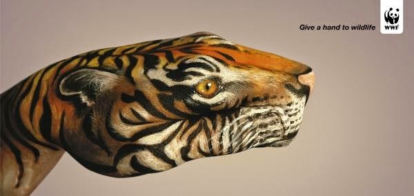
I looked into previous WWF campaigns, which is something that I didn't feel the need to do before, as regardless of what the previous campaigns have looked like, this project is about what Beth wants. Hopefully I can change the images to be more continuous while Beth still likes them.
Some work as a set because of how the backgrounds have a consistent background style despite having different coloured content. Because of the nature of what I've been doing, the closest thing I've been able to get to a consistent background is the grey bar at the bottom of the posters.
Some have same sort of grungy editing on the images. When you look at the images that I used, it's obvious that I didn't consider this, I edited them all separately to get what I considered to be the "best" result for that photo, and didn't consider how the way you edit things can help the continuity. The lighting is also the same in some of them, which allows for a slight variation in the background itself.
Some have same sort of grungy editing on the images. When you look at the images that I used, it's obvious that I didn't consider this, I edited them all separately to get what I considered to be the "best" result for that photo, and didn't consider how the way you edit things can help the continuity. The lighting is also the same in some of them, which allows for a slight variation in the background itself.
Task 4 - Re-write your latest post or write your next post using the following guidelines.
- Avoid overly subjective language
- Use sophisticated and professional language
- Don't fill with unnecessary or uncritical details
- Suggest improvements and discuss limitations
- Critical justifications in light of all other options and through experimentation
- Quotes must be referenced
- Explicit yet concise
The blog post that relates to this task is my evaluation for the responsive brief where I did some work for Beth, a creative advertising student.
Wednesday, 10 December 2014
OUGD504 - Studio Task 13 - Print Finishes
Varnish
Varnishes are generally used in higher end books and magazines, they give the paper a more consistent feel as well as protecting the ink by sealing it into the material. Gloss varnishes are generally used for image-heavy layouts, whereas matte varnishes tend to be used for more text-heavy layouts.
Lamination
Spot UV Varnish
Foiling
Embossing/Debossing
My taste in stuff generally isn't expensive/posh enough to own anything that has any embossed or letterpressed stuff, so I had to take the images from the guide on eStudio.
Letterpressing
 |
| Gloss Varnish |
 |
| Matte Varnish |
Lamination
Lamination adds a layer of protective coating to your print which can make it sturdier and more water-resistant. You can use a glossy lamination which improves the contrast of colour, particularly in images, or you can use a matte lamination which has a darker more luxurious outcome.
 |
| Gloss Lamination |
 |
| Matte Lamination |
Spot UV Varnish
This finish is applied by a machine that varnishes your print and then uses UV light to dry it out in the areas you don't want it, leaving behind the varnish in your selected areas, it's quite an expensive process to use. You don't need to change your document in terms of how it's set up, you just need to specify to the printer what areas you want to be varnished, it's advised that you set up a new layer in your document that illustrates this. Spot varnishing is a lengthy process because each bit of print has to be individually fed into the machine. Spot varnishing is generally used for highlighting certain parts of your print by making it contrast with the background, and it can make your print look a bit higher end.
Foiling
Foil stamping works by creating a metal stamp with the shape you want to foil block onto your area. You then place a sheet of foil over your print and the stamp on top of it. The machine you use causes the stamp to put pressures on the foil and your print, as well as heating it up. This causes the area of the foil under your stamp to fuse with the paper, leaving you with a reflective foil surface when the stamp is removed. It works better on stocks that have smooth surfaces, and the foil stamp shouldn't be a halftone image or anything to thin, as it can make the stamp less durable and make it more flakey. Foil stamping creates something that your eye is immediately drawn to, and is often used as a mark that something is official.
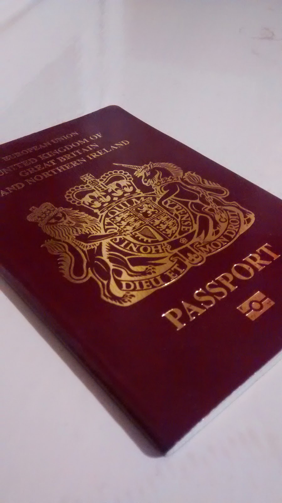 |
| Foiling |
Embossing/Debossing
Embossing and debossing works by creating two metal plates, one that works as a die, and the other that works as a counter-die. The plates are made from brass, copper or magnesium. Brass plates are more expensive and durable, and can generally allow you to use various levels of embossing. Copper plates are less durable and generally sis only effective for single-depth embossing, although they're cheaper than brass plates. Magnesium plates are cheaper still but are only any good for a one-off print. The material is placed between the two dies and squeezed and heated. The squeezing causes the material to rise up in certain places, and the heat causes the rise to be smooth. Embossing can be used as a stamp of approval in a similar way to foiling can, but can also be used to created shadows on your print.
My taste in stuff generally isn't expensive/posh enough to own anything that has any embossed or letterpressed stuff, so I had to take the images from the guide on eStudio.
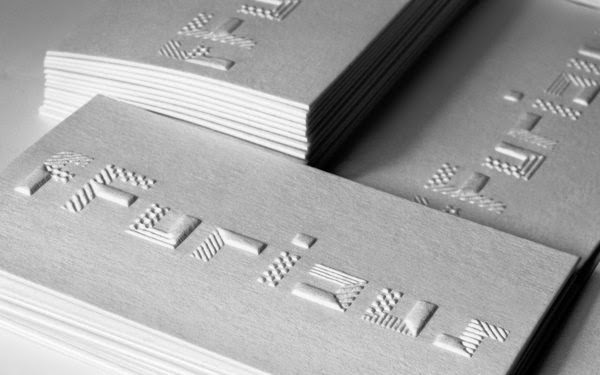 |
| Embossing |
Letterpressing
Letterpressing is similar to debossing in that it lowers certain areas of your print. If you use a letterpress without any ink it won't leave any colour on your print, but if you apply enough pressure it will leave its stamp mark. It generally works better on thicker or duplexed stock as there is more room for indentation within the material.
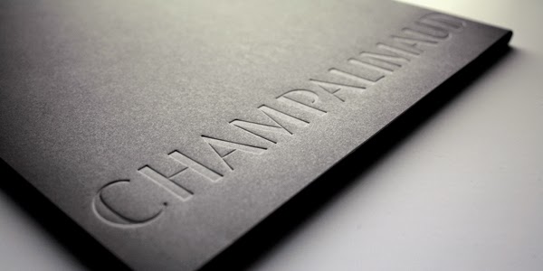 |
| Letterpressing |
Tuesday, 9 December 2014
OUGD504 - Studio Task 12 - Augmented Design
What is the potential of interactivity in print?
I think, as the videos shown in the session showed, the potential of interactivity in print is, somewhat ironically, linked with the potential of digital technology. Whilst various ornate folding and binding methods can be used to make print interactive, very little of that is anywhere near as impressive as being able to interact with print digitally, in my opinion at least.
Can augmented design draw people to your website?
Yes. The reasons are more fully explained in my rationale, but as a summary, if my campaign can encourage people to make more pancakes then people will start looking at toppings more, which makes my website less of a niche and more mainstream.
Is it all just a bit gimmicky? Or does it have potential?
I personally think the examples shown in the presentation were very gimmicky, I actually said it to the person sat next to me before the examples were finished and these questions were raised. I think there's a certain novelty that comes with it that a company could use to justify bumping up their prices, but I don't think any of the examples we were shown use the technology to it's full potential, not that I could suggest any better uses.
What kind of interactivity would be effective for my campaign?
With the target audiences being mothers with younger children, and young/middle-aged people wanting to try something new, I feel like the idea of physical interaction is more appropriate than digital interaction.
The limitations of Augmented Design in this project
When you apply augmented design to websites, then you're generally going to need a heavy understanding of how technology works in apps if you want to do something spectacular. There's no way I'll be able to make an app that does anything fancy like in the images below, because I wouldn't have any idea where to start. For me, in this project, augmented design should stick to print for practical reasons as well as it being more appropriate.
Monday, 8 December 2014
OUGD504 - Studio Task 11 - Project Rationale
Currently my website exists as a resource containing various different pancake toppings that are more interesting than the traditional toppings. Other than this, it does nothing else. Because of this, the only reason people would have to visit the site would be for ideas for toppings when they’re making pancakes, the problem being that people very rarely make them in the first place, which, in turn means that few people will visit my website.
My printed campaign should address this issue by encouraging people to make pancakes, focussed mainly on the following two reasons:
- Pancakes are a great way to experiment with eating things you wouldn’t eat because they are generally eaten with a topping.
- Making pancakes is a fun process and can be a good way to get children interested in cooking and food in general, potentially helping and encouraging them try new foods.
Because of the potential difference between a mum with young children and a young-middle-aged person who’s interested in trying something new, it will be difficult to produce three things that cater to both of these audiences. Because of this, I will aim to produce one piece of printed media that is aimed at each market, and then another piece that will work with either of the other two because the other will put it in context.
I would suggest that possibly the best way to encourage people to eat more pancakes would be to give out samples, and the printed media for this campaign would probably be used in conjunction with free samples. Because of the expense involved with samples, it is important that the materials and processes used in the printed campaign be kept simple in order to keep costs down.
It is important that the two audience-specific pieces of the campaign should have a clear indication of who their audience is, but at the same time they shouldn’t be too stereotypical to the point where they make the person think, “Oh, I’ve only be given this because…”
Tuesday, 2 December 2014
OUGD504 - Studio Task 10 - Advertising Considerations
Audience
As I discussed in my UXD session on my blog, my audience is predominantly female, which means my printed campaign should have a slightly feminine aura about it, but not overly feminine to the point where it’d be patronising. Because of how part of the audience will be mums with youngish children, the campaign will have to be practical and durable rather than something very ornate and delicate, which might be a difficult balance to find given it needs to be somewhat feminine.
Tone of Voice
Similar to the audience, the tone of voice will have to be quite calming but at the same time not patronising. Following on from the content of the site, the content needs to be informative but not too heavy.
Message
The message I’m going to try and put across is that you can eat pancakes in a more inventive and fun way that just putting the traditional toppings on them.
Similar Campaigns
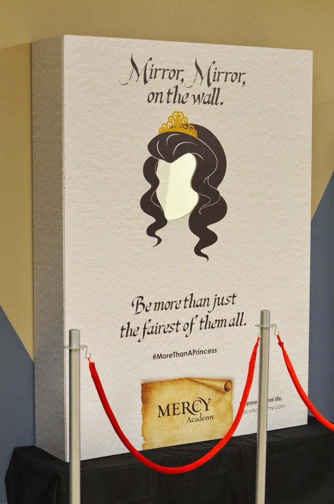
Mercy Academy - Life's Not A Fairytale
The below images are adverts for Mercy Academy, a Catholic girls school in Kentucky. Which encourages their students to be in charge of their own lives and prepare their own futures, rather than to wait on a 'Prince' to sort their lives out for them, which is the case in a lot of childhood fairytales.
Initially it seems that the audience for this campaign would be younger than my audience, but when you consider that it is the parents who choose where their children go to school, then the audience for this is exactly the same as my audience; mothers with a modern attitude towards life.
Coca-Cola Life (Argentina) - Parenting
The video below Argentinian advert for Coca-Cola Life. It featured on a list of 9 adverts that The Huffington Post said were most appealing to mums in 2013. It uses soft, happy and innocent imagery to appeal to the audiences maternal instincts.
Although this isn't a printed campaign, there are numerous stills in the video that could be used as images in a printed campaign for the product because of the heartwarming nature.
These are shots that I think particularly reflect the soft and innocent nature of the advert.
Fiat 500 - The Motherhood
I stumbled across this video when looking for other campaigns that I could take inspiration. It uses the wit and attitude of the Mercy Academy campaign and combines it with the maternal nature of the Coca Cola advert. It has the exact tone of voice that I want to try and recreate. It also plays well on stereotypes and has a clever use of words, which are things that may be important in my campaign.
Subscribe to:
Posts (Atom)


