General Comments
Going back to what I said in my first post for this brief, the outcomes for this brief were completely pre-decided by Beth, the Creative Advert student who's project I agreed to do some work on. While this sounds like there wasn't much room for me to work in, I feel like this was a good brief to take on because of how it would test where I am with my Photoshop abilities, and testing how good any on-the-spot ideas I had were, as I'd have to sell them to Beth before I could act on them. I also think that it's good to take on a brief with tight limitations straight from the off after the problems I had with the J2O briefs limitations revealing them slowly.
Successes
There was never a time during the past 2 weeks where Beth had to be pushy with me to see where I was at, my time management and communication was excellent. I was constantly sending her screenshots of the progress I was making with the work, and Beth was quick to reply more often than not, which helped a lot.
The influence I had to make the billboards and posters black and white with colour-dropping rather than them being full colour was important to the overall completion and success of the outcomes. Not only were they more effective than the colour ones individually because of how much clearer the message was, but the continuity between them was greatly improved because of the continuous colour scheme (or lack of one). This made it much easier to design the app because it wasn't necessary to use colour for continuity, which avoided any potential problems I could've had with colour, which tends to be an issue with my work.
Changes
My thoughts on this project initially were that because the outcomes had already been decided, and what they'd look like had already been decided to some extent, that research wasn't going to be overly important in this brief. This was short-sighted of me as I ended up having to do some research into continuity in WWF campaigns after I'd produced the initial designs for the billboards and posters, and change them accordingly, which was much less time-efficient. This was something I rectified for the app, and it made the process noticeably easier.
Given the problems we had initially with the photographs, it would've been better had I been with Beth when she was taking the photos. This would've been logistically difficult though, and making time and arrangements for this would've somewhat defeated the object of this project being one of my smaller responsive briefs.
Going Forward
Having had to design a website for OUGD504 and re-work it to fit a phone screen was useful experience when designing the app, which goes some way to explain how smoothly that process went. This has taught me the value in re-visiting old work of mine as a way to help me with my current projects.
Whilst I have stressed that this isn't a collaborative brief as such, it is the first brief I've ever worked on that was important to any grade where someone else's opinion had just as much weight, if not more, than mine did during the development of the outcomes. I wasn't looking forward to this aspect of the brief because of the room for disagreement, but it turned out that Beth and I worked quite well together in terms of communicating and making decisions, which was important given that we are friends outside of university and I wouldn't want work to compromise a personal friendship, especially given the consequences I've seen from people working together in a similar scenario to Beth and I.
Because of this experience I'm now a lot less nervous about the collaborative brief and the PPP Taking Care of Business brief as I feel this positive experience of working with someone else was something I needed as reassurance.
Showing posts with label Responsive Brief 4 - Beths WWF Work. Show all posts
Showing posts with label Responsive Brief 4 - Beths WWF Work. Show all posts
Wednesday, 4 February 2015


Tuesday, 3 February 2015
OUGD503 - Work For Creative Adverting Students - Last Minute Changes
Changes
Beth asked me to make some changes at lunch time today based on some feedback she was given by her tutor. They were only small changes so this wasn't really an issue.
There was a small spelling mistake on the twitter part of the app, where it said 'AND' instead of 'AN'. I also noticed that I'd put an 'e' in the word 'expiry' so I changed that too. I also decided that I could change the way the donation page scrolled so it moved vertically rather than diagonally, which makes much more sense, and I don't know why I didn't set it up in that way in the first place.
In the billboards and posters she wanted the '...Meanwhile the Earth is screaming' removed, and the messages changed to 'Killer *insert word where*'.
The final billboards, posters, and app screens are shown below.


My Thoughts
The vertical scrolling for the donation page makes much more sense than diagonal scrolling because it's more consistent with the rest of the app, as well as being less extravagant, which normalises donating to charity, making users more likely to donate again in future.
Getting rid of the '...meanwhile the Earth is screaming' text does make the posters and billboards look a lot cleaner, and it not being there makes it easier for your eye to concentrate on the main message and the photo itself. I don't know what to think of the changed messages. Whilst they are slightly more consistent in their wording now, from a design point of view they make very little difference. Beth was very panicky about having to make the changes, which suggests to me that the changes were more important than I thought them to be. We managed to keep the overall aesthetic though, and if anything we made it cleaner.
Beth asked me to make some changes at lunch time today based on some feedback she was given by her tutor. They were only small changes so this wasn't really an issue.
There was a small spelling mistake on the twitter part of the app, where it said 'AND' instead of 'AN'. I also noticed that I'd put an 'e' in the word 'expiry' so I changed that too. I also decided that I could change the way the donation page scrolled so it moved vertically rather than diagonally, which makes much more sense, and I don't know why I didn't set it up in that way in the first place.
In the billboards and posters she wanted the '...Meanwhile the Earth is screaming' removed, and the messages changed to 'Killer *insert word where*'.
The final billboards, posters, and app screens are shown below.
My Thoughts
The vertical scrolling for the donation page makes much more sense than diagonal scrolling because it's more consistent with the rest of the app, as well as being less extravagant, which normalises donating to charity, making users more likely to donate again in future.
Getting rid of the '...meanwhile the Earth is screaming' text does make the posters and billboards look a lot cleaner, and it not being there makes it easier for your eye to concentrate on the main message and the photo itself. I don't know what to think of the changed messages. Whilst they are slightly more consistent in their wording now, from a design point of view they make very little difference. Beth was very panicky about having to make the changes, which suggests to me that the changes were more important than I thought them to be. We managed to keep the overall aesthetic though, and if anything we made it cleaner.
Monday, 2 February 2015
OUGD503 - Work For Creative Advertising Student - App Pages Development

I used body copy that was 9pt so it was slightly smaller that the rest of the text, and altered the leading to 9.4pt so the baselines aligned with the baseline of the 'My Changes' option in the menu, and with the line that is going through the "How To Help" text.
The top of the image is aligned with the half way point between two of the lines rather than on a line, because putting it on the line left too big a gap.

The arrows are reversed so it implies that when it's clicked it makes things smaller rather than bigger. It's placed with the same gap from the grid lines as the gap between the original arrows and their gridlines.

The gaps between the text of tweets and the separating white lines are consistent throughout the feed, and the twitter bird is always placed half way between the white separation lines.
OUGD503 - Work For Creative Advertising Student - App States
This is the starting state of the app.

By pressing the little white up arrow in the bottom bar the bottom of the app slides up to show a feed of WWFUK's latest tweets that can be scrolled through by the user.

The Twitter feed goes back to the bottom of the screen by pressing the arrow again, which at this point will be facing downwards.

When the Twitter feed is closed, the donation page can be opened, which slides up diagonally across the screen when the black arrows are pressed.

Below shows what the donation page looks like, the page can be collapsed again by pressing the arrows again, which now all point inwards. The above GIF is stretched unfortunately, but it gives the impression of the movement.

The pages that are under the home menu will fit the following format/grid. The content will only take up the right hand side of the middle section of the app to keep the layout continuous.

By having the pages laid out this way, it keeps the option to donate always available and easy to find for the user, as well keeping the twitter feed easy to access to encourage interaction between the user and WWF.
Minor Tweaks
In all the above images and gifs there are some slight differences from the final design. In some of them the colour is a bit off for some reason, there are two arrows on the twitter feed, which is unnecessary and somewhat confusing. I also changed the arrows on the donate tab to be white for continuity.
These are the final designs.


I'm really happy with them, and after showing them Beth, I know she is too.
Saturday, 31 January 2015
OUGD503 - Work For Creative Advertising Student - Development of App
I started by setting up a 4x6 inch document, which was what my research in the 3rd Brief from OUGD504 suggested was the right size and ratio to use when designing for phones.
I used a grid based on the golden ratio because of it's links to nature, which makes sense from a conceptual viewpoint. I used the smallest square that this grid created as a way to make margins that fitted in with the grid.
When I put in the search bar where Beth wanted it it overshadowed the logo, which drew attention away from it, something that isn't good from a design point of view. I tried positioning it below the logo, but it still drew attention away from the logo. When I moved it to the left and increased the size of the logo this problem was no-where near as problematic.
For the "my WWF", I used the font from the logo, and found that it the WW:F fit the golden ratio perfectly, and having it at that size made it balance with the actual logo really well. I aligned the "my" with the "Hear, Change, Heal", which also helped the left and right balance out.
I made the Twitter bar half of the size of the bottom row, which was considerably thick, with the intention of using the other half of putting the donation part in the other half. I looked on Twitter to use a format that was familiar to twitter, so I used bold for the account name, light for the @ bit, and a smaller font size in regular for the actual tweet. I added little white triangles above and below the text to let the user look through the tweets.
When I added the Donation bar I experimented with ways to separate them, including different weights and colours of lines that stretched various percentages of the width of the app. I found that the best looking way to do it was a full width 10pt white line, which was probably the simplest way to do it as well. I found that using a full width grey rectangle was wasting a lot of space and looked a bit odd given that a lot of the area was empty, so I cut it down to a rounded off rectangle which went as far as the search bar, which was a lot better. I added a little icon that the user could click to enlarge the donate section to show a form that they could fill out to donate.
I changed "menu" to "home" because I felt it was more appropriate for a web/technology based design project. I underlined it to show a noticeable difference in the hierarchy on the page without it drawing attention to itself immediately. I aligned the left of the options with the right of home, spacing them out vertically so they filled the space. I found a vector of a paw print that didn't have claws because of the softer look it has, and shrunk them to a size slightly bigger than the black box in the search bar so that the circular elements go slightly out of alignment, like how the circular elements of a typeface sit slightly below the baseline. At this size the paws lead the eye down the page quite nicely.
I added the panda in at a size that fitted the grid, rather than the larger size that it was in Beths drawing, I did this to make it less overpowering that it was in Beths drawing. I also placed it lower down because of how it looks natural when placed there because of how the eye has been drawn to it by the paws.
Using this layout gives me options going forward to create other pages for the app. I showed it Beth and she was happy with it, so I'll be taking this design forward.
Friday, 30 January 2015
OUGD503 - Work For Creative Advertising Student - App Functionality Research
I looked at some of the information-based apps on my phone to look for design features and problems in multi-page apps that I can take inspiration from or need to avoid or get around.

The home screen of the British Gas app is one big menu, but after clicking on some of the options you realise that the way they open is inconsistent, something which could potentially be confusing to the user. The pop-out effect is detrimental to the consistency of the colour scheme due to having a shadow. Having a mechanism that allows you to return to the home screen easily like the sliding "Home" tab at the bottom of the other pages gives the user an easy way to navigate around the app, and it's important that this is placed consistently for ease of use.

The Sky Sports Score Centre app has it's homepage set to display the most important information at any given time, which increases the functionality of the app. This is contradicted however by how unclear it is as to how to access any other information. When you do open the menu it takes up the vast majority of the screen in a way which makes it look awkward and unconsidered because of the numerous visually unappealing shadow effects. There is also an inconsistency in the size of the text that titles the page, as can be seen in the "Pub Finder" text compared to the "Fixtures & Results" and "Home" text, this is a basic error that should be avoided for consistency.

Overall the British Rail resolves the menu problem by having a fairly elegant menu at the bottom of the page that doesn't draw much attention to itself. This only becomes a problem when you choose to see more options, as it then covers a large amount of the screen, but this would only cause problems to more niche users of the app because the main functions of the app because the vast majority of the functions of the app are fulfilled within the 3 options on the regular menu. For the most part the grid and styling of the app is extremely consistent, making the app easily to use and navigable because the user already has an idea of where certain things will be found. The only inconsistency comes when adverts are involved, but this isn't going to be something I need to consider.
The home screen of the British Gas app is one big menu, but after clicking on some of the options you realise that the way they open is inconsistent, something which could potentially be confusing to the user. The pop-out effect is detrimental to the consistency of the colour scheme due to having a shadow. Having a mechanism that allows you to return to the home screen easily like the sliding "Home" tab at the bottom of the other pages gives the user an easy way to navigate around the app, and it's important that this is placed consistently for ease of use.
The Sky Sports Score Centre app has it's homepage set to display the most important information at any given time, which increases the functionality of the app. This is contradicted however by how unclear it is as to how to access any other information. When you do open the menu it takes up the vast majority of the screen in a way which makes it look awkward and unconsidered because of the numerous visually unappealing shadow effects. There is also an inconsistency in the size of the text that titles the page, as can be seen in the "Pub Finder" text compared to the "Fixtures & Results" and "Home" text, this is a basic error that should be avoided for consistency.
Overall the British Rail resolves the menu problem by having a fairly elegant menu at the bottom of the page that doesn't draw much attention to itself. This only becomes a problem when you choose to see more options, as it then covers a large amount of the screen, but this would only cause problems to more niche users of the app because the main functions of the app because the vast majority of the functions of the app are fulfilled within the 3 options on the regular menu. For the most part the grid and styling of the app is extremely consistent, making the app easily to use and navigable because the user already has an idea of where certain things will be found. The only inconsistency comes when adverts are involved, but this isn't going to be something I need to consider.
OUGD503 - Work For Creative Advertising Student - App Briefing
I briefly went over to Beths this afternoon to give her the files for the billboards and posters. She told me that she was going to be using the black and white ones as her final pieces.
She showed me the below page in her sketchbook showing what she wanted the app to look like.

So I had something a little clearer to work from when I was working without Beth being there I did a very quick and bad mock-up so I knew where everything was going to go.

The writing in Beths sketchbook summarised the function that each section of the app was going to fulfil.
My Changes
The page records what positive changes the user has made to their lifestyle. Includes things such as:
She showed me the below page in her sketchbook showing what she wanted the app to look like.
So I had something a little clearer to work from when I was working without Beth being there I did a very quick and bad mock-up so I knew where everything was going to go.
The writing in Beths sketchbook summarised the function that each section of the app was going to fulfil.
My Changes
The page records what positive changes the user has made to their lifestyle. Includes things such as:
- Visiting wildlife sanctuaries
- Donating to wildlife related schemes
- Recycling paper, plastic bottles, cardboard etc
- Turning off lights
- Turning down thermostats
- Walking
Free Prize Draw
Regular users who update their profile can enter a monthly prize draw with wildlife related prizes won.
Games
Two games, one where the use save animals by 'hunting the hunter' and stopping him before it's too late, and the other where the user plants plants where other plants start to disappear in a race against time to save the planet.
How To Help
Information about WWF's local and national companions, as well as tips on how to make changes to your lifestyle.
About Us
The goals of WWF and what WWF are trying to achieve.
Thursday, 29 January 2015
OUGD503 - Work For Creative Advertising Student - Continuity Development
I decided that the best was to start off addressing the problem with the lack of continuity was to add the border to the bottom of the billboards. This will change the ratio of the billboard though, I spoke to Beth though, and she said that this didn't matter particularly as the project is more about the image of the billboards not the final polished thing.


Adding the border to the billboards means that the changes I made to the colour of the jumper weren't necessary, so I changed that back as it looks more natural without the changes. The results are below.
Whilst this was a start, I still think that the lack of consistency in colour and composition of the photos does still leave a lot to be desired in terms of consistency. Obviously I can't change the composition of the photos, so the colour seems the way to go.
Looking back at when I first worked on the first billboard, I showed Beth what it would look like in black and white where the lipstick message was left in colour. I thought that this could be a good way to go forward because it makes the consistency of the colours a lot stronger, as shown below.
I think these look a lot better in terms of how they work as a set. I've shown Beth both sets and suggested that I think that in terms of a campaign, the black and white ones are the ones to go with. I'm happy with them.
Tuesday, 27 January 2015
OUGD503 - Work For Creative Advertising Student - Continuity in WWF Campaigns
Looking at the 4 images I've produced, they all work individually, but when you look at them together they have very little continuity within the style of the images.


It's obvious that these two are part of the same campaign due to the consistency between them both. I think it's particularly important to note how the logo and text are in the same place on both, something which I tried to do but couldn't manage it because of the nature of the photographs I was using.


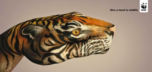
These are my favourite WWF campaign posters. Again the text is all placed in the exact place, with content of the posters being altered slightly for each variation. The lighting is also the same in each of them, which allows for a slight variation in the background itself.


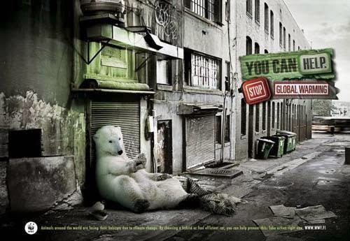
I looked into previous WWF campaigns, which is something that I didn't feel the need to do before, as regardless of what the previous campaigns have looked like, this project is about what Beth wants. Hopefully I can change the images to be more continuous while Beth still likes them.
The below four work as a set because of how the backgrounds have a consistent background style despite having different coloured content. Because of the nature of what I've been doing, the closest thing I've been able to get to a consistent background is the grey bar at the bottom of the posters.
It's obvious that these two are part of the same campaign due to the consistency between them both. I think it's particularly important to note how the logo and text are in the same place on both, something which I tried to do but couldn't manage it because of the nature of the photographs I was using.
These three have the same sort of grungy editing on the images. When you look at the images themselves that I've used I didn't consider this, I edited them all separately to get what I considered to be the "best" result for that photo, and didn't consider how the way you edit things can help the continuity.
These are my favourite WWF campaign posters. Again the text is all placed in the exact place, with content of the posters being altered slightly for each variation. The lighting is also the same in each of them, which allows for a slight variation in the background itself.
Subscribe to:
Posts (Atom)