Showing posts with label Brief 6 - Covered. Show all posts

Thursday, 21 May 2015

OUGD505 - Design Practice 2 - Module Evaluation

General Thoughts On The Module 

I’ve really enjoyed this module, and I put this down to the freedom that came with it. Considering how open the bigger of the two briefs was and the amount of time we were given to spend on it, I don’t see an excuse to not have enjoyed it, as it allowed everyone to focus on something they’re interested in and gave them enough time to be ambitious with it. Their is no comparison between this and the briefs in the other 30 credit module, where one of them was branding (which I don’t really have an interest in), and two were tied to our Summer brief, which didn’t really work out for me because the format of the briefs didn’t suit the research I’d undertaken over Summer. So I’m pleased that I’ve had the freedom that this module has allowed me. 

On the assumption and understanding that Extended Practice next year will function in a somewhat similar way to this module, I feel that this module was a good introduction to next year, as it was far more self-directed than any module undertaken up to this point, which I’m pleased about because it shows my time and self management skills in their greatest light.

My Performance In The Module 

As it has been throughout the year, my attendance and punctuality has been very good, I can only remember being late to one timetabled session, although I wouldn’t want to be quoted on this. 

I also feel that I’ve taken on board the feedback from responsive well since I was given it in late April, which was that my work and my experience as a designer would benefit from experimentation with different new processes. Because of the timing of this, it is shown more in my book cover than in Product, Range, Distribution. The time and effort put into the book cover through the extra processes has somewhat awakened me to the potential stress that can come with being a graphic designer, although this was somewhat minimalised by my good time management. That said, I think that the extra momentum I carried with me in terms of willingness and motivation to go the step further when producing my work has shown in my information boards. Combining the processes of digital printing, laser printing, laminating, and duplexing would probably have been something that I wouldn’t have bothered with at the beginning of the year for an outcome as basic as an information board, and I’d probably have just stuck with the digital mock up and been happy with this.

How This Module Has Helped Me

Because of the enjoyment I’ve found in both the briefs, this module has helped point me in the right direction for COP3, as well as helping me to consider what work I want to focus on in the future.

I found creating the booklet for the app very satisfying in terms of organising something nicely on a page, and this is something I tend to feel often when using InDesign. This isn’t just because I was interested in the brief, because the element in which I engaged with on a personal level was the research and the designing of the app itself.

The slight disappointment I felt with my final book cover has highlighted the importance of experimentation to me, as if I needed to do something involving stenciling or debossing in the future where I was being paid, I wouldn’t want to give a client work I wasn’t happy with. I now realise that learning how to properly execute these processes early is important.

Next Year 

Like mentioned above, I know that next year I want InDesign to be pretty central to a fair few of the projects I undertake because I enjoy using it and enjoy working with layout in a wider sense. This is something I identified to some extent in Level 4 as well, through my enjoyment of the layout brief.

I also found that I enjoyed the challenge of making the app consistent with itself, which isn’t really a surprise given how this challenge lends itself to layout. But I noticed that throughout the development stages of the app I felt more comfortable designing an app than I would’ve done a poster. This is very reminiscent of my feelings when working on Beth’s Creative Advertising work in responsive where a print element worked alongside a digital element. I put this down to the intimidation that comes with starting with a big empty space and not wanting to make the first mark. In terms of developing portfolio work next year, I feel like working on app design is something I should pursue next year.

The only field of design that this module hasn’t allowed me to work on is packaging, so I’ve identified this as something I want to experiment with early on next year so I can decide if it’s something I want to persist with going further into Level 6 and even beyond that.
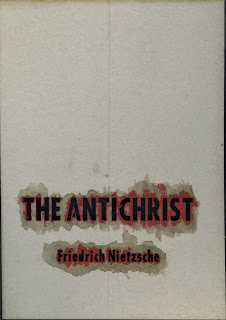
OUGD505 - Covered - Post-Exhibition Experimentation

After seeing the exhibition yesterday I did some experiments with the stencil I used for the text on my folder to try and look at alternative covers for my book that might've been more suitable for the exhibition by making more use of the two colour stipulation.

I started by scanning the front and back of the stencil so I could digitally make use of the marks left on it by the blood and ink.


I found that when trying to produce an outcome that was completely digitally based strayed too much from the roughness of the concept I was trying to stick too. The best digital version I got was this, which I don't think is better than the version I submitted.


Because of this I went back to the print room and tried adding ink to the debossing block, to try and neaten up the application of the ink to the paper.


I only had two sheets of the stock I used left, and the difference between the application of the ink between the two showed that this wouldn't have worked as well as I would've wanted it too without a lot of persistence and wasted paper.


To try and get the deeper and more prominent debossed effect, I tried pressing the block into the greyboard stencil, as this was thicker than the paper, which left a larger room for the depth of the debossing. However, the board was too sturdy and so the embossing was about the same depth as it was on the paper.


During a conversation with James Holt after I told him I'd been printing with blood he suggested that an alternate route I could've gone down would've been to stain the grey board with blood and screen print on that, which would've allowed for a tidier finish. I wish I had have had this conversation two weeks ago, because this would've been a really good experiment. Not only this, but because the grey board would be weakened by the blood, it would be softer and easier to deboss into, which would've possibly allowed me to get the more prominent debossed effect I wanted.

OUGD505 - Product, Range, Distribution & Covered - Design Boards

These are the design boards I'm going to submit with my project. They summarise the more important decisions I made and research I undertook throughout these past two projects.


OUGD505 - Covered - The Exhibition

Retrospectively, maybe the sort of approach I took to this brief wasn't right for the exhibition. Most of the other posters there were a lot more colourful and eye-catching than my own.


On the plus side, the debossing looked a lot better than I was expecting it to because it wasn't very deep. I do think a more polished finish to the lettering would've made it fit in a lot better, but this is something I've already expressed my regret about in terms of my lack of previous experimentation.


Tuesday, 19 May 2015

OUGD505 - Covered - Evaluation

General Comments

I discovered Nietzsche doing some research for COP, and was very interested in thoughts initially, despite them not being particularly relevant to my COP this year. I knew I wanted to involve him heavily in COP next year as a learning experience for myself, and I saw this brief as an opportunity to get a head start on my reading for my dissertation research. In this sense I wasn’t sure if I should pick The Antichrist or Thus Spoke Zarathustra, as these were the two books that I was initially attracted to Nietzsche by. From a Graphic Design sense, The Antichrist left me with more options because of the connotations of the title. This was probably the brief I’ve enjoyed most since being at LCA because of how it’s allowed COP to merge in quite heavily.

What Went Well

I feel that from a conceptual point, I got this brief pretty spot on, and no matter how much longer I could spend on the brief, the concept couldn’t become more refined or appropriate to the book or the author.

Given previous projects of mine have “challenged conventions" in more satirical ways (such as WWF Condoms), I was happy to show that I could produce work that was a much more serious undertone to it whilst still being heavily engaged with it, which has been something I’ve struggled with at times, such as in the J2O brief. In this sense I feel like I’ve shown that I’m more than what most people probably see me as, which is something I see as a success on a personal level.

What I'd Change

My lack of experience in producing physical outcomes using different processes has been highlighted in this brief. I didn’t order enough stock to be able to allow for wide enough experimentation in the debossing process and painting or printing with the blood. In hindsight I should definitely not have used stencils for the printing, and instead used the laser cutter to cut out printing blocks to use like a letter press, as this would’ve made for a much neater finish for the lettering on both the poster and the sleeve. I also would’ve liked the debossing to be deeper into the stock to give it more prominence. I would also have painted the areas of the debossing blocks that I wanted blood to run through so that would’ve been printed on with the embossing, making it neater than myself painting it by hand. I feel like I didn’t leave myself enough to time or resources (in terms of stock) to experiment as much as needed to in order to do the concept justice, which I’m slightly upset about in all honesty.

Friday, 15 May 2015

OUGD505 - Covered - Embossing and Printing Process

I spent a while testing out different settings on the laser cutter to get the right depth and clarity of cut in the wood I was making my embossing blocks out of. The first one clearly shows I had the file set up wrong, the second wasn't deep enough and was slightly pixelated, the third one fixed the pixelation but not the depth, and the fourth setting was pretty perfect.


The final A4 embossing blocks came out like this, and took ages to cut out because of the size, this is a part of the process I would look to refine in future. I also cut out the stencils on the laser cutter but in thin, sturdy card. I chose this material to make it easier for me when it came to the painting.


After the paper had been embossed I tried applying the lambs blood through the stencil, but it was far too runny and leaked under the stencil, making it completely illegible. It also dried a horrible yellowy-brown colour, which doesn't make it clear that it's blood.


I tried mixing the blood with the red paint block in this tin I had in my cupboard to thicken it slightly and give it a deeper red colour. Whilst the result was a slight improvement, it wasn't striking enough and didn't look as powerful as I wanted it too.


I got some red ink from the print room and mixed some blood into it. This allowed me to have a deeper colour, thicker printing material and still use the blood. This was done in the knowledge that vangardist magazine mixed blood with the ink successfully. This gave me a much deeper colour without having anywhere near as much running. 


I did a couple of practice runs with some of embossed paper.


This was my final poster


This was the final sleeve


Whilst the printed version does the concept more justice than the laser printed version, I'm a bit sceptical as to weather it was worth all the time and effort for it. It's definitely an improvement on the cover of my copy of the book though, and it was nice to do a project that was a bit more hands on than my other projects.


The text on the final poster does look a bit like Resolution Sans, the Jonathan Barnbrook font I used for the headings in my Study Task 3.

Tuesday, 12 May 2015

OUGD505 - Covered - Sleeve Alterations, Blood, and Laser Cutter Preparation

Sleeve Alteration

Having realised the benefits of printing a book/booklet at a size smaller than A4 in Product, Range, Distribution, I altered the sleeve slightly so that the whole thing could be printed on A4. The new design is shown below. It is fundamentally the same but with varying amounts of whitespace.


Blood

I managed to get hold of some blood today from the Butchers section at Morrisons. It came from a recently delivered lamb. The butcher wrapped it in numerous layers of cling film and suggest that it should be thrown away if not used within a week, which shouldn't be an issue given that I'm laser cutting the debossing guides and blood stencils tomorrow.


Laser Cutting Preparation

In preparation for the laser cutting, I prepared these two illustrator files. The top one will be used if wood can be burned into to make the orbits rise above the rest of the sheet, with the black representing the area to be burned into and the red lines showing what will be cut clean through. If the technician suggests that this isn't the best way to do it, the second file will be used to cut out the orbits out completely, and I'll then superglue them onto another sheet of wood to create the debossing sheet.


Saturday, 9 May 2015

OUGD505 - Covered - Design Decisions and Potential Processes

Initial Design Decisions

Imagery

I wanted the focal point of the poster to be the blood printed type, so the accompanying imagery on the poster needed to be subtle so as not to overshadow this.

To reflect the passing of time I initially had two ideas. The first of these was to use a gradient behind the type to represent erosion and fading, the second was to set the page up like a calendar. The gradient idea was very vague and would've been difficult to execute well because of the two colour stipulation of the brief, whereas the calendar idea was very literal and contrasted with the more conceptual idea of using blood to print with. 


The second idea developed into using a planetary orbit diagram, which is appropriate because our orbit around this sun is what causes the seasons to change and years to pass. Not only this, but the calendar we use today that is dictated by our orbit around the sun is the Gregorian calendar, which was changed from the Julian calendar in 1582 by Pope Gregory XIII to change the date Easter was celebrated on the day it was originally celebrated on by the early Church, this illustrates one of the books ideas that people high up in the church have more power than they should have. On top this the connotations of 'big questions' that are carried with space related imagery are also carried with philosophy as an area of study.

Layout

The cover is an element of the sleeve, so I designed it in this context to make sure I wouldn't have any problems transferring the cover into a sleeve. To make the imagery cohesive between the front and back I made sure the orbits wrapped around the spine and placed the focal point of the orbits on a position dictated by a golden-ratio based grid to reflect the naturally occurring nature of the solar system.


The title and Nietzsche's name are placed unusually in the lower portion of the page to represent how he lived his life out of the way. The blurb starts at the same height as the top as the title, which both had to be lowered slightly to move the blurb away from the focal point of the orbits. Nietzsche's name was placed in alignment with the bottom of the blurb. The blurb doesn't cover the full width of the page in order to leave some of the orbits unobscured, and is placed on the left side to balance out the barcode, which placed traditionally in the bottom right corner. Adding the publishers mark above the barcode balanced out the type even more.

The positioning of the text on the spine means it aligns centrally with the blurb.

Fonts and Colours

I chose to use Futura for because it was inspired by the Bauhaus, giving it underlying German connotations, and when it was designed it made no attempt to look traditional, giving it the same forward thinking principles as Nietzsche's thoughts. The fact that it's sans serif leaves more room for imperfections along the straight edges when I print in blood, as this gives it a more human feel.

Condensed bold was used on the cover because the type needed to reflect the fact bold nature of the name of the book, this was also the reason full capitals were used for the title. Nietzsche's name isn't in full capitals in order to further emphasise the full capitalisation of the title. Both theses will be printed in blood, as the use of blood represents the pain Nietzsche was in throughout his life and a similarity between him and myself in the similarity of having questioned a heavily religious family background in our teenage years, as well as being reference to the below quote from another of Nietzsche's books.

'Of all writings I love only that which is written with blood'
                                       - F. Nietzsche - Thus Spoke Zarathustra

The text on the back is in Futura Book 10pt black, as I found this to be the most legible. Using 10pt also allowed me to fit enough words in a row to make the text fully justified without the text being unreadable due to being too small. Having fully justified type keeps it looking tidy.


Potential Processes

Debossing

I want to deboss the orbits so they look to sit behind the text. This is preferred to embossing to represent Nietzsche trying to rise above his illnesses. Using a deboss to show this has to be done rather that printing because to try and represent the same thing by printing I would have to use a colour lighter than the stock as my second colour (the first being the blood), leaving me with very few options for the blurb etc.

Stencilling

The debossing of the orbit rings will be done before the printing so as not to risk cracking the ink or tearing the stock (which would've been weakened having soaked up the blood). Because the stock will now have an uneven surface, making printing blocks won't work because they won't reach into the debossed area of the stock. To get around this I'll make a stencil for the text, and apply the blood/ink to the page manually, probably using a paint brush. Hopefully the blood/ink will run through the debossed areas slightly, which will then give them a similar use to a vein/artery as well as their symbolic use, which won't be made clear in the poster because they continue around the spine and onto the back of the book.

Digital Printing

The blurb and publisher marks etc on the back of the book are small and fine, and so I need to use a process that makes them as clear as possible, digital printing is the method that best fits this as it removes the room for human error that comes with screen printing.

Halftone

If the debossed orbits hinder the legibility of some of the blurb on the back of the book, or make the folding of the spine difficult, they'll be printed in halftone. If this still effects readability of the blurb I will have to block out the area behind the text. This is something I want to avoid doing though.

Process-Informed Design Changes

Stock

Due to using debossing I'll need to use a thick stock. I chose to use 250gsm Brite White from G. F. Smith's Parche Marque range because it's thick enough to use for embossing, thin enough to fold with relative ease, it's texture feels like it could absorb some of blood if it needed too, keeping it fairly sturdy, and it's off white colour should allow the colour of the blood to stay fairly true.

Layout

After looking into embossing and debossing tips, I found that it wasn't feasible to deboss areas that had fairly small text on them that wasn't bold without affecting it's readability. I then looked into halftoning instead of embossing, but this looked terrible, with or without a blocked out area behind the text.


The only alternative to this was to move the text so it wasn't covering the same area as any of debossing. By moving it to the top left the cover remains unaffected, which means that the poster will still work as intended, but the jacket as a whole has a better sense of balance about it. Moving the publishers logo to the top helps your eye border the back of the book, which is important when you see the jacket placed flat. I also moved the spine text so it was centrally aligned with the focal point of the orbits, but had to remove Nietzsche's name from it in order for it to fit.


Fonts

Using stencils brings up issues with the counters in letters, which made Futura unusable as it was. It was suggested to me by Danny that I use a font called DIN Schablonierschrift, a stencil font that had similar dimensions to what I was using. After I looked into this I found that whilst it was usable for the title, it didn't have a lower case font to use for Nietzsche's name. I tried using the capitals for the name, but found that at a small size the gaps in the stencils were too narrow to be usable. 


Rather than mix use the two fonts in combination with each other I decided to modify Futura to be usable as a stencil. However, I still found that the gaps in the lower case were too narrow to be usable. Due to the small size of the counters in Nietzsche's name and the easily recognisable nature of the letters d and e, I feel that filling in the counters and continuing to use Futura shouldn't be too much of an issue.

This is how the final InDesign Files look.


I expect the final poster and sleeve will look something like this.


Wednesday, 6 May 2015

OUGD505 - Covered - Vangardist Magazine

Ryan showed be this article on Vice about a an Austrian magazine called Vangardist, who printed a 3,000 magazines using ink that was mixed with the blood of people who were HIV positive. They reported that it generally got a positive reaction and helped raise awareness of the condition. They printed to variations of the cover, one using the ink mixed with blood, and one using regular ink. The results is below.


Because of how well the ink mixed with blood has printed, I feel that I should experiment with mixing blood in with ink too, as the blood might need thickening up to work properly.