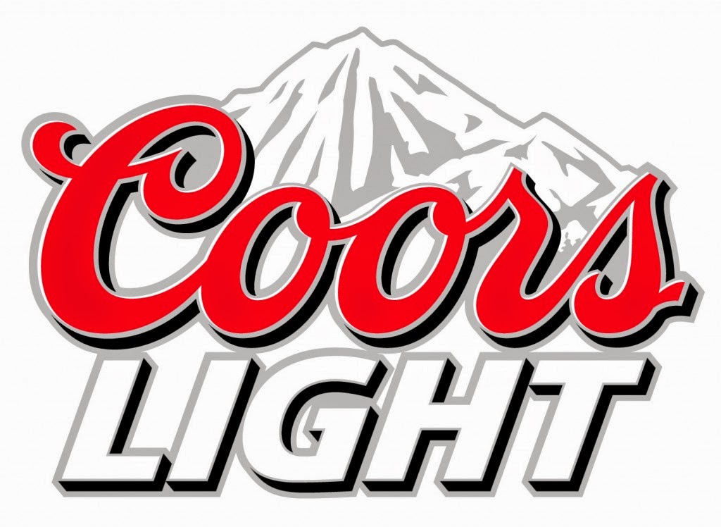
The branding behind Coors Light is the idea of refreshment above all else, as shown in their very unique adverts. The mountainous imagery works really well for this and the silver and blue reflect this well due to their connotations as cold colours. But then they go and use red lettering as well, which is strange. I appreciate that it's an American company, and that American pride dictates that you must use red, white and blue wherever humanly possible, but I really feel that if they'd have stuck to the cold colours the bottle and logo would work a lot better.


Budweiser
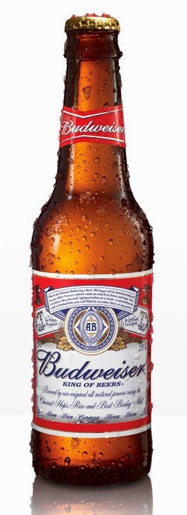
In a very American way, Budweiser advertises in a way that very much reflects the country's obsession with superiority, and the tag line, "The king of beers" sums it up pretty concisely. The use of a rich red in the logo gives it a sense of self importance with the hints of gold and the addition of the gold crown suggesting royalty and class. This class is backed up by a bow tie shaped block of colour and an easily readable script font. I think they've done an excellent job of the logo and branding in general.

Hornsby's
Hornsby cider is a brand who's branding reflects the history of the company. The founder of the company, George Hornsby moved from Britain to America and missed British cider, so he started brewing his own. Hornsby was a traveller, and the story goes that when he was travelling in Africa he encountered a black rhino and was inspired by it's fearlessness and strength, and that this encounter was an inspiration to his future exploits. I find this pretty certain to be fictitious given the mans surname though. As another American brand it's not surprising that the logo revolves around the colours red, white and blue. I also feel that the logo has quite a cultural feel to it, it's the sort of drink that I can envisage being drunk in an American Diner or at a frat party. I think the emphasis of the design on American culture is very appropriate given the story of the founder. The fact that he chose to live in America of all places suggests that the culture was important to him. I think this is a pretty ok logo in all honesty, nothing special, but I think it works really well in conjunction with the rest of the branding and the context of the product.
Jack Daniels
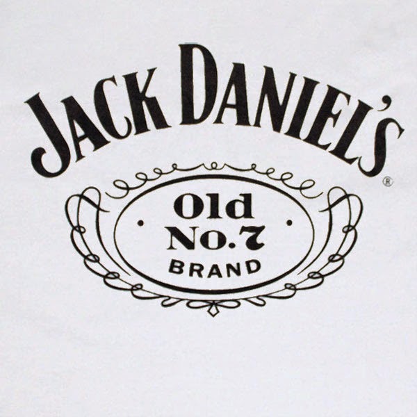
The black label of Jack Daniels is pretty iconic worldwide in terms of food and drink branding. It was first introduced in 1908 to mark the death of Jack Daniel, and this was when the brand really started to take off, although it was being distilled since 1866 in the Jack Daniel distillery, which is now the oldest registered distillery in America. Because the brand has such a long history, the old style poster-like label is appropriate and very much gives the bottle a historic feel, even if you knew nothing of the companies history. The logo itself works really well. The old fashioned style lettering works really well with the shape of the logo, which makes it look somewhat like a stamped seal that you'd find on old letters. Keeping the logo black and white keeps the old fashioned traditional feel. I think like Coca-Cola and McDonalds, Jack Daniel's is a very sustainable brand.


No comments:
Post a Comment