Showing posts with label OUGD504. Show all posts

Thursday, 8 January 2015

OUGD504 - Module Evaluation

General Thoughts On The Module

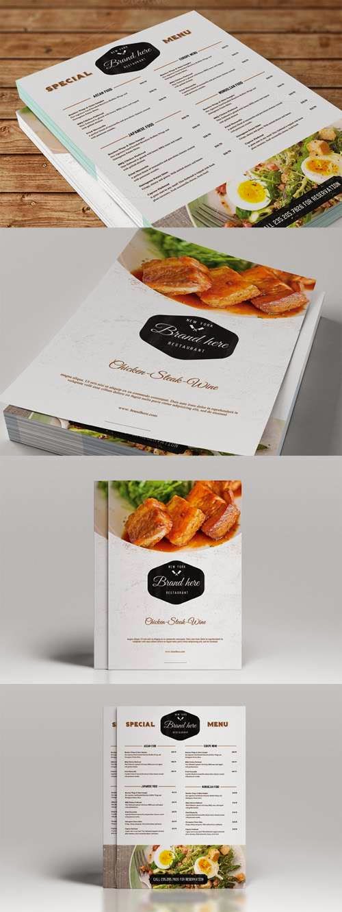
I really enjoyed the way this module was structured. The length of the module combined with the fact that the first two briefs were only week-long briefs meant the amount of time it left us with for the third and fourth brief was great, as it really gave me time to think about the project rather than just jumping into it like I did with the second brief. On top of this, the fact that the brief 3 built on our summer project gave me extra incentive and motivation because I had a reasonably strong starting point. This was the same for the final brief, and I feel like this is the brief where the advantage of having more time really shows as I think that my influences are really clear, which has in turn made it of a higher quality.

I feel the way the briefs were linked together by lots of studio tasks was excellent, because these tasks were always relevant and kept me pointed in the right direction, but without feeling like I was being told what to do. I also found the design for print workshops we did as part of the module were really worthwhile in terms of being able to use the software to its full potential, and understanding how spot colours work in practice, which is something I had no idea about up until now. I feel like if we’d have had these specific workshops right at the very beginning of the year, my work would’ve benefitted even more, in particular the J2O brief for Responsive.

Because of the length of time we’ve had on the module, there have been times where it’s sat back in my list of priorities behind Responsive and PPP, which has really helped the strength of my PPP blog when you compare it to how my PPP blog was looking at this point last year, which I’m really grateful for. Having time to work on Responsive alongside this module was beneficial to me in terms of my time management skills, which I feel were already pretty good, and to the quality of my work, as I spent less time staring at the same brief repeatedly, and the variation helped stop me from getting bored. 

My Performance In The Module

I’m really pleased with my progress in this module, I feel like my abilities as a designer have noticeably improved, especially judging from the outcomes in for the final brief and the current work I’m doing for self-branding in PPP. I put this down to a combination of the design for print workshops and the content of the first brief. The workshops have really helped me develop the use of colour within my work, and the first brief has helped me understand my own creative process, which has helped me from then on in the production of the rest of my work. 

At the beginning of the year I found myself a bit slow to react to the restarting of being back at uni, which highlighted to me a problem in my attitude towards work, as I was expecting the pace to slowly build up from last year into third year. Having two week-long briefs straight away was exactly what I needed to help me with this problem, and subsequently my work ethic was much better for this module that it was at any point last year, and I think this is highlighted by the amount of work I did over Christmas (across all modules) and the thoroughness of my blogging. This change in attitude towards work has slowly been spreading across to my attitude towards the design industry in general, as shown by my use of G.F Smith and MPC in the final project. I definitely wouldn’t have looked at doing that last year, as I’d have seen using an external paper mill as something that was pretentious and unnecessary, and using an external printing company as expensive and lazy. I definitely think the visiting professionals we’ve had in have influenced my opinion on the design industry, as I now feel less like everyone in the industry is pretentious, which was, retrospectively, a stupid thing to think in the first place.

I’m really looking forward to starting the next module because of the renewed work ethic I have, which I’ve not felt since my GCSE’s, an appreciation for how the industry and external factors can improve my work, and a building sense of confidence in my abilities. One thing I will be looking to improve on however is the amount of time I spend in uni. Whilst I do come in for 99% of timetabled sessions and have not intentionally missed one this year, I do tend to go home as soon as I can. This happens to the extent where a few people on the course have commented that they hardly ever see me any more, which I feel is unfair on me, especially given how the group is split for some sessions. In order to improve this I have to make lifestyle changes which will make me less tired during the day, and I need to start bringing more food into uni as well, as often I go home because I’m hungry and refuse to pay £3 for a sandwich.

To summarise, I really enjoyed this module, and I think that it could be quite a big turning point for me in the course, which is important given how far into it I now am.

Tuesday, 6 January 2015

OUGD504 - Augmented Design - Evaluation

General Comments

This project has been by far and away my favourite project of the course so far because of how it’s brought lots of things together for me, including previous projects, software workshops, talks from visiting professionals. But I think the most important thing I’ve gained from this project is an appreciation of how PPP links in to the rest of the course, something which was somewhat a mystery to me last year. The below two posts explain this further.


In my rationale I spoke about how my recipe card and menu card have different audiences, I wouldn't say I've lost track of that, but I think the way both outcomes look mean that this isn't particularly obvious as they have a consistent style. I don't see this a failure because it doesn't make the outcomes any worse, but at the same time it's not really a success because it's not what I aimed to get when I started out.

Successes

I’ve always struggled somewhat with the use of colour (as documented in the PPP linked posts), and I feel the workshops we did for this have gone a long way to helping me with this problem. Subsequently, I’m very pleased with my use of colour in this project.

On a more personal level, this project gave me more incentive to interact with the design industry, even if it was just requesting paper samples from G.F Smith and uploading a file to be printed on the back of a playing card, but these are both things that I wouldn’t have done before for whatever reason. Because of this the finished project is of a higher quality than it would’ve been otherwise.

Changes

I honestly wouldn’t change anything I did in this project. I’m very happy with it. The only thing that I’d do differently would’ve been to start it earlier than I did which would’ve given me more time on it, allowing me to take it further. That said, I generally take a long time thinking about a project before I start it, as explained in the first brief of the module, so I can’t be too disheartened about this. 

Going Forward


This project has made me feel a lot more confident about my abilities as a designer and my willingness to be more open-minded about and interact with the industry. I personally feel this came from me being pleased with and proud of the work I was doing in this brief, whereas this often isn’t the case, this is particularly prominent when you compare this project to something like my J2O brief in Responsive. This has highlighted to me the importance of being pleased with your work, which, while it sounds stupid, isn’t something I’ve thought to be particularly important in the past.

OUGD504 - Augmented Design - Printing

This morning I went to the digital print suite and printed my recipe cards and menu cards on the paper I'd got from G.F Smith


In my previous post about stock I mentioned that I had particularly high hopes for the China White paper. I only had 2 sheets of each colour paper, and I had problems with the ink not sitting on the Mist paper fantastically well, as shown below. This wasn't a problem particularly though, as I felt the paper was a bit dark and dingy, and much preferred the China White.


The China White paper worked really well, and I was really pleased with how my playing cards turned out, and now I had all of the project finished, I took some photo's of it.


I set the file up in Indesign like the image below shows. By having the menu cards and recipe cards on the same file, it meant that I only needed one good print for my submission, which was important given I only had 4 sheets of paper. Had I separated them and there had been a problem with the printer on some of printouts I could've been left without a "perfect" menu card or recipe card to submit.


That said, had I been doing this in industry, I'd be using die-cutting, and setting the file up this way would be the cheapest and quickest way to do it anyway, as it'd only require one stencil to be made, rather than having to make one for the sheets of recipe cards and one for the sheets of menu cards.

Sunday, 21 December 2014

OUGD504 - Augmented Design - Printing/Production Methods

Playing Cards

My Order

Due to time constraints, I had to upload my playing card design to be printed today, but I didn't have any other thoughts on it in the two days since I last worked on it, so I'm not too concerned about this being a problem. 


I ordered 2 packs on 310gsm linen finished paper, as that was what the website said the standard quality was for playing cards. I ordered in a white window tuck box (shown below) as the packaging option as it showcases the design well as well as being a cheap option.


Commercial Considerations

Having looked at the prices the website charge, using this website on a large scale probably wouldn't be cost effective. A few potentially important price points are shown below.

250 Packs - $1,000 - £640
500 Packs - $1,625 - £1,040
1,000 Packs - $2,700 - £1,730
2,500 Packs - $5,000 - £3,200
5,000 Packs - $9,000 - £5,760
10,000 Packs - $15,000 - £9,600

Exchange rate as of 21st December 2014

I would imagine that the most cost-effective way of producing them would be to send them to a commercial printers, receive them in an uncut sheet form, and then use die-cutting to cut them up. 

Menu and Recipe Cards

My Examples

I hope to be able to use the digital print facilities for my menu and recipe cards, as this is important due to the precise nature of some of the vector images. Rather than printing the background directly onto the stock, I've ordered some samples from G.F Smith that were closest to the colour of the background I was using, China White and Mist. I ordered them in 270gsm, as that and 350gsm were the closest weights they had to the 310gsm I ordered the playing cards on, and given the delicate nature of the menus I went with the lighter option. 


China White
Mist

If they don't end up printing as well as I'd like them too, I'll print them one some white stock that they have in the print facility, but I'm hopeful that the China White paper will work well. This will mean I'll have to prepare the documents for print both with and without the background colour in them so I'm ready for either scenario.


Commercial Considerations

Had I been producing this on a larger scale, I doubt I'd have used a higher-end stock such as G.F Smith because of the cost, and would probably have used some stock that the printer use as a standard to keep costs down. This would cause me less concern over the stock colour because I would expect to have less problems with the consistency of the printing of the background colour with a commercial printer than from a digital printer. This would allow me to use white stock, which I would expect to be cheaper than coloured stock.

Friday, 19 December 2014

OUGD504 - Augmented Design - Playing Card Development

From producing the menu cards, I'd created quite a lot of vector images of toppings that I could use, and I felt that I should incorporate at least some of them into my playing card for some consistency. 


I initially started off by using the same sort of style as the recipe and menu cards, but it became clear at quite an early stage that this wasn't the route to go down. It looks more like a book cover than anything else.


Looking back at the websites that sold different packs of cards, I noticed that the backs of cards tend to be more decorative than anything else. I used the vectors of the raspberry, tomato, pear, peach, chilli and grapefruit to create this pattern. I left out the honey, maple syrup and bacon, because the size of the card lends itself to a 4 x 6 grid, and these 6 toppings have in common that they are food in their natural food, so it kept a pretty obvious concept throughout them. Whilst, visually at least, this is an improvement, it no longer looks very pancake-specific, especially without my logotype. Whilst the style of it works with the menu and recipe cards, it wouldn't be fit for it's purpose without them putting it in context.


To get round this I made a vector of a pancake that I could use in combination with the others. I think this works excellently on a conceptual level, as it shows that the main thing is pancakes, but everything else can go with them, hinting at what the website is about.


I put this into the website and this is the preview that came up, I'm happy with it, but I won't be ordering it yet for a couple of days in case I have some other ideas.


OUGD504 - Augmented Design - Final Recipe and Menu Cards

After producing another of both the recipe and menu cards with different content in the same layout, I discovered a slight problem with them both.

Recipe Cards

The header text on recipe card was too low down, which meant that any letters with a descender would interfere with the text below it, so that had to be moved up slightly. I also found that any topping which required a third ingredient meant that the text sat on top of the egg box vector, so I had to reposition the egg box slightly further down the page. The two are only slightly different, and visually it is only noticeable because of the different heading text. I think the extravagant curves in the typeface cause a clear enough to difference for it to be noticeable, and because it's only a minor difference, it causes intrigue as to if there are any more differences, which encourages interaction. 

These are my two final recipe cards, they will be printed back to back.


Menu Cards

The only problem I found with my menu cards was that some of the pancake toppings required 2 lines of text instead of 1. I remedied this by only using 3 lines of body copy for those examples rather than 4. I also realised I'd not put the web address anywhere, and after experimenting with a couple of positions, I decided that it worked well at the bottom of the page as it split up the border a bit, making it look slightly less geometric.

These are my final two menu cards, which will also be printed back to back.


OUGD504 - Augmented Design - Playing Card Research

Existing Cards

I looked online to find a few examples of decks of cards that have been designed with a specific them, given that this is what I'll be doing. I found some pretty interesting ones, and the variety was a lot wider than I expected. There were two websites which I found particularly useful, www.artofplay.com and vandacards.com.


This set of playing cards was designed by a printers. The suits were replaced with CMYK and the numbers were replaced with tints. Whilst this is a really cool concept, given that my cards will have a wider audience than these, I will probably stick to the traditional suits to avoid any potential confusion.


This set of cards was designed purely using typography. Personally I feel that this is a bit of a gimmick, and the lack of a recognisable shape for the suit would probably make them difficult to play with. The back of the cards are quite classy though.


These cards were designed to test the limits of how much can strip back a set of cards before they become unusable. The contrast between these and the type-based cards shows the room for creativity in designing playing cards.


A lot of novelty playing cards revolve around a simple theme. My favourite example was this bacon themed pack. I just think that it's got the exact right tone of voice for what I need. It's not serious by any means but it still advertises its cause well.


Card Printers

Printing a few packs of cards, cutting them with consistency, and packaging them is a big job, and I don't think it's something that's achievable in the time scale I have, especially given that I'm not in Leeds at the moment and so my resources are very limited. Because of this I looked into websites that can make a custom deck for you.

All the sites I found were American based, which means that the shipping time could be a problem given the closeness of the deadline. I have decided to use MPC, as they have the following benefits.

  • No minimum order, which keeps my costs down.
  • Lots of options for print finishes and packaging.
  • Video guides, so there's less chance of me going wrong, which is important given that the time scale I have will probably only allow me once chance.
  • The site has been partially funded through Kickstarter, which gives me more confidence in its credibility.

The only drawback of this company is that I can only design the back of the card, not the fronts. That said, I don't think it would be feasible to design the front of the cards within my timescale anyway, but I plan to mock up a couple to show how they would look at least.

Thursday, 18 December 2014

OUGD504 - Augmented Design - Menu Card Design Decisions

Size

I experimented with folding some A4 paper into various sizes to get an idea of what sort of size the menu card should be. In the end I decided to go with a non-standard size. I felt that it should be taller and thinner than any of the standard sizes. I decided to go with 74mm x 210mm, as this is the same total area as the recipe card, which means that you can fit the same number of these on a page as you can the recipe card, which would make for a simpler printing process.

Grid

Because of how thing the menu card is, it was clear that I should stick to a single column. I started off with the same 10mm border as the recipe card, dictated by my web style guid, added in the heading at a size I felt was appropriate, then split the remaining space into 3 equal rows, causing a 4 row grid, where the top row is slightly taller than the others.

Text

I started off using 12pt sub headings and 10pt body text, the same as the recipe card. After some experimentation I found that using 9pt body made the edges of the text a lot neater, as well as providing a slightly larger area for images to be placed in, so I decided to stick with 9pt. It's all centre aligned as that was a feature in a couple of the menus I looked at that I thought worked well. 


Colour and Images

I decided to use vectors again for continuity, but I made these ones slightly neater as they had to look a bit more modern, I took inspiration from the vector images I saw in my research. I stuck to the same 4 colours as my recipe card for continuity, but I used the darker brown less sparingly to make the images softer so they didn't take too much attention away from the text. I stuck with the light background because I thought it worked well on the recipe card.

Border

I experimented with using a border as I had used one in the recipe card and I'd seen one in used in the thinnest menu in my research. I found that having the curvy border clashed with the simplicity of the rest of the menu. I found that using a plain 1pt light brown border worked the best.

Changes To The Recipe Card

After considering some of the decisions I made in the menu card, I re-visited the recipe card to make some small changes to improve the continuity. I made the body text 9pt, which makes very little difference, and I changed the border so it matches the menu. I think this makes it less prominent, which is probably a good thing. The main change was the size of the heading text, which was reduced to 48pt (ampersand to 30pt). This makes it the same size as the heading text in the menu card, which I feel is probably important given that they're going to be printed on paper that has the same area. I don't think this makes it any less noticeable straight away.


From Here

I'm very happy with both my designs. I will be using the same layouts to create an alternate version of either which I can print on the back, to make both of them double sided, as this provides further interactivity. I'm happy that from here I can effectively design the rear side of a playing card using this sort of branding.

OUGD504 - Augmented Design - Menu Design

I looked at a few examples of menus online that each have their own selling points as a style of menu, and each have a different way of selling themselves. They have assured me that the format should be vertical, either in one or 2 columns.

Printing or etching on a different material can provide an ornate look, although the price or practicality of doing so isn't something I'm sure is appropriate for a large scale campaign.

Using a modern style of vector could help appeal to a more modern demographic of people, but doing so generally means you don't use a lot of colour, which might compromise the continuity of the campaign and the website. 
Having a matte finish gives a print a more upmarket and high quality feel to it. Having a mid-toned background such as a silver/grey also allows you to use white ink to highlight certain areas, which isn't something you get using a white or light background.
Using a script font with lots of extravagant curves and little flicks with centre alignment is the stereotypical way that a menu looks. Lots of whitespace, a simple border, and a lack of images put the focus on the text.


This menu uses full bleed images to sell their food visually rather than through the design of their menu. Because of this the rest of the menu is pretty minimal, with nothing that draws your attention away from the images other than the logo.

Wednesday, 17 December 2014

OUGD504 - Augmented Design - Recipe Card Design Decisions

After adding the content I decided that the plain background was a lot nicer than the gradiented one. I feel that the gradient is too distracting to the eye when you're trying to read the instructions, and the contrast between the colour of the images and the white at to bottom of the gradient is too strong, whereas having a constant background colour that is used within the images makes the contrast a lot softer.


Text

When I originally started working with the content I tried sticking to the style guide I produced for the website for means of continuity, but it was naive of me to think I could religiously stick to it as it should be obvious that if your smallest text size is 12pt, you're not going to fit much body copy on an A6 spread. 

For this reason, the lists are at 10pt, which is the size I tend to use for body copy, the text under the title is 12pt, which is just big enough for it to be noticeably bigger, whereas the column headings are 18pt so they're big enough to draw your eye straight to it after you've read the main heading. The main text itself is 56pt, apart from the ampersand, which is 36pt as I didn't want it to be as tall as the capital letters. This sort of ratio looks nice, and those numbers specifically work well for the grid, as shown below.


Images

Like I suggested in my research post, I wanted to keep the images quite quirky to make the tone of voice less serious. The egg carton and pancake stack are vectors I made using photographs as a starting point. I placed them in the corners so there is a visual balance between the top and bottom of the page. The whisk was place where it is to break up the space between the columns, that was a free vector I found on the internet that I altered.


Border

Having looked back on the examples I found, I saw that a few of them had borders, which I feel give them a more feminine feel, which is something I haven't particularly concentrated on. By experimenting with the idea of using a border, I feel like it has this effect on my recipe card too. 

I also think that having a border may be necessary in the context of it being on a fridge door, as there may be plenty of other things on the door, and having a border around this that frames it will make it more noticeable.


Tuesday, 16 December 2014

OUGD504 - Augmented Design - Recipe Card Grid

Using the sort of layout that my research suggested would be appropriate and the grid of my website as a starting point, this is what my first idea for a grid is. It uses the same size gaps as the website, but because the page is only A6 they look considerably bigger, which needed to be addressed.


I changed this by halving the size of the gaps between the boxes, expanding the larger boxes to fill in the gaps that were no longer supposed to be gaps.

After this, I decided that the gap between the two boxes at the top wasn't necessary due to the nature of the information that would be going in those two boxes, which will be stuff like how long it takes to make, how many it serves etc etc, so I merged them together.

Doing this makes the layout look a lot simpler on a basic level, and draws more importance to the ingredients and directions as they will be the only information that will have a defined horizontal column.

However, this gives me a problem when considering colour, as the top two boxes will span an area where the background has two different colours in, so I experimented with a few ways round this.


None of the above options really worked, I think it was due to the use of block colours, something which none of the recipe cards I looked at had. By removing the boxes completely there is less contrast, which instantly makes it look softer. I will still use the same grid, but it will just be less defined.

I could use a gradient background like this, where the colour starts to fade as it goes down the list of ingredients.

Or I could use a plain coloured background, I would have to use a tint of the colour that I have been using though, to make it look softer, something like this colour.

I think both options are feasible, I'll come back to this and decide at the end.