Skeuomorphism is a design style where digital design tries to imitate the physical world. It's generally found in digital design that the user has to interact with such as the use of folder and files images for computer filing systems, or a letter symbol for e-mail, as this makes computers feel more familiar to users. This approach is increasingly being criticised for its lack of ingenuity and its failure to try to make progress in terms of design.
Apples design is a good example of this. The newsstand design for apple is a digital bookshelf both metaphorically and visually.

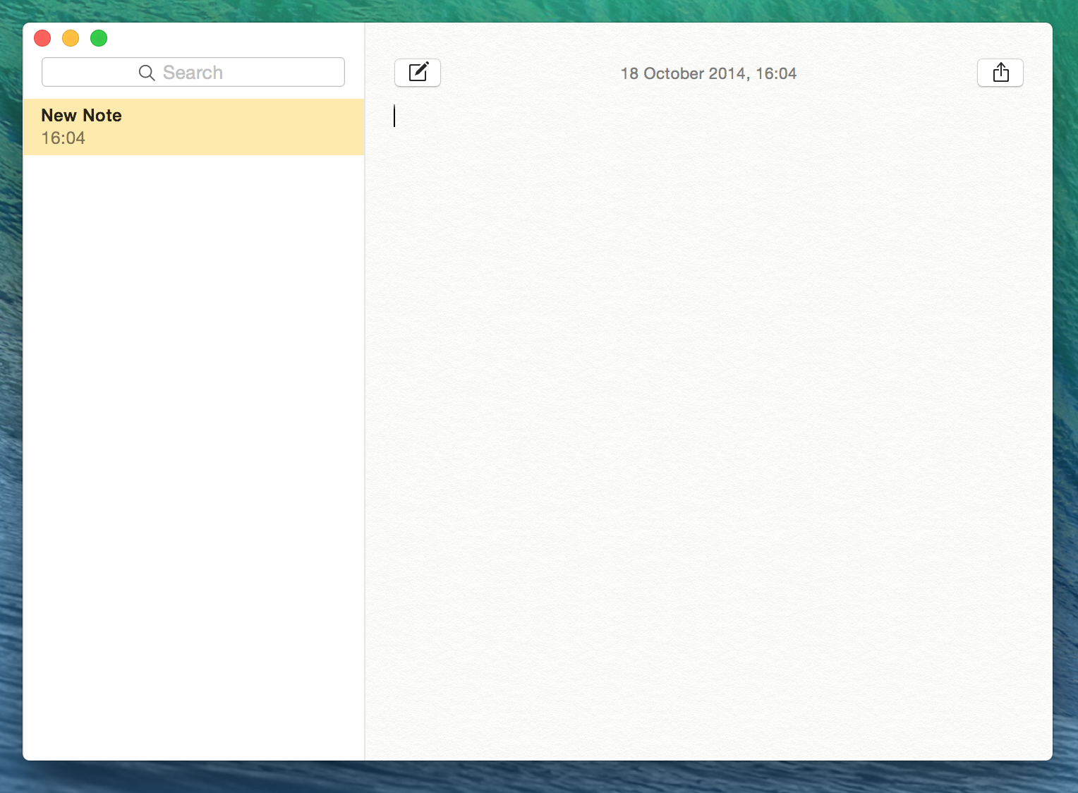
The notes app is designed to look like a notepad, edited with digital things such as the time and date of the note.

Possibly the best example of this is the calculator app on the computers. It is designed to look real even to the point of even the bevel on the buttons and the shadow it leaves behind it on the screen.
Even the Itunes symbol, which is no longer a CD, is made to look 3D by the use of colour, shadow and lighting. It's pretty unnecessary apart from continuity.
Flat design is the alternative to skeuomorphic design. It generally looks a lot cleaner and more modern the skeuomorphic design, although I often find it's difficult to make it look really nice.
Apple have recently made their designs a lot flatter, moving away from their traditional skeuomorphic designs. The most obvious example of this is the notes app. It looks a lot cleaner, and I think a lot nicer.
It's also clear in the calculator app, although I preferred it the way it was. Whilst it does look a lot more modern, I really hate the colours in it, and feel like the skeuomorphic version of it was just a lot nicer, which just shows how flat design can be difficult to make work well.
I think all things considered, the newer fat design looks nicer, and is definitely more appropriate for Apple as their brand is clean and modern. The dock looks much more like Apple where flat design is more incorporated into it.
Conclusion
I will definitely by focussing more on flat design than skeuomorphic due to how it looks cleaner, and cleanliness is something that needs to be associated with food and cooking.
I also think that successful websites have to be up-to-date in how they look, which is why big web-based companies such as Facebook and Apple regularly update their sites, and so it seems that flat design is the way to go.


No comments:
Post a Comment