OUGD504 - A Brief History Of.. Website - Web Grid Analysis
My website will be a strange sort of mixture between informative and entertaining in a sort of tongue-in-cheek sort of way. I've looked at the grid layouts for the Vanish Tip Exchange, a site which allows users to post tips on how to use Vanish to get rid of certain stains, and CompareTheMeerkat.com, a tongue in cheek site set up for an advertising campaign.

The lines show quite a focus on the middle 50-60% of the screen, and I imagine this is because having the background that extends past this section allows the site to be viewed in the same way on different devices with different screen size ratios.
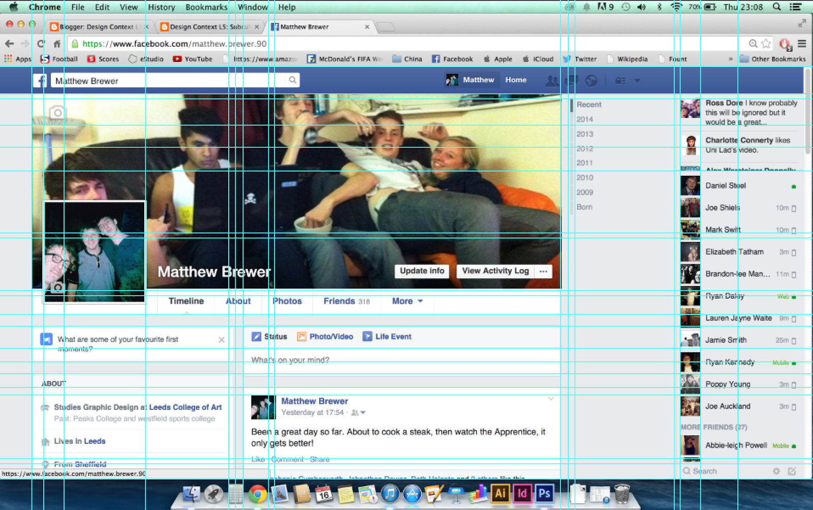
Social media websites such as Facebook at Twitter seemingly have fairly simple layouts, and using a layout similar to a social media site might encourage interaction from people as well as making them feel more comfortable whilst interacting, so I looked at the grid layouts of Facebook and Twitter.
In contrast to the previous two websites, social media sites use the whole width of the page to maximise what they can do. They can do this because on different sized screens such as phones and tablets, they will have apps for their sites with their own layouts.
In order to try and get a feel for the social media element in an appropriate grid layout for my site, I overlayed the two grids and simplified it for an initial suggestion of what my grid should look like.

 This is the sort of grid layout I will look to use. After I've looked into screen size ratios and considered what needs to go onto my website I'll adapt this further to make it more suitable.


No comments:
Post a Comment