Showing posts with label Brief 2 - Logostarter. Show all posts

Sunday, 12 October 2014

OUGD504 - Logostarter - Evaluation

General Comments

This was the first branding/logo project I've done since my AS year at college, and although I would never want to compare my work from then to my work from now, I feel that the experience, even from that long ago, has helped me in this project. By this I mean right from the very beginning I considered things like how the logo would look at different sizes, and how the logo could work as either just text or just image. This combined with the considerations that I have become important whilst studying at university such as printing limitations, printing costs, and ease of reproduction have resulted in me completing the task to what I feel was a fairly professional standard. In the evaluation of my last project I mentioned correctly using different software together, and I feel like this project has built on that even further by adding Illustrator to Photoshop and InDesign, which I’m pleased about.

Successes

I feel like my research for this project was pretty spot on in that it all ended up having some sort of influence on my outcome, and I think this is reflected in my outcome when cross referenced with the research I did. By this I mean that I established what sort of typeface to use, use of colour, and general feel of the overall design.

Given the nature of the product I was designing for, I feel I did well to avoid potentially obvious and very much negative connotations of drink driving, which was something I highlighted early on in this project as a potential stumbling block. Instead of this, I think the logo I created has a pretty strong emphasis on motion and movement, and the references to alcohol within there are quite subtle, and very immediately avoidable when placed out of context. This is important as there are numerous examples of logos that provide all sorts of the wrong connotations and suggest the wrong sort of thing whilst taken out of context.

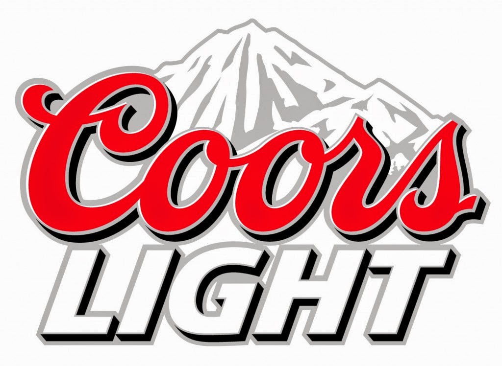
Whilst I was developing the logo I was experimenting with the use of colour, and was contemplating using grey and blue to suggest refreshment like in the Coors Light logo. I spent about 3 hours doing this, and the outcome of that, whilst justifiable, threw into question its ease of reproduction, it’s printing cost, printing limitations, as how it would look at different sizes. Given that I spent so long looking at colour, it’d have been easy for me to stick with the grey and blue, and to be honest, it’s something I probably would’ve done this time last year. So on a personal level I feel like the biggest success of this project was to objectively assess and make logical considerations on my own work, which has been a problem for me in the past.

Changes

I often feel like I follow a pretty rigid process when working, and so I quite often say that I wouldn’t really have done anything differently in retrospect. This project was different though, starting from my choice of project. When I first saw the Kreweser I thought, “this is perfect for me” and took it from there, but what I didn’t consider was how the problems that the company has when presenting itself severely limit the amount of options for a logo and branding.

Building on this, I regret not experimenting with abstract styles of logo’s, as this would’ve avoided the limitations of the products branding, as well as potentially having a very modern and trend based logo that would’ve worked in the sense that it attracted a modern audience.

Going Forward


I think that the main thing I’ve taken from this project is not to write off abstract design immediately, which is something I’ve done in the past as I’ve been under the impressions “anyone could do that, what does it even mean”. Whilst this viewpoint isn’t likely to change any time soon, I think I definitely have a new found appreciation for the occasional use for that sort of design.

Saturday, 11 October 2014

OUGD504 - Logostarter - Logo Contexts

The images below show the logotype could be used on the product itself to increase brand awareness.


The full logo, the logotype, and the symbol could be produced as vinyl stickers for people to plaster all over the place. The images show how a sticker sheet could look and how a vinyl sticker could look on a laptop. Personally I feel that the full logo doesn't look as nice as the two aspects of it separately.


A fairly hipster thing going on at the moment is sticking a load of badges into your backpack. These images show how the symbol would look as a badge and how the badge fits in this context


OUGD504 - Study Task 4 - Branding Proposal

Given that the Kreweser is currently a relatively unknown brand, I would suggest that the product itself should be branded with the logotype on the side of the fridge compartment, it strikes me as a bit odd that a product wouldn’t advertise itself, especially at such lesser-known stage of the brands existence. The symbol should then be used on the back, as this way you can make the most efficient use of space on the product itself.

From here I would suggest that the website should be changed, as it doesn’t reflect at all what the target market would want from a product. I would suggest using a much smaller video as currently it’s pretty unmanageable due to how huge it is. I’d also make the “As Seen On” section much smaller, as the brand should be presented as something that is strong enough to stand by itself without needing any support. The website should be more like the Kickstarter page, which uses images of young women on the product over and over again in order to try and sell it. There is none of this on the website, and I think it would be beneficial to have this sort of thing there, if for no other reason as it gives the website some sort of context as to the age of the target market, whereas currently it looks somewhat like the website for a brand of cleaning products.

Social media could be important to the Kreweser brand, as it is something that it’s target market is comfortable with. The Kreweser is very much an impulse buy, and by using advertising on things such as Twitter and Facebook you are putting the name and the brand subconsciously into the minds of the target market so that if the situation arises where someone would be in a position to buy it, the fact that they have some recognition of the brand is going to give them more trust in it. Twitter could be used more actively as a place to try and raise awareness of the product through the use of posting photos to college student-related pages and offering discounts and running competitions for those who retweet. I think this would definitely be a viable strategy given my own initial reaction to the product, which was something along the lines of, “oh my god, this is the best thing ever”.

Building the brand through associations with other strong brands is also something that I’d look into. Potentially producing limited edition models with companies such as Chrysler and Chevrolet would build add a lot of prestige to the product. Obviously this would be very dependant on the mentioned companies, but I think the idea could easily be sold to them as a way of connecting with younger potential car buyers, and the idea could be mutually beneficial.

I would target the advertising at areas saturation with young people such as colleges, and produce leaflets and flyers to leave in areas that are part of student life in America such as sports facilities and libraries. Student fairs would also be a good opportunity to showpiece the brand through the use of merchandising such as stickers and badges etc. 

All text used should be in a sans serif and be using a less recognisable typeface than something like Helvetica, as the brand needs to come across as somewhat edgy. I would suggest Gotham, as it’s associations with the Obama campaign make it a very American font, and this reflects the patriotism that is generally felt by the American people.


I would suggest that the main logo not be used at a height of less then 30mm, as at any smaller size the detail starts to become less noticeable. The logotype shouldn’t be used at a height of less than 10mm because at that point it starts losing its blackness. It should be used only in horizontal spaces. The symbol should only be used in situations where either the logotype or a photo of the product is present for purposes of association. It shouldn’t be used at a height any larger than 30mm because at that point you may as well be using the logo. The exceptions to this could be on merchandise where a more circular layout would be more preferable, such as for badges or stickers. It shouldn’t be used at a height of less than 20mm because at this point it starts losing the points around the edge. Again, the exception to this would be on merchandise, for example on the end of pens or pencils.

Thursday, 9 October 2014

OUGD504 - Logostarter - Development Process and Design Choices

I started off with just the word Kreweser in the font American Captain, which is a very similar font to the one used in Marvel's film advertising for Captain America, a stereotypically American film, as well as being a similar style of font used in the Hummer and Dodge, two American car brands that the demographic of the Kreweser would stereotypically aspire to own. The use of full capitals suggests power and importance, which are things that potential buyers would want to associate themselves with.


I then used the curve in the Budweiser beer bottle to adapt the K to give it a bit more personality and individualism.


I decided I wanted to use the wheel of the Kreweser inside a bottle top for the symbol in the logo, as that brings together both the drinking and refreshment aspect of the product and the movement aspect. This gave me the symbol for the logo.


Following on from the crit, I decided to change the shape of the counter in the final R into a bottle opener, and having the bottle on the left and the opener on the right suggests that the product has something to do with beer even without a symbol.


Combining these together gave me the first suggestion of a full logo.


I then took this into photoshop and tried to give make it look like it was made from some sort of cold metallic material, similar to the Coors cans, as this reflects the refreshment the product provides. However, after spending a considerable amount of time on this, the best I managed is shown below, which I wasn't overly happy with as I think it looks a bit juvenile.


It was confirmed to me that this was bad when I quickly imposed it onto the Kreweser itself to see how it sat with the product in a real world situation. The fairly complex effects just don't work at a small size and the colours don't make an impact. It just looks terrible.


Seeing it in this context suggested to me that I should return to black and white and try something else to give it a little edge. In order to try and suggest movement in the type I added a skew to the lettering, and I think it gives it the edge it needs. I also thought that the symbol was quite overpowering in terms of trying to read the text, so I made it smaller. I played around with this a bit and found that at twice the height of the text how it looks its most balanced.


I imposed this onto to product. This time I separated the symbol from the text though to see show how they'd work in different circumstances, and I'm much happier with this one.


I think that having the logo this way has the right sort of mix between appropriateness for the project, social responsibility by now basing it around binge drinking, and a sense of American design that relates to the target market.

OUGD504 - Logostarter - Crit

I went into the crit today with a rough sketch of what I was going to aim for with my logo and the beginning of some digital development on the type. I also explained what the project was, what sort of branding and logo it needs, and what research I've done.


The general response was that there isn't really any obvious solutions to this brief, and so it should just be a case of continuing to work on the design until it was fitting for it's purpose really.

However, a couple of points did come up. Someone said that I should consider the idea of movement in the imagery, and someone else suggested using the shape of a bottle opener in the type along with the beer bottle.

Whilst this wasn't amazingly useful, it was encouraging to hear that there were no objections to my plans.

OUGD504 - Logostarter - American Youth Music Album Covers

1950's-60's

After the second world war American youth culture took off with the rise of rock and roll with Elvis and from there onwards the diversity of the music scene at the time took off with the rise to prominence of R&B and Motown lead by Ray Charles and followed on by Marvin Gaye, James Brown and Stevie Wonder etc. 

Elvis Presley

The Elvis albums tended to be really colourful and fun, and I suppose that reflected the change of the attitude towards different styles of music at the time. There was nothing pretentious or political about it, just fun. 


Ray Charles

The Ray Charles covers were also colourful, although they look a lot more reminiscent of modern day graphic design to me given the seemingly infinite more attention that was paid to the lettering compared to a lot of the Elvis colours.


James Brown

It looks to me that a lot of the James Brown covers took a more artistic approach to the covers. What I do find odd is how the lettering was clearly considered important in the Try Me cover, but then a lot less so in the Please Please Please cover. There's not much consistency amongst his covers.


Stevie Wonder

You can tell the Ray Charles had an influence on Stevie Wonder through the album covers. They tended to have the same format of some plain lettering, a bit of colour, and a photo of himself on them without much artist deviation.


Marvin Gaye

Generally the Marvin Gaye covers were just messy and without consistency, although really, out of the few artists that I've looked at, his were the most inventive with the lettering, and that link may be something that still exists today.


2000 Onwards

Youth culture today is very much driven by the music industry and the influences it provides. Clearly the music industry is huge and has expanded massively since the 50's as it's been made more accessible to everyday people through technology becoming cheaper and talent shows such as the X Factor. Despite this, general mainstream music in youth culture has remained in similar genre groups as in the 50's and 60's, the main change is that because of the growth of the industry, each genre encompasses more different variations.

Jay-Z

Jay-Z's album covers illustrate how music today is no longer really about branding and visuals and more about the music itself due to it's generally digital nature. There's generally very little continuity throughout his album covers, and these two covers from the Blueprint and the Blueprint demonstrate 3 this well. Ironically enough, I've not shown the artwork from the Blueprint 2 for reasons of continuity.


Red Hot Chilli Peppers

These two album covers demonstrate how art has found its way into album covers, in these through nudity and obscurity and like the Jay-Z covers, there's no sort of continuity.


Eminem

I found that Eminem's album covers are some of the very few that reflect any sort of emotion. I think they reflect the emotion because the plain typography doesn't interfere with the imagery used.


Green Day

Green Day's covers tend to feature images of something that is or implies destruction or rebellion. This fits with the sort of music they play rather than being something seemingly arbitrary.


Kanye West

Most Kanye West albums feature small text with some sort of memorable image, be it striking or just weird. Either way, you can tell the typography has been considered for each cover rather than designing a cover around a logo.


Conclusion

I think what this research has shown me more than anything is that when it comes to music, image doesn't really matter as much as it used to. People wouldn't tend to buy an album based on it's cover now because there's so much choice out there that they may as well buy something they know they'll like, although in the 50's and 60's this may not have been the case and so image was a lot more important and consistent.

This translates into branding quite well I think. For example, if you had two bottles of fizzy drinks to choose to buy from that cost the same price and one was Coca-Cola or 7Up or something like that, and the other was a brand you'd never heard of, no matter how well the other drink was branded, most people would go for the brand they recognise and trust anyway.

This relates specifically to Kreweser more specifically in a strange way. Given that there is no hypothetical Coca-Cola for Kreweser to compete with, Kreweser has nothing to compare itself to or aspire to, other than to become the Coca-Cola of it's future market. For that reason it's incredibly important that the logo design is sustainable, in this case more so than most.

Wednesday, 8 October 2014

OUGD504 - Logostarter - Segway

An existing problem that I can draw a few comparisons with the Kreweser is the Segway. Essentially the Segway and the Kreweser are both personal transport systems that aid you in specific tasks or scenarios. Whilst the Kreweser is very much for reasons of fun and enjoyment, the Segway is a lot more serious and is generally used for police use and law enforcement. 


The branding for the Segway is very plain and futuristic, as that was the vision the company had when they released the product. Obviously it's not worked out quite how they thought it would but their intentions are clear from the website and the logo, which is important.


The logo in particular reflects the product through it's simplicity and neutrality. The logotype they us has a futuristic feel to it, and the clear action of the image in a neutral inoffensive colour won't isolate any potential demographic of customer.

I suppose really this is the opposite of what the branding for the Kreweser should be like. The Kreweser has a very specific target market, and needs to market itself as something that is happening at the moment and is a cool thing to own rather than something will be a necessity, as that would take the sense of fun out of the project.

OUGD504 - Logostarter - Successful and Unsuccessful Logos

I had a look at some successful and unsuccessful existing logos to try and established some ideas of what makes a good or bad logo.

The below logos are all successful in my opinion. 


Northwest Airlines logo looks simple at first, but when you look closer, the N on the left combines with the little triangle and the negative space to make a W as well (NorthWest). Also, the arrow is pointing to the top right of a circle, implying North West on a compass.


Amazon has an arrow that resembles a smile on it, but it also starts at the "a" and very specifically finishes at the "z", with the arrow showing the idea that they sell everything from A to Z.


The shapes which make up the letters in the word Vaio are shaped like the symbols for analog and digital, which is relevant given that it's a TV company. That said, I imagine they probably came up with the logo before the name in this case, it just seems to perfect.


The Baskin Robins and FedEx logos use the positioning of their letters to create a hidden message. The angle and spacing between the "B" and "R" create the number 31, which is the number of flavours they produce. This is highlighted by using a changing its colour. The FedEx logo has no spacing between the letters, and has a very specific x-height in order to create an arrow between the "E" and "x" which suggests something getting from somewhere to somewhere else. 

The next 3 images I found are bad logos. They aren't explained because it's obvious why they're bad.


Conclusion

Good logos are simple, often with a hidden meaning behind them, and generally they're text based. None of them have any intricacies so they can be repeated at numerous sizes, and they're no more than two colours, with the colour being in blocks.

OUGD504 - Logostarter - American Alcohol Brands

Coors Light

The branding behind Coors Light is the idea of refreshment above all else, as shown in their very unique adverts. The mountainous imagery works really well for this and the silver and blue reflect this well due to their connotations as cold colours. But then they go and use red lettering as well, which is strange. I appreciate that it's an American company, and that American pride dictates that you must use red, white and blue wherever humanly possible, but I really feel that if they'd have stuck to the cold colours the bottle and logo would work a lot better.


Budweiser

In a very American way, Budweiser advertises in a way that very much reflects the country's obsession with superiority, and the tag line, "The king of beers" sums it up pretty concisely. The use of a rich red in the logo gives it a sense of self importance with the hints of gold and the addition of the gold crown suggesting royalty and class. This class is backed up by a bow tie shaped block of colour and an easily readable script font. I think they've done an excellent job of the logo and branding in general.


Hornsby's

Hornsby cider is a brand who's branding reflects the history of the company. The founder of the company, George Hornsby moved from Britain to America and missed British cider, so he started brewing his own. Hornsby was a traveller, and the story goes that when he was travelling in Africa he encountered a black rhino and was inspired by it's fearlessness and strength, and that this encounter was an inspiration to his future exploits. I find this pretty certain to be fictitious given the mans surname though.  As another American brand it's not surprising that the logo revolves around the colours red, white and blue. I also feel that the logo has quite a cultural feel to it, it's the sort of drink that I can envisage being drunk in an American Diner or at a frat party. I think the emphasis of the design on American culture is very appropriate given the story of the founder. The fact that he chose to live in America of all places suggests that the culture was important to him. I think this is a pretty ok logo in all honesty, nothing special, but I think it works really well in conjunction with the rest of the branding and the context of the product.


Jack Daniels

The black label of Jack Daniels is pretty iconic worldwide in terms of food and drink branding. It was first introduced in 1908 to mark the death of Jack Daniel, and this was when the brand really started to take off, although it was being distilled since 1866 in the Jack Daniel distillery, which is now the oldest registered distillery in America. Because the brand has such a long history, the old style poster-like label is appropriate and very much gives the bottle a historic feel, even if you knew nothing of the companies history. The logo itself works really well. The old fashioned style lettering works really well with the shape of the logo, which makes it look somewhat like a stamped seal that you'd find on old letters. Keeping the logo black and white keeps the old fashioned traditional feel. I think like Coca-Cola and McDonalds, Jack Daniel's is a very sustainable brand.