Showing posts with label Responsive Brief 2 - YCN - J2O. Show all posts

Tuesday, 17 March 2015

OUGD503 - YCN - J2O - Final Packaging

I mocked-up the packaging without the green because it looks better, and there's still an argument to be made that the green is still included via the bottle cap.


Thursday, 18 December 2014

OUGD503 - YCN - J2O - Evaluation

General Comments

After the Royal Mint brief, I wanted to do a more corporate brief as I feel like this module offers me the chance to have a go and a variety of different briefs. I didn't want to pick a dull company like Santander, and so J2O seemed like the obvious choice because of the bright colours.

Successes

I think the main success in this brief was that my research was pretty in-depth, by which I mean I think I gained quite a good understanding of the sort of thing J2O were looking for.
I also think that I achieved this, albeit by going against one of the briefs key requirements which was including the green. Weather this can be considered a success is debatable for this reason. That said, it is still debatable that the green is still included as I didn't change the bottle top, which is green.

Changes

I very much went into this brief with the attitude that the green was horrible and I was going go change it. This attitude definitely affected my mindset throughout the brief and made me approach it in a pretty negative way.

I took on this brief quite hastily after getting a bit worried about the considerable time period between the completion of the Royal Mint brief and the start of the next brief I was going to do. I quite heavily underestimated the size of this brief at this point and should probably have taken on a different brief instead.

Going Forward

Whilst I'm happy with how my outcome looks without the green, I'm not happy with how it looks with it, but feel I've reached a point where this brief is reaching a dead end for me. For this reason I won't be spending the extra time to prepare this project for entry as I don't feel there's any possibility of winning and the time could be better spent elsewhere. I do intend to create physical mock-ups of my design for my own satisfaction, my Responsive submission, and for my blog, as I feel that I've spent too much time on this brief to justify not having an actual final outcome.

This brief has taught me to not jump in to making rash decisions or making big decisions too quickly. I'm disappointed that I didn't enjoy this brief more, and it's been quite eye-opening as to how difficult being a designer can be if you're not enjoying the work. This can only be gained through experience, and I'm glad I've found out so soon.

Monday, 15 December 2014

OUGD503 - YCN - J2O - 4 Pack Packaging

Being happy with the bottle branding, I moved onto the 4 pack packaging. I started off on the front, and wanted it to be simple like the branding for Old Mout Cider, which I believe has the same sort of audience that J2O is aiming at.


I started off by making some vectors of the 4 fruits that are in the drinks, as it said in the considerations that depicting fruit has increased sales in the past. These are what I produced. I only used the two colours from the swatches for both the mango and the passion fruit on this post, and colours that were 50% tints of them for continuity purposes.


I then combined these with the colour scheme of the text from the bottle neck as well as my new logos for each of the drinks, and made a very simple front design. Having seen how the fold in the front affects how it looks on display in the shop in this post I thought it was important that all text should be below the fold to make it clearer, especially given that some of it will be in yellow. I used the big space above the fold for the logo because of this, which then left a natural gap for the images to fill.


The lack of information on the front meant that the back was going to be quite text-heavy. After some experimentation I managed to get all the text that was on the original packaging, as well as some that was on the original bottle neck, to fit in a column with a hierarchy that fitted the following order;
  1. Logo
  2. Images
  3. Nutritional Information
  4. Other Flavours
  5. Contact Details
I feel that the layout works well because of this, and am confident that this is the order of importance that the content should be listed in. For the nutritional information I used the same shape and format that I did with the calories on the bottle neck, but colour coded them in a traffic light system to show what was good, average and bad. The colours for these were the yellow and red that were specific to each flavour, and the green is the green that J2O is synonymous with, which further backs up the positive connotations of the brand.


After I placed the two in the template, I added the logo into the middle, slightly smaller, and made sure that it was facing the front of the packaging, as it is important to note that my packaging only works with the front facing forward, whereas the old packaging didn't. I also made it slightly smaller to make it look in proportion to the space it is in. This is the final result.

I feel like they definitely show my initial influences, which is always a good thing. The two flavours have only slight differences between the two of them, similar to Kopparberg. The style of the images has a quirky fun feel like Brewdog, but the content is clear and appropriate like Innocent. 


Following on from what I said in my last post, this is how they look without the green. While the hierarchy loses a little bit because of the loss of the green, I think from a wider design point of view it is justified because of how much simpler it looks.

I personally feel that without the green the influences show even more as it looks a lot slicker and has a more grown up feel to it like Shloer and Appletiser. I feel that these are two brands which have got their branding spot on for the market J2O are trying to get into, and so this is a very important factor.


Sunday, 14 December 2014

OUGD503 - YCN - J2O - Second Attempt

Having read the brief more thoroughly and taken into account their considerations a bit more, I changed my designs slightly. 

By changing the colour of the 2 in the logo to the green, I've killed two birds with one stone. It allows me to use the green in "some capacity", and by using the traditional J2O colour for the number two, it highlights that "J2O is a blend of two fruits". I wanted to keep the use of the green pretty minimal because I don't like it. On the label for the bottles neck I made the names of the fruits green as well to further back up these points. I removed the red and yellow borders because they were a bit too geometric, as well as the bits that went either side of the text because they weren't really visible from the front of the bottle and were a bit unnecessary. I'm a lot happier with it now as it fits the brief a lot better.


I duplicated these and changed them to fit the Orange and Passion Fruit colour scheme as well, as shown below.


Despite these changes, I still feel a bit concerned about the green though, and think that my designs look a lot better without it, as shown below.


I think the best way to combat this is to show how the final product will look both with and without the green when I submit my work, as this will show both what I think works well, as well showing that I've considered the brief.

Personally I don't understand why they want the green. They say "The J2O brand is synonymous with the colour green", and they're wanting to re-invent themselves, so if anything I'd have thought they'd have wanted to stay away from the colour green. I personally feel that the shape of their logo is enough of a symbol for J2O because of how recognisable it is, and because of this I don't think their necessarily has to be a synonymous colour for the brand as well.

Thursday, 4 December 2014

OUGD503 - Progress Crit

Today we had a crit on our progress in Responsive. It worked out pretty well for me because it alerted me to few things that I had overlooked.

J2O Brief

Helen showed her work on the J2O brief, and mentioned that they wanted to keep their green colour as an aspect of the brand, something I had clearly missed. I checked the brief and it states 

"The J2O brand is synonymous with the colour green that is on all of our packaging. Please make sure that it features in some capacity when coming up with design ideas."

It's been a while since I looked at the brief, and it also states:

"In the past, the depiction of fruit on our packaging has increased taste credentials so although it’s not compulsory to do so, bear this in mind when coming up with design ideas."

These are two considerations that I will take forward with the brief.

Roses Student Awards

Melissa mentioned that she was going to enter a Roses Student Awards brief, which had an entry cost of £15. I'd completely forgotten about entry costs, and had planned on doing two of their breifs, "State of Mind" and "Spread the Word". It seemed a bit unnecessary to pay £15 twice, so it's made me re-think this, and I'm only going to be doing the "Spread the Word" brief.

Pantone

I spoke about how someone had told me about the Pantone brief. I didn't read it initially having automatically wrote it off as being probably boring. I spoke about how where I live has an odd name (Halfway), and how that gives me quite a lot of scope to do something quite interesting with the brief. This was met with quite heavy approval, so this is something I'll look into further.

Wednesday, 26 November 2014

OUGD503 - YCN - J2O - My First Attempt

This is my first attempt at the re-designing of the J2O bottle. I think it's a lot more modern compared to the original one. In general the more minimal design lets your eye focus more on the colour of the drink, which is one thing that might attract you to buy it, but at the same time, the large amount of white on the bottle will stand out against the darker colours of beer bottles and the luminous colours of alchopops such as WKD that J2O would be competing for visual attention with in the mini fridge behind a bar. 
Despite the general lack of colour on the labels, it still retains the fun characteristic that Britvic were after through the shapes and offsets in the logo, it's just been railed in a bit to make it less childish. It's more like organised fun now as opposed to spontaneous fun, which I think would reflect a characteristic in the stereotypical drinker of J2O according to their wording in the brief.
I'm not as happy with the neck design as I am with the other bit. Seeing it in context highlights some of the problems with designing something for 3D on a computer, as you can't see how it's going to look wrapped around the bottle neck. I think the first thing that needs addressing is that the lines that create a border give of a feeling of restriction, which is the opposite to what it should be doing. As well as this, the type is too large and the yellow doesn't show up as well as text, so thing is something I'm going to have to re-assess in terms of hierarchy. Because the text is too large, you can barely see the splashed from a direct front on view, something which would make the brand seem more fun.


I'm very happy with the type hierarch of the small text. I managed to make it so it was all readable, the hierarchy is clear and it looks pretty discrete. I judged it pretty well so that where the overlapping section sits on top of the the black area, the gap between the texts looks like it could just be a new paragraph. The photograph doesn't show that because I only used white tack to temporarily stick the label to the bottle.


On a more general note, retrospectively I realise that the labels don't really clearly communicate the idea of two things being blended, which is something I need to take another look at when I'm making changes to the design. 

Monday, 24 November 2014

OUGD503 - YCN - J2O - Current Packaging

I went into Morrisons today to see how J2O was displayed in-store. This will help me assess how best to approach the re-brand in terms of what space is important and how best to make use of that space.


This was what I found. The first thing I want to mention is that Morrisons saw fit to put it on offer at the same time as Shloer, which is one of the drinks I identified that I want the re-brand to give off the same messages. Seeing it next to Shloer on the shelf makes me realise what Britvic meant in the brief about J2O being seen as cheap and chavvy. The Shloer bottles look a lot more refined than the J2O packaging. I think showing a bottle of J2O on the packaging gives the display a very geometric and structured look when displayed like this, and this goes against the fun natured brand that Britvic want. I also think that the gradient on the packaging is unnecessary, as it's not particularly meaningful, and when you combing this with the way that displaying them on the shelves gives them a slight shadow anyway.


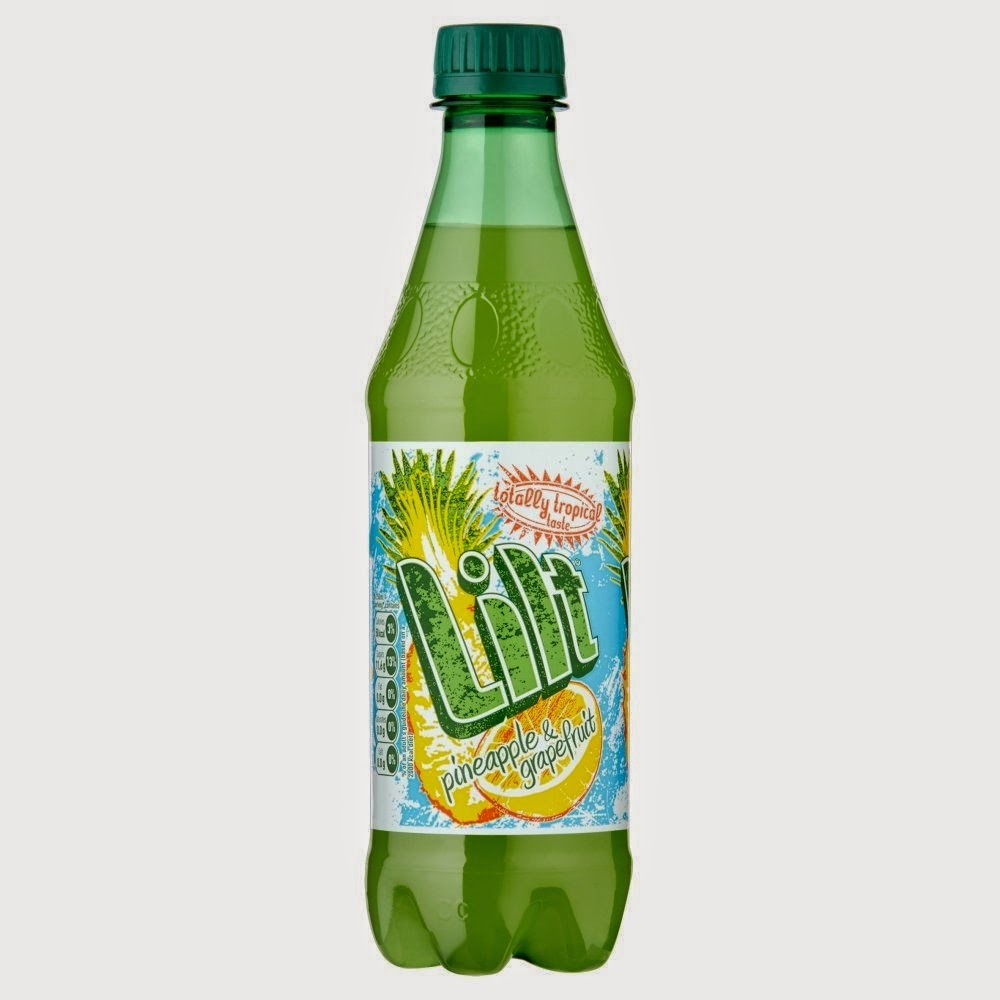
On top of this, I find it pretty uneccessary to show what the drink looks like given that the sides are open so the customer can see the colour of the drink anyway, which is inevitably not as bright or attractive as it is on the packaging, as shown below.


The packaging can be displayed either way round, which means that the bit on the top has no real purpose other than to make it look nice. But this bit again goes with the somewhat childish use of colour, it reminds me somewhat of the twister ice cream (here), which is a very child targeted product.


One idea I do like is the use of thin lines of colour being used as decoration, as it's simple and quite subtle. I don't think they need to lead into a great big bulky central point like on the top of the packaging though, I think they're fine as they are, and need slight adjustments rather than being completely re-thought.
I notice that the picture of the bottle on the back is a lot fatter than the one on the front, and for seemingly no reason. This sort of inconsistency should be fairly easy to avoid. I also think the block of text is too blocky, and doesn't' compliment the curves of the bottle or the curves of the artwork very well. The whole thing doesn't seem to show very much consideration for spacing, and the packaging in general is very busy.

Wednesday, 19 November 2014

OUGD503 - YCN - J2O - Current Branding

I looked at the branding J2O already has as a brand to help me decide what sort of things my rebrand should communicate. 


This was the main image used on J2O's page on the Britvic web page. It is very much how I had imaged Britvic seeing their customers drinking J2O, very cosy, very comfortable, very politically correct, very inoffensive. If the design of the bottle is too "edgy", then it may deter a potential customer from buying it in this sort of friendly setting. I also notice that it shows other people drinking other drinks such as Becks and Pepsi, which suggests to me that Britvic aren't after a powerful, all-consuming brand such as Coco-Cola or arguably Carslberg, but more of a soft, almost submissive brand that's happy to make up part of the market and embrace its competition.


I also noticed that their logo changes from product to product, with the gradients changing inside the outline of the logo. This is something I find noteworthy, because it shows that Britvic have tried to use colour to differentiate between their products, and by using a gradient, they've incorporated the idea of blending.


Their bottle design is currently very garish because of how bright the colour of the drink itself is. This is obviously something that they want to display to try and make the drink itself look as attractive as possible. But I can see how their brand could be perceived as "cheap and chavvy" as stated in the brief. 


Similar to the bottle design, the 4 pack container also uses bright colours, but a lot more of it. This is the thing that I think needs the most working on out of the re-brand, but I feel like If I leave it until last then it will be a lot easier because I'll be able to make it consistent with the rest of the branding.

Using the idea of blending two fruits together, I decided to start off by seeing how the logo would look with just 2 flat colours. I chose to use flat colours because I feel like it shows more clearly the idea of 2 fruits rather than a gradient. I decided to delete the thinner lines that went around the edges, as I felt the more simplistic logo suited the more adult market that J2O are targeting.


This one shows how it looks using the red and yellow from the mango.


This one uses the maroon and yellow that I took from the passionfruit.


I think by having a darker colour in front of the lighter colour, the darker colour will stand out more when it's on the light coloured bottle, rather than having a light colour standing out from a dark colour standing out from a lighter colour, especially in the case of the passionfruit one, as there is potential for some complementary contrast

I think using these logos and colours are going to be a pretty good starting point for the rest of the rebrand.

Thursday, 13 November 2014

OUGD503 - YCN - J2O - Mangos and Passionfruit

Mangoes


Health Benefits

  • Decreased risk of colonic cancer
  • Improvement of the digestive system
  • Improvement in bone health
  • Quicker healing skin

Geography

A third of all mangoes are grown in India, but most of them are eaten in India, of all worldwide mango imports, only 1% come from India. China and Spain are the next largest growers of mangoes, but they're also commonly grown in most countries on or close to the equator such as Mexico, The Congo, and The Caribbean Islands.

Trivia

  • They are the most eaten fruit in the world. 
  • Mango trees have been known to be over 300 years old and still grow fruit.
  • It is said in Indian folklore that the Buddha meditated under a Mango tree.

Colours


Yellow #ffcc66 (255, 204, 102)
Red #cc3333 (204, 51, 51)
Green #669966 (102, 153, 102)

Passionfruit


Health Benefits

  • Reduces risk of high blood pressure
  • Improves digestive system
  • Improves immune system
  • Reduces symptoms of asthma
  • Helps sleep quality

Geography

Passionfruit naturally grows mainly in South American countries, Argentina, Brazil and Paraguay in particular. It's also grown commercially in India, New Zealand, The Caribbean, Mexico, warmer states in the USA, south and east Africa and Australia.

Trivia

  • The pulp is used more often in sauces and drinks than the fruit is eaten
  • It got its name from Spanish missionaries who thought the flower looked like various religious symbols

Colours


Maroon #993333 (153, 51, 51)
Yellow #ffcc00 (255, 204, 0)
Red #ef3c39 (239, 60, 57)

Monday, 10 November 2014

OUGD503 - YCN - J2O - Drinks Brands

The below paragraphs are taken from the J2O page on the YCN website. I've highlighted some key points in there that have helped me identify some drink brands to look at for inspiration and a starting point.

"As it stands, 40% of J2O consumption is by those aged 16 and under, but we’re wanting to change that. The current artwork design is not seen as ‘adult’ by many; the colours are viewed as bright and childish, and some consumers have even described it as cheap and ‘chavvy’. We’d therefore like you to redesign J2O to appeal to a target audience of 25-35-year-old men and women. The design should make them proud to be seen holding J2O in bars, restaurants and at home, and should bring through J2O’s expressive, unpretentious and playful personality."

"25–35-year-old men and women who love getting together with their friends and family, both in and out of home. They are grown up, confident, have an established social network, and feel relaxed with those around them. They don’t need alcohol to boost their confidence or lower their inhibitions and are happy to interchange between alcohol and soft drinks."

Lilt

The design of the Lilt bottle and Lilt's branding in general makes it very obvious that the drink is made from more than one fruit, it does this through quite a busy-looking label as well as bright colours. This however is one of the problems that Britvic have with their current design, their colours are perceived as childish, and the Lilt bottle has a very similar feel to it, although it is a lot more childish than the J2O bottle design. What I can take from this however is that a busier design suggests a more complex product, whereas a more minimal design, like the J2O bottle, suggests a simpler product.


Innocent

In my opinion, Innocent is the best-branded fruit juice company. It takes a very non-serious stand point on health, and I think people like that. This sort of fun and playful branding is how J2O want to approach their re-design. Using something quirky and somewhat childish like this wouldn't work though, as it's a completely different target market. I think something quirky would have to be a lot more playful for it to work for J2O.


Appletiser

Appletiser is more sophisticated and grown-up drink that contains fruit. Apparently it counts as one of your five a day, although I'm not sure just how healthy a option it is compared to eating an apple, or just who is drinking it for its health benefits. I feel like this somewhat simplistic bottle design is more appropriate for the target audience than something busy like Lilt, but then you get the problem of it not suggesting the use of more than one fruit like the Lilt bottle does. I think it'll be difficult to get this balance right.


Shloer

Shloer is very similar to Appletiser in terms of it's design, it's very simple and is based around the colour of the drink, which is one of things that helps sell food and drink as it appeals to one of your senses. The bottle shape being more reminiscent of a wine bottle than the Appletiser bottle automatically gives it a more grown-up sort of feel to it, but the shape of the bottle isn't something that I can change in the re-design, so this isn't something I can use to my advantage unfortunately.


Kopparberg

Kopparberg is one of the more high-end brands of cider, you certainly won't see any homeless person sat on a street corner with a 3L bottle of it. Given that Britvic identified that their target market aren't overly bothered about drinking an alcoholic drink because of it's alcohol content, and don't discriminate between alcoholic and non-alcoholic drinks, Kopparberg seems like an appropriate brand to look at. Their branding is very up-market, using reflective foil, dark colours and a traditional typographic style to create a very high-end brand, and this is reflected in the price of the product. This isn't a problem though, because generally the market that Kopparberg attracts has the disposable income to afford it, similar to the market for J2O. All this contributes to a product that people happily ascociate themselves with, which is what Britvic are after.


Brew Dog

Ale is traditionally an old mans drink, but Brew Dog are a company that tries to make it appeal to a younger market through edgy design and an edgy brand. This is the sort of expressive and playful design that I think Britvic are after, and the sort of market that their drinks attract are pretty much the same people that I'd imagine J2O would want to attract, especially the designated driver amongst the group.