1950's-60's
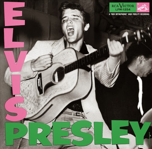
Elvis Presley
The Elvis albums tended to be really colourful and fun, and I suppose that reflected the change of the attitude towards different styles of music at the time. There was nothing pretentious or political about it, just fun.

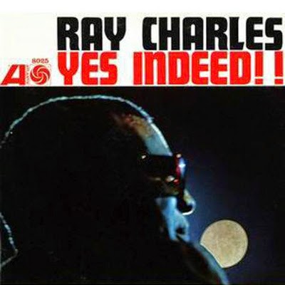
Ray Charles
The Ray Charles covers were also colourful, although they look a lot more reminiscent of modern day graphic design to me given the seemingly infinite more attention that was paid to the lettering compared to a lot of the Elvis colours.

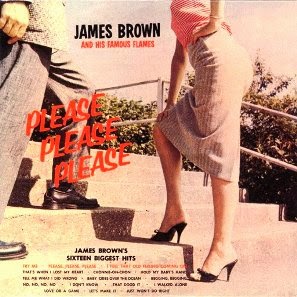
James Brown
It looks to me that a lot of the James Brown covers took a more artistic approach to the covers. What I do find odd is how the lettering was clearly considered important in the Try Me cover, but then a lot less so in the Please Please Please cover. There's not much consistency amongst his covers.

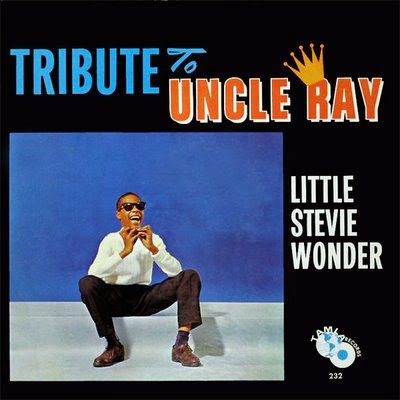
Stevie Wonder
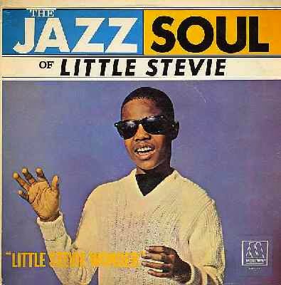
You can tell the Ray Charles had an influence on Stevie Wonder through the album covers. They tended to have the same format of some plain lettering, a bit of colour, and a photo of himself on them without much artist deviation.
Marvin Gaye
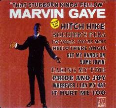
Generally the Marvin Gaye covers were just messy and without consistency, although really, out of the few artists that I've looked at, his were the most inventive with the lettering, and that link may be something that still exists today.

2000 Onwards
Youth culture today is very much driven by the music industry and the influences it provides. Clearly the music industry is huge and has expanded massively since the 50's as it's been made more accessible to everyday people through technology becoming cheaper and talent shows such as the X Factor. Despite this, general mainstream music in youth culture has remained in similar genre groups as in the 50's and 60's, the main change is that because of the growth of the industry, each genre encompasses more different variations.
Jay-Z
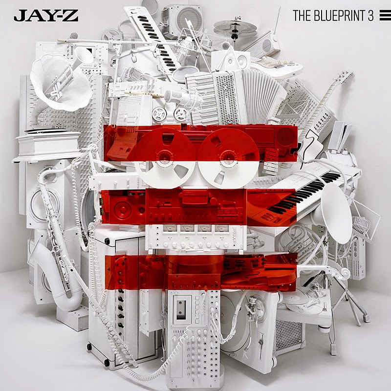
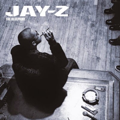
Jay-Z's album covers illustrate how music today is no longer really about branding and visuals and more about the music itself due to it's generally digital nature. There's generally very little continuity throughout his album covers, and these two covers from the Blueprint and the Blueprint demonstrate 3 this well. Ironically enough, I've not shown the artwork from the Blueprint 2 for reasons of continuity.
Red Hot Chilli Peppers
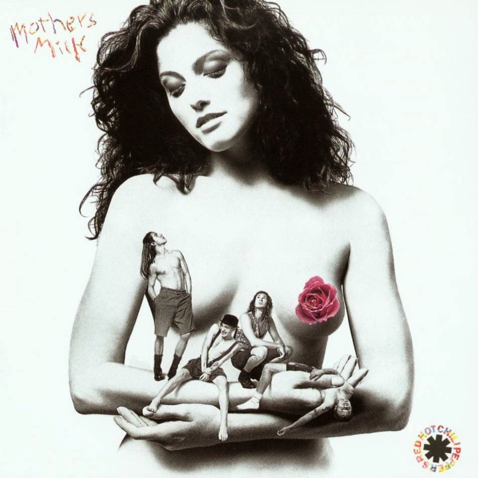
These two album covers demonstrate how art has found its way into album covers, in these through nudity and obscurity and like the Jay-Z covers, there's no sort of continuity.

Eminem
I found that Eminem's album covers are some of the very few that reflect any sort of emotion. I think they reflect the emotion because the plain typography doesn't interfere with the imagery used.


Green Day
Green Day's covers tend to feature images of something that is or implies destruction or rebellion. This fits with the sort of music they play rather than being something seemingly arbitrary.


Kanye West
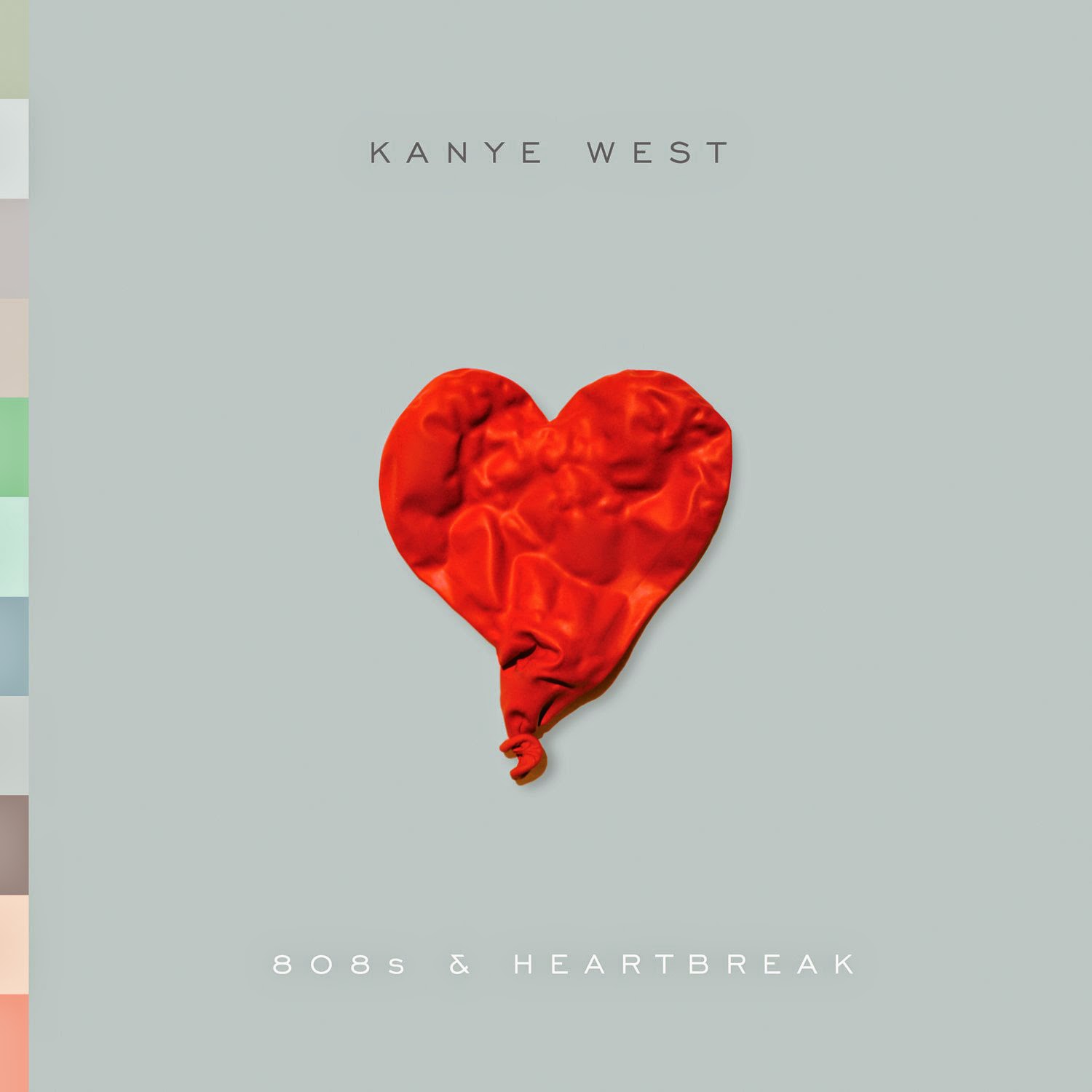
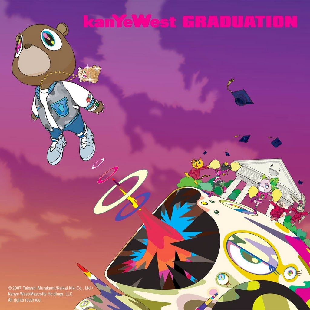
Most Kanye West albums feature small text with some sort of memorable image, be it striking or just weird. Either way, you can tell the typography has been considered for each cover rather than designing a cover around a logo.
Conclusion
I think what this research has shown me more than anything is that when it comes to music, image doesn't really matter as much as it used to. People wouldn't tend to buy an album based on it's cover now because there's so much choice out there that they may as well buy something they know they'll like, although in the 50's and 60's this may not have been the case and so image was a lot more important and consistent.
This translates into branding quite well I think. For example, if you had two bottles of fizzy drinks to choose to buy from that cost the same price and one was Coca-Cola or 7Up or something like that, and the other was a brand you'd never heard of, no matter how well the other drink was branded, most people would go for the brand they recognise and trust anyway.
This relates specifically to Kreweser more specifically in a strange way. Given that there is no hypothetical Coca-Cola for Kreweser to compete with, Kreweser has nothing to compare itself to or aspire to, other than to become the Coca-Cola of it's future market. For that reason it's incredibly important that the logo design is sustainable, in this case more so than most.
No comments:
Post a Comment