Font and Text Layout
I started at the top of the hierarchy and decided what font I should use for the front title. It was always going to be a sans serif font purely because I think sans serif fonts generally look a lot nicer than serifs.
I tried out a few different typefaces, but my favourite two were Futura and Marianina because of how the taller, thinner letterforms leant themselves to the thin shape of the leaflet. Impact, whilst having tall letters, I felt was too loud for something that was meant to reflect myself.
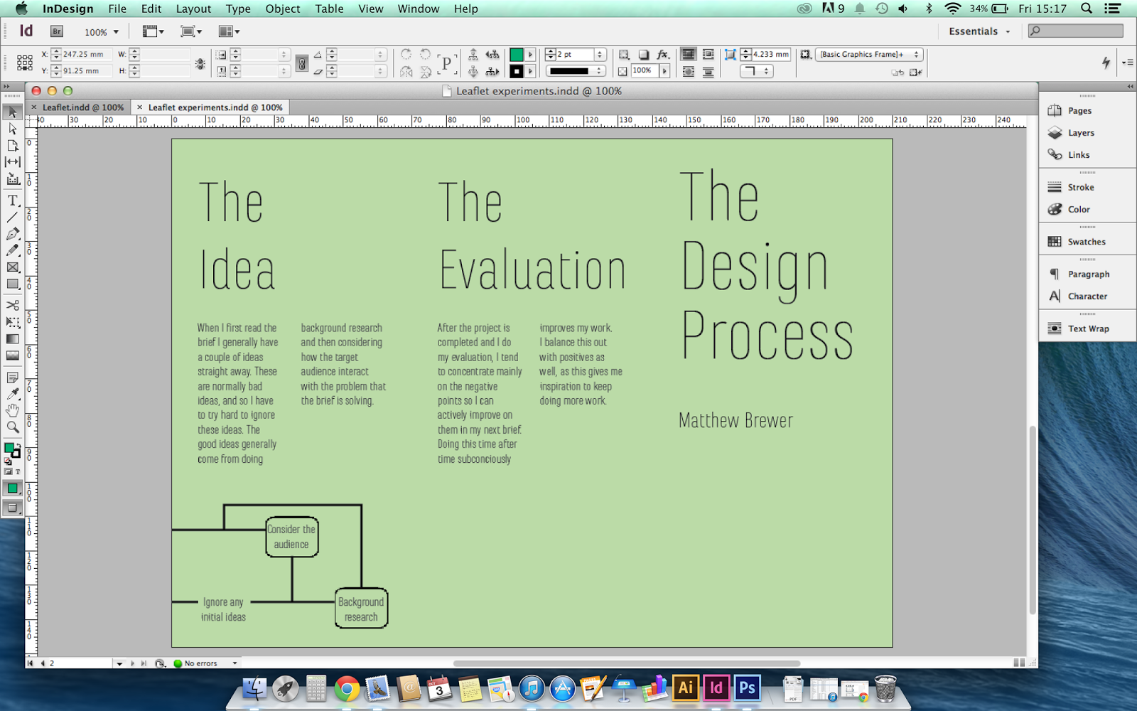
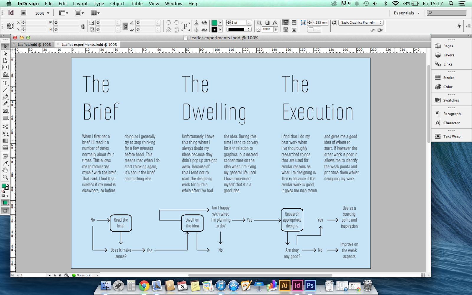
After experimenting further with both Futura and Marianina, I decided to use Marianina Thin, because the extra thinness of the letters emphasises the tallness and leant themselves to the shape of the booklet, particularly the upper case D and P. Not only this, but the relatively large spaces between the letters leant itself well to the idea of the sections of my process being separate. Further to this, the thinness allowed me to increase the point size which also makes slightly better use of the page space, it seems the like perfect choice.
Consistency was something I wanted to focus on in this brief, so I decided to use Marianina for the remainder of the titles, although made smaller to give them the impression of being encapsulated by the process as a whole.
I started off using Marianina regular for the body font, as I felt it to be the most legible at small sizes.
By using a two column text grid it keeps the idea of thinness, whereas I feel like one fat column would have clashed with the narrow letters.
However, when I viewed the page at actual size, the large x-height of the typeface lead to the body copy looking a lot darker than the titles, which is something that I think looks ugly.
So whilst keeping the view on actual size, I switched the font to the thin version, the same used as the titles. This solved the problem of the darkness, but made the body copy too small to be readable.
Increasing the point size from 9pt to 10pt solved this though.
Diagram
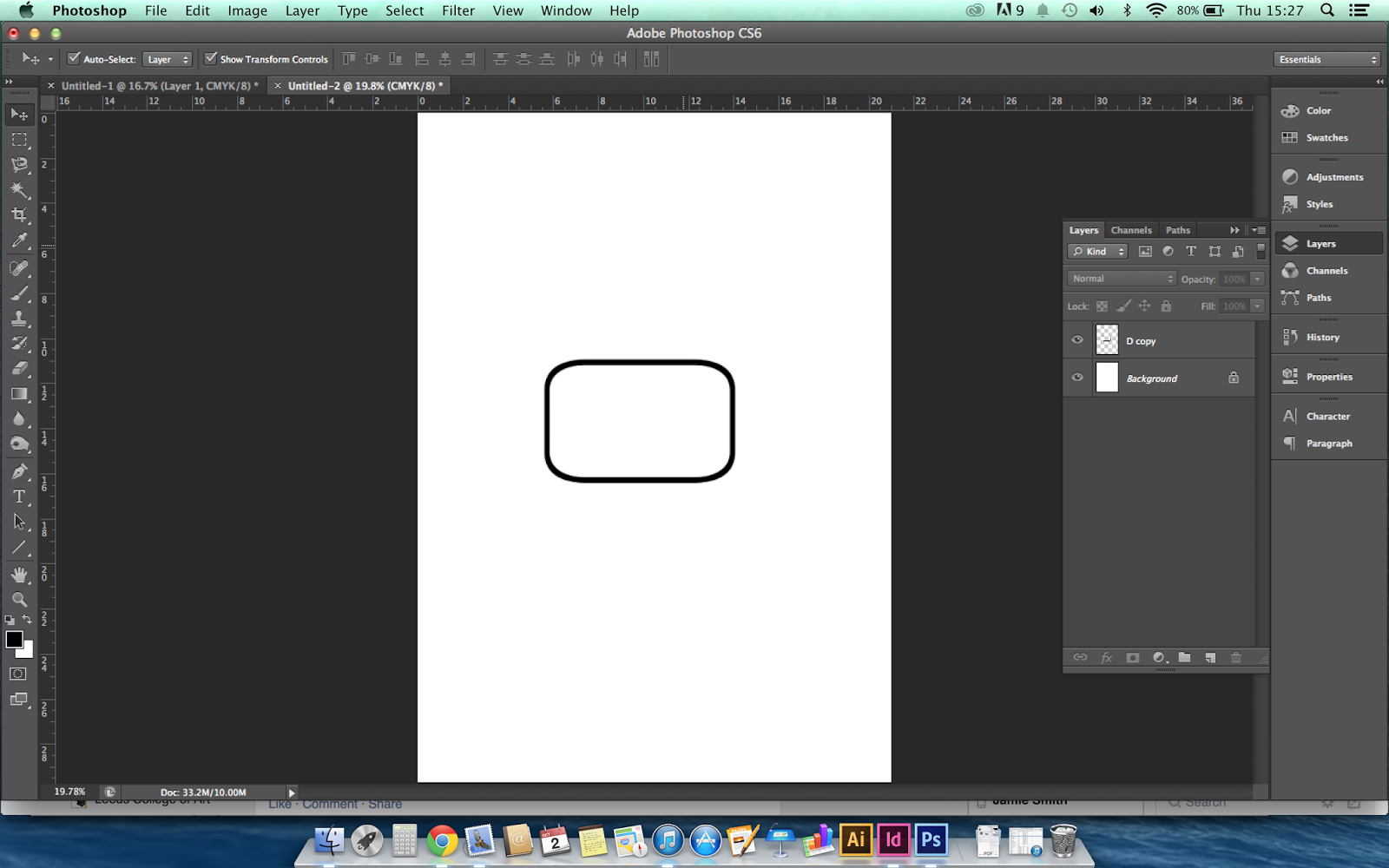
For the diagram I started out using the same point size text as in the body copy. I also used the capital D from the typeface to create the boxes from a flow chart sort of thing.

I found that my initial diagram was too busy and intrusive on the rest of the page layout, given the amount of white on the page due to the narrow typeface used.
I then altered it to make it less dark and intrusive by only using the borders on the section that specifically applies to the page it's on to make it clear how each page links to the diagram. I lowered the diagram to make it less intrusive on the rest of the page, added arrows to make clearer the direction of some of the information flow, and thinned the lines to decrease the darkness on the page.
Stock and Colour
I want to use a stock with a fairly rough texture because I would associate that with rigidity and sturdiness, which is something I also associate with my design process. It needs to be of a weight that allows the folds to stay folded to keep it tidy, but at the same time it needs to be thick enough to support itself when it stands up.
I wanted to use a slightly off white colour because I think using it in conjunction with just black ink reflects the simplicity of the process better than any other colour could do. Arguably this could look very dull due to the lack of colour and images though, so I will print it on a few different colours first to assess this. Personally I feel that either bright green or pale would be the most suitable, as bright green reflects positivity and motivation whilst a pale blue suggests calmness and organisation.


After experimenting with colour on the InDesign file I came to the conclusion that colour is needed on the background. I found the green much more appropriate than the blue as the blue looked quite maternal. This was because both colours needed to be quite lightly tinted in order to allow the text to be fully legible.
I very much doubt I'll be able to find textured stock of this sort of green colour, so I think I'll probably end up buying a plain coloured stock of the right weight and either dying it it or using watercolour paint to tint it before printing on it.


No comments:
Post a Comment