OUGD504 - Augmented Design - Menu Design
I looked at a few examples of menus online that each have their own selling points as a style of menu, and each have a different way of selling themselves. They have assured me that the format should be vertical, either in one or 2 columns.
Printing or etching on a different material can provide an ornate look, although the price or practicality of doing so isn't something I'm sure is appropriate for a large scale campaign.
Using a modern style of vector could help appeal to a more modern demographic of people, but doing so generally means you don't use a lot of colour, which might compromise the continuity of the campaign and the website.
Having a matte finish gives a print a more upmarket and high quality feel to it. Having a mid-toned background such as a silver/grey also allows you to use white ink to highlight certain areas, which isn't something you get using a white or light background.
Using a script font with lots of extravagant curves and little flicks with centre alignment is the stereotypical way that a menu looks. Lots of whitespace, a simple border, and a lack of images put the focus on the text.
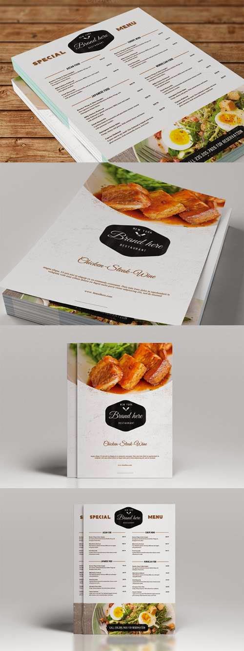 This menu uses full bleed images to sell their food visually rather than through the design of their menu. Because of this the rest of the menu is pretty minimal, with nothing that draws your attention away from the images other than the logo.


No comments:
Post a Comment