Olly Moss
The idea behind wanting to use some form of negative space came from the Star Wars posters by Olly Moss. They're examples of design that I've always looked up to both for the creativity behind them and the amount of patience that must've been required.
Olly Moss's website is here
Tang Yau Hoong
The use of negative space in these Land Rover adverts is prominent because of the high contrast between the foreground and background. This bold use of colour is fitting for Land Rover because it's a strong and bold product. This sort of design would also be fitting for the Sledgehammer artwork because of how bold it is, whilst at the same time looking very simple, which is what I'm aiming for.
Tang Yau Hoongs portfolio can be found here
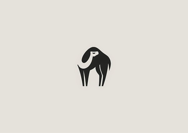
George Bokhua
This style of illustration is really appropriate because of its simplicity and high contrast. By leaving an opening in the black shapes the negative space is more prominent. The contrast between pointy corners and soft corners help the negative space stand out too.
George Bokhua's Behance page can be found here


No comments:
Post a Comment