During the production of the menu cards, there were quite a lot of vectors that were used that will be used again in the playing card design for consistency within the project.
After some experimentation with the same sort of layout as the recipe cards it became clear that this sort of look was immature and needed to be changed as it looks like a book cover.
Looking back at the websites that sold different packs of cards, the backs of cards are more decorative than anything else. The vectors of the raspberry, tomato, pear, peach, chilli and grapefruit were arranged to create this pattern as a staring point. The honey, maple syrup and bacon were left out because the size of the card lends itself to a 4 x 6 grid, and these 6 toppings have in common that they are food in their natural form, which kept a pretty obvious concept throughout them. Whilst, visually at least, this is an improvement, it no longer looks very pancake-specific, especially without my logotype. Whilst the style of it works with the menu and recipe cards, it wouldn't be fit for it's purpose without them putting it in context.
To get round this I made a vector of a pancake to use in combination with the others. This works excellently on a conceptual level, as it shows that the main thing is pancakes, but everything else can go with them, hinting at what the website is about.
After uploading this to the website, this is the preview that came up. It looks fit for purpose based on the other designs produced for this project and other examples of backs of playing cards.
Task 2 - Re-writing a post from OUGD504 where a design decision has been made on personal preference or aesthetic comparison.
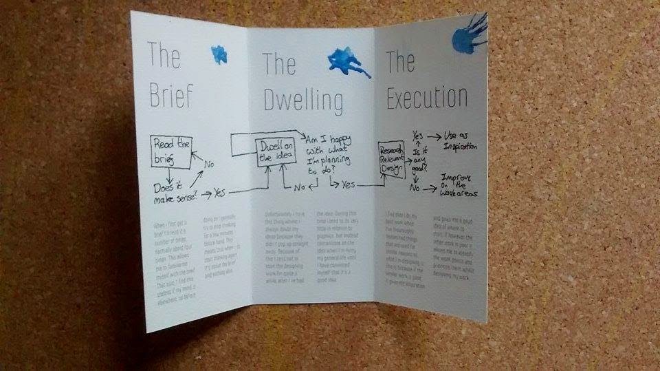
I painted over some of the rough printouts of my leaflet on the watercolour paper to assess how they effect the final product. I bought some watercolour paints yesterday to do a better and more consistent job this time round.
I started off with the green. I found that to get the colour the right sort of saturation that I wanted, the weight of the paint initially made the structural integrity of the paper go out of the window, it was curling everywhere.
On top of this, I found that thickness of the paint meant that some of the body copy was wiped off. Taking this into account I decided to use considerably thinner paint for the blue experiment.

The paint used for the blue experiment was a lot thinner than the green paint was to avoid taking the ink of the paper. Whilst this was successful, the paint was that watery that you could hardly notice the blue apart from in the fold creases.
As you can see, the paper naturally opened up after it had been painted whereas before the creases stayed pretty firmly shut.

I took a different approach and tried adding splatters of colour in the corner of each page, but I found this clashed pretty badly with the fairly minimal design across the other aspects of the leaflet, so in the end product I'm going to just stick with no colour. I also think that not using the blobs of colour is more contextually appropriate and doesn't communicate the right messgaes, given that the context of this brief is to explain myself, and this sort of randomness doesn't occur in my thought process very often.
Task 3 - Re-writing a post from OUGD504 where a series of small design decision have been made in a way that summarises the accumulation of the decisions.
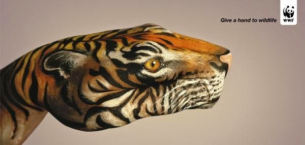
I looked into previous WWF campaigns, which is something that I didn't feel the need to do before, as regardless of what the previous campaigns have looked like, this project is about what Beth wants. Hopefully I can change the images to be more continuous while Beth still likes them.
Some work as a set because of how the backgrounds have a consistent background style despite having different coloured content. Because of the nature of what I've been doing, the closest thing I've been able to get to a consistent background is the grey bar at the bottom of the posters.
Some have same sort of grungy editing on the images. When you look at the images that I used, it's obvious that I didn't consider this, I edited them all separately to get what I considered to be the "best" result for that photo, and didn't consider how the way you edit things can help the continuity. The lighting is also the same in some of them, which allows for a slight variation in the background itself.
Some have same sort of grungy editing on the images. When you look at the images that I used, it's obvious that I didn't consider this, I edited them all separately to get what I considered to be the "best" result for that photo, and didn't consider how the way you edit things can help the continuity. The lighting is also the same in some of them, which allows for a slight variation in the background itself.
Task 4 - Re-write your latest post or write your next post using the following guidelines.
- Avoid overly subjective language
- Use sophisticated and professional language
- Don't fill with unnecessary or uncritical details
- Suggest improvements and discuss limitations
- Critical justifications in light of all other options and through experimentation
- Quotes must be referenced
- Explicit yet concise
The blog post that relates to this task is my evaluation for the responsive brief where I did some work for Beth, a creative advertising student.


No comments:
Post a Comment