 The page was split into two rows and 3 columns using the golden ratio. This was done with the intent of using the larger top section for the conversation, and the bottom for the campaign tagline and twitter hand etc. The top section was split into 4 even rows for the fragments of speech. The bottom section was then split using the golden ratio, with only the bottom section of the bottom section being used for this as this allows plenty of whitespace, which is necessary in contemporary design. The columns will be used as guides as to how far the speech bubbles will go across the page, as in my initial layout sketches a slight overlap looked the best visually, and the golden ratio is an appropriate way of determining this overlap because of how it is supposedly the most visually pleasing ratio.
 |
| My Initial Layout Sketches |
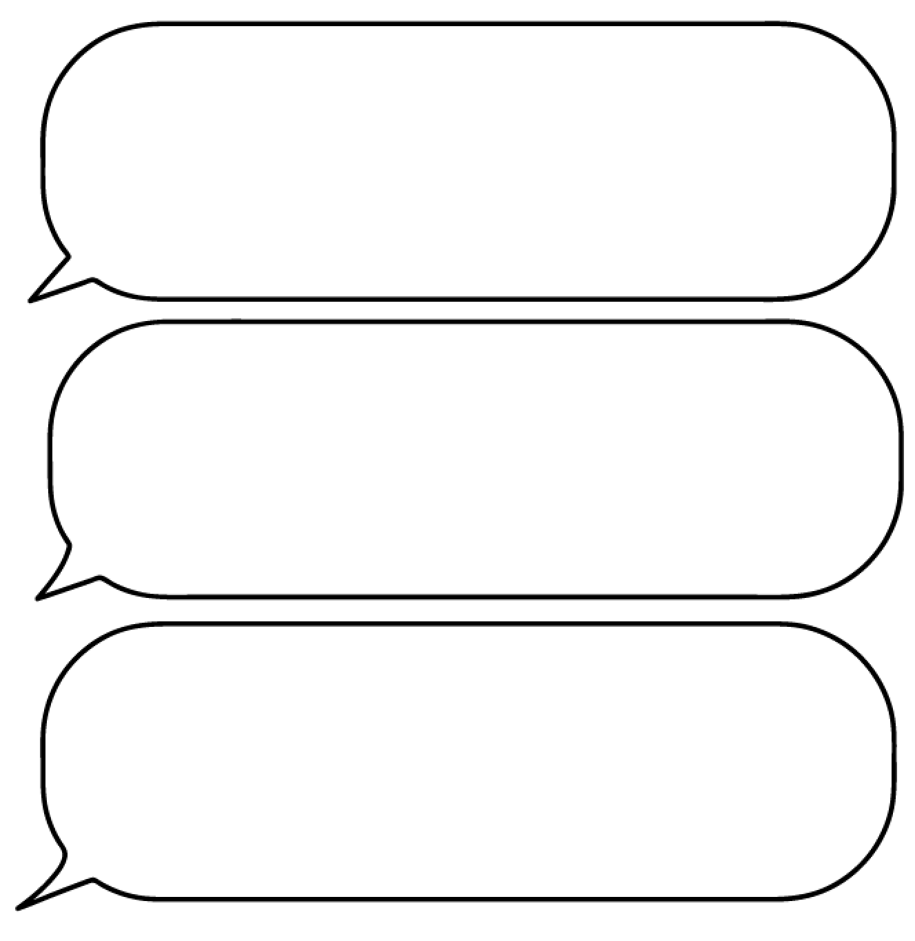
The speech bubbles were tried in various shapes to see which aesthetic looked most pleasing. The ovular one became too thin too quickly and looks somewhat awkward. Using a rounded rectangle remedies this problem, and increasing the curvature of the corners makes the shape look softer and friendlier, which reflects conversation better.
A flick on the box was necessary as without it the box may look like it's reflecting a solely online conversation, whereas with the flick it implies more traditional conversation. The regular pointy flick looked too sharp and it contrasted with the rounded box, it looked more friendly and suitable when a slight curve was added to it. The initial curve made the opening in the flick look too wide though, which is why it was narrowed down slightly.

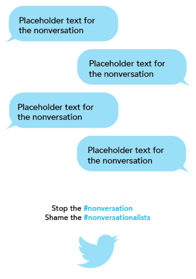
I position the boxes and put text on them to see how they looked. Various effects were applied to the text boxes, namely gradients, bevels and tints, to see how they looked. The bevel and gradient were too distracting from the text, so they were to be avoided. The higher tonal contrast between the black text and the tinted text box made the text clearer, so I decided to use a simple block coloured speech bubble.
Blue was the colour I initially chose to experiment because of it's relaxing and friendly connotations as well as its links to Twitter and Facebook. Various tints of the blue were tried, and the 40% tint is what I'm going to use because of it's balance between its visibility itself and the tonal contrast between it and the text.

After I'd decided this I tried green and orange as well. Green because of the positive connotations it carries, and orange because it's bright and eye-catching without being overly bold like red.
Neither of these were as appropriate as the blue though. Because of the CMYK printing gamut it was difficult to find a light green that wasn't mossy and natural, which isn't very reflective of technology. Whilst the orange is eye-catching, it looks angry and not as relaxed as the blue
Based on how well the WWF logo sat in the bottom right corner of the WWF posters and billboard, I decided to put the hashtags in the bottom right corner of the poster. In this instance it didn't draw enough attention to itself though. It was important that it did this because of how the success of the campaign revolves around the success of the hashtag.
Adding the Twitter logo to the left of it draws more attention to it, but the way the grid is set up means that it overpowers the hashtag, which just makes it look like an advert for Twitter, which is something that should be avoided.
Centralising both the logo and the text emphasises the importance of them both a lot more than having them in the corner. The logo was too close to the edge of the page though, which made it look uncomfortably placed. For this reason I decided to ignore the grid at this point and place them where they look comfortable. It sits well visually in the centre because the overlaps in the speech bubbles draw your eye down the centre of the page to the logo and the text.

Based on this, I re-assessed the width of the borders, as the Twitter logo was further away from the side of the page than the text boxes. Just from making the small rough changes below, it was obvious that increasing the borders dramatically would result in the speech bubbles having to shrink dramatically, resulting in the text being smaller, which is something I wouldn't want because it would reduce readability from a distance. The consistently thick border also makes the poster look a bit too polished, the sort of thing you'd expect to advertise a bank rather than a social campaign.
For these reasons I'm going to stick to the below template.


No comments:
Post a Comment