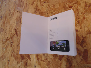
I started off by printing out some screenshots of my app at a size large enough to fit the gaps in the information boards. Laminating them gave them the shiny reflective quality of a digital screen.


I had the information boards printed on white mount board to give them a sturdiness that any other stock couldn't provide. This came with a couple of problems though, cutting out the rectangle for the laminated paper to sit on was difficult even using a scalpel, and left me with a corner that wasn't very tidy.
As well as this, there were areas where the print quality wasn't fantastic, particularly on the photo of the lemur. This is an issue I've had with the digital print equipment before in the OUGD504 Augmented Design Brief. Because of this previous experience I decided not to print the background colour I had used in my digital designs because the printing of large areas in block colours tends not to come out very consistent, as I felt that a white background would look better than a poorly printed off-white.
I used double-sided tape and masking tape to fix the screens to the back of the boards as opposed to any glue to eradicate the potential of any glue smearing into a visible area.
I found that even printed on mount board, the large size of the information boards made them a bit flimsy, so I backed them on foam board, again using double sided tape to avoid smearing. This not only made the boards sturdier, but it also hid the untidy fixing of the screen to the board, and made the board as a whole more representative of the thickness it would be in commercial use.
I printed them out at different sizes to show how they worked at A3 as well as A2, so that they place less restrictions on their potential positioning in a real life context.
I decided to print the cover for the booklet in a darker colour stock to differentiate it from the rest of the spreads. I used the same 135gsm G. F. Smith Colourplan as the spreads, but I used Cool Grey rather than Ice White.
I bound it using staples because the simplicity of it lent itself well to the commercial side of the booklet. Because of the relative thickness of the stock, creep was a noticeable issue at first, but I'd left enough whitespace around the edges of the spreads for this to be easily resolved by trimming it off with a ruler and scalpel. The thickness of the paper was necessary because I was printing double-sided, and wanted to avoid being able to see through the pages slightly.
Overall I was very happy with the outcomes, and feel that they sum up my research well and have the educational undertone that I set out to achieve.


No comments:
Post a Comment