I had to create a new button on the menu screen for the tutorial level. I wanted this to be represented by something synonymous with education because of the suggestions of learning. The issue I found with this was that the only thing iconic enough to represent education and learning is a graduation hat, and this was too detailed to be made out clearly at small sizes. The best alternative to this was a question mark because of it's association with confusion. This makes it a natural button to press if the user isn't sure what they're meant to be doing.
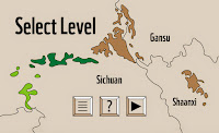
The logical place to put it on the screen was between the menu button and the play button because learning the rules/controls should come before playing a game, but after you've decided you want to play it. The layout was altered slightly for this by moving the existing buttons further away from the middle, allowing the tutorial button to fit in between them keeping the size of the gaps between them the same. Not only is the screen more functional now than it previously was, but the extra button helps fill in the space at the bottom, making the screen look more visually balanced as well.
Level Goals Screen
It was brought up in a crit the other day that it's not obvious what the object of the game is, and they wouldn't have known what they were meant to do had I not explained it to them. This issue is solved by displaying the goals for a level that you need to accomplish in order to pass the level. Briefly explaining some goals for each levels will explain through practice what the object of the game is.
The screen that displays the goals will look like this, and will be shown after a level has been selected to play. The buttons remain the same and in the same place and the title text remains left aligned to draw obvious similarities between the layout of this screen and the level select screen to avoid confusing the user. The text needed to be left aligned rather than centrally aligned so as not to look out of place against the left aligned heading text. This left a large gap on the right of the screen which I filled with the outline of the selected level from the map. Not only is this useful in terms of filling the space, but it's functional in the sense that some of the goals refer to the shape of the map, which make having it there useful.
Adding A Panda To The Game
The in-app purchases allows the user to buy more pandas to add into the game, making it more fun to use the the overworld and photography modes of the game and helping them complete some of the goals.
After the user has chosen to buy a panda, they're taken to the overworld screen where a crate will be hovering over the screen. The message board gives the instructions of moving how to place and release the panda into the game, which is a very simple process.
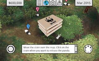
I tried toning down the colours of the screen behind the crate to put more emphasis on the crate, in the hope that this could work continuously with how the colours are toned down behind the instructions on the tutorial screens. In this instance it didn't work the same way, and the duller colours just take away from the positive tone of the game.
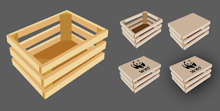
The crate itself was based on this vector I found online, which I manipulated for it to be closed so it could contain an animal. Imposing the the WWF logo on top of the crate makes it more obvious to the user what is inside the crate, and adding the shadow behind it helps it stand above the rest of the screen.
Zoo Tycoon Screenshot Backgrounds
I went back to Zoo Tycoon and took the below screenshots to use as backgrounds for various screens. This makes the overall look of the app more interesting while still keeping consistency. Different screenshots will suit different pages based on the composition of the screenshot and where buttons will be placed on the screen.

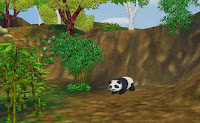
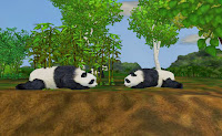
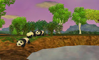
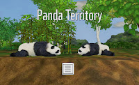
The original screenshot suited the menu best, so I kept that one the same, changing the others so that a panda was always visible. The one I used for the title screen was chosen specifically because it allowed me to keep the text on one line to be consistent with the rest of the app, rather than taking up two like it previously was.

Producer Credit Screens
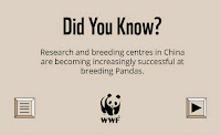
I hadn't given it much thought up until now, but the games I looked at in my research all had some sort of producer credit screen. The below screenshots show how they would look. On the basis that most logos have a monochrome variation, keeping to the use of black and the light brown background keeps consistency with the rest of the app.

Loading Screens
Given that the grey isn't used as a background anywhere else in the app, I decided to keep the backgrounds on both the loading screens brown for visual consistency across the app.


No comments:
Post a Comment