After looking into the more serious WWF apps, I looked for more fun ones. I found a game called Rhino Raid, where you control a Rhino who's mate has been captured by poachers, attempting to free her from the poachers. In doing this you have to defeat poachers who use weapons such as guns, tranquillisers, and chainsaws along with traps and poisons to try and kill you.
Upon introduction to the game, you're presented with a fun looking, highly illustrative, comic book-like loading screen which immediately engages you with the game. This is important as in the UXD Session in the last module we were made aware that people don't give a website much time to impress them when they first visit one, so why would they give an app any more time? After this you're made aware straight away that the app is supporting WWF and you are immediately presented with facts about the situation, using similarly illustrative images keep you engaged with the app. For some reason the background seems to be some sort of starry night sky, which seems random. Given the style of the illustrations however, it is important that the background shouldn't be a plain block colour, as that would show a contrast in styles.
From the main menu (purple screen) you are presented with options to share what you're doing with Facebook or Twitter, allowing the game to interact with social media, as well as adjusting the sound or finding out more about WWF, as well as starting the game. If you choose the WWF button you are taken to a blue screen, which is somewhat confusing and disorienting given that the previous screen was purple. From here you can find out more information about the cause or donate to WWF. This screen is unnecessary and the contents of it could easily have been put onto the main menu screen to save the disorientating feel that the sudden change in colour presents you with. Again neither screen has a plain background, although up until this point there is no consistency amongst the backgrounds, which detracts from the visual strength of the app.
When you play the game the instructions are clear and simple in a pop-out. The illustration of the rhino carries through from the start-up screen. As the rhino moves along the level the background image of the savannah moves as well. It's the first background that has a reason behind being there. As you go along the levels avoiding traps and beating up the bad guys occasionally you lose and the rhino gets stars around it's head in a classic cartoon-like style, which as an example of how the attention to small details makes the game look visually successful. After each level you get a summary of your performance, and you can go back to any previously completed level by using the map you're presented with as a skeuomorphic menu.
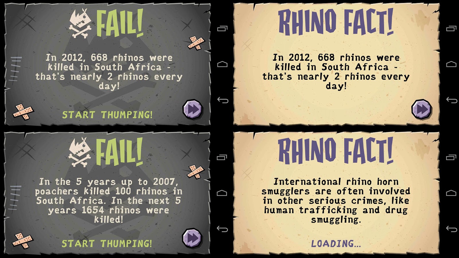
The difficulty of the game increases level by level and occasionally your rhino will be killed, at which point you're presented with one of the fail facts on the left, which aptly explains about how or why rhinos have been killed. You can also access these facts at various points throughout the game on occasions such as when you are waiting for a selected level to load, so seeing this facts doesn't rely on you losing the game. When they appear through loading they appear like they do on the right below, in a much more positively connoted design through a lack of the skull and crossbones and the plasters as well as a much lighter coloured background.
As the game goes on you are occasionally shown cartoons depicting the poachers and their organisation with evil connotations such as long black cars, dodgy dealings, guns, helicopters and balaclavas. When it does this the colours are darkened from what they normally are to give the app a more mysterious and dark feel. It's important to note that the app openly shows the use of guns, because it clearly shows the issue, rather than tip-toeing around it.
The game ends with you freeing the rhinos mate and them smiling in front of a sunset which is made to look brighter by using tones of red and orange that have been used minimally throughout the app. The text that belittles the achievement of you completing the game in comparison to the size of the problem that the rhinos face when facing extinction encourages you to keep on playing the game by helping in real life.
The game is really successful visually because of both the visual style and continuity behind it, the vectors are jagged and the colours are slightly neutralised and look a bit dirty, which is reflective of the African savannah that the app is trying to portray.
It took me about 45 minutes to complete, and I thought it functioned well as a game. However, I don't think it's as addictive as things such as Crossy Road, doesn't have the variety that Angry Birds has, and doesn't really have the replay value or real-time longevity of Hay Day. Whilst it's fun, there's no incentive to play it again, and because of this, the message behind it is easily forgotten.
Conclusion
I commented that the backgrounds in the menus for this app seem a bit random, and if the menus had looked more like the menus on the Norwegian WWF app but in darker colours, it would be another small thing that makes the app successful, like the stars around the rhinos head after you fail on a level.
I feel that this app is a good starting point for me to develop my app from, making alterations to the visual and strategic concepts of it based on the research from the other games and WWF apps I looked at.


No comments:
Post a Comment