In my rationale I spoke about how I will develop 2 separate bits of print that will be aimed at a separate audience, and then an accompanying piece that will work for both audiences. After giving this quite a lot of thought, below is an explanation of what I am planning to do.
Mums With Young Children
Some sort of laminated recipe card that can be put on a fridge using blue tac or fridge magnets. They will act as a constant reminder that pancakes can be eaten year round. There will be bright pictures on it and the text will be quite large to encourage the younger children to enquire about it with their parents.
Young/Middle-Aged People Wanting To Try Something New
I will produce some sort of menu card that uses fancy words to try and sell pancakes as something that are high end things to cook/eat in your own home, rather than exclusively being bought at expensive and fancy pancake stalls in market places. I will include the ingredients needed to make them, as this will make it clear that I'm trying to get them to make pancakes themselves, and it will avoid them potentially thinking that I'm trying to give them an actual menu for a restaurant.
Accompanying Piece For Both
I intend to make a pack of cards that have some sort of promotional advertising on the back of them, be it some sort of imagery or branding on the back of them. My little sister used to love playing card games such as pairs and snap when she was 6 or 7 years old, and so they can be used in an interactive and engaging way like that. Younger middle aged people can use them for more grown up games such as poker or something like that. A pack of cards are the sort of thing that can always be useful but no-one ever has handy. The back of the cards will act as a constant reminder that pancakes can be an everyday thing.
Monday, 15 December 2014
Sunday, 14 December 2014
OUGD503 - YCN - J2O - Second Attempt
Having read the brief more thoroughly and taken into account their considerations a bit more, I changed my designs slightly.


I think the best way to combat this is to show how the final product will look both with and without the green when I submit my work, as this will show both what I think works well, as well showing that I've considered the brief.
By changing the colour of the 2 in the logo to the green, I've killed two birds with one stone. It allows me to use the green in "some capacity", and by using the traditional J2O colour for the number two, it highlights that "J2O is a blend of two fruits". I wanted to keep the use of the green pretty minimal because I don't like it. On the label for the bottles neck I made the names of the fruits green as well to further back up these points. I removed the red and yellow borders because they were a bit too geometric, as well as the bits that went either side of the text because they weren't really visible from the front of the bottle and were a bit unnecessary. I'm a lot happier with it now as it fits the brief a lot better.


I duplicated these and changed them to fit the Orange and Passion Fruit colour scheme as well, as shown below.
Despite these changes, I still feel a bit concerned about the green though, and think that my designs look a lot better without it, as shown below.
I think the best way to combat this is to show how the final product will look both with and without the green when I submit my work, as this will show both what I think works well, as well showing that I've considered the brief.
Personally I don't understand why they want the green. They say "The J2O brand is synonymous with the colour green", and they're wanting to re-invent themselves, so if anything I'd have thought they'd have wanted to stay away from the colour green. I personally feel that the shape of their logo is enough of a symbol for J2O because of how recognisable it is, and because of this I don't think their necessarily has to be a synonymous colour for the brand as well.
Thursday, 11 December 2014
Design For Print - Workshop 3
You should discuss the bleed with printer when you discuss stock, spot colours and other stuff like that.
The slug area is used for crop marks, fold marks etc etc. You should talk to the printer about what they want you to include in the slug area.

How to set up a tinted swatch.

Setting Up Images
- Images need to be used at actual size
- Images should be at 300dpi
- Images should be CMYK or Greyscale
- Images should be TIFF or psd files
You can apply colour to greyscale TIFFs in InDesign as if it were a duotone image by selecting the binding box and using the fill colour to fill the white areas. If you select the image re-sizer thing and fill that it applies the colour to the black area.

You can see how your file will look as separations by going on;

Window -> Output -> Separations Preview -> View -> Separations


You can print your separations by doing the below things.

The frequency and angles boxes should be left to be set up by the printer to avoid having a Moire effect, which can occur when dots are overlayed as shown below.
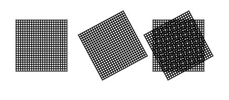
When preparing something for screen printing the frequency should be beween 50 and 65 lpi, the angle of the first positive should be 15 degrees, the second should be 75, then 105 and 155.
Exporting to a PDF
File -> Adobe PDF Presets -> [Press Quality]
or
File -> Package
Wednesday, 10 December 2014
OUGD504 - Studio Task 13 - Print Finishes
Varnish
Varnishes are generally used in higher end books and magazines, they give the paper a more consistent feel as well as protecting the ink by sealing it into the material. Gloss varnishes are generally used for image-heavy layouts, whereas matte varnishes tend to be used for more text-heavy layouts.
Lamination
Spot UV Varnish
Foiling
Embossing/Debossing
My taste in stuff generally isn't expensive/posh enough to own anything that has any embossed or letterpressed stuff, so I had to take the images from the guide on eStudio.
Letterpressing
 |
| Gloss Varnish |
 |
| Matte Varnish |
Lamination
Lamination adds a layer of protective coating to your print which can make it sturdier and more water-resistant. You can use a glossy lamination which improves the contrast of colour, particularly in images, or you can use a matte lamination which has a darker more luxurious outcome.
 |
| Gloss Lamination |
 |
| Matte Lamination |
Spot UV Varnish
This finish is applied by a machine that varnishes your print and then uses UV light to dry it out in the areas you don't want it, leaving behind the varnish in your selected areas, it's quite an expensive process to use. You don't need to change your document in terms of how it's set up, you just need to specify to the printer what areas you want to be varnished, it's advised that you set up a new layer in your document that illustrates this. Spot varnishing is a lengthy process because each bit of print has to be individually fed into the machine. Spot varnishing is generally used for highlighting certain parts of your print by making it contrast with the background, and it can make your print look a bit higher end.
 |
| Spot UV Varnish |
Foiling
Foil stamping works by creating a metal stamp with the shape you want to foil block onto your area. You then place a sheet of foil over your print and the stamp on top of it. The machine you use causes the stamp to put pressures on the foil and your print, as well as heating it up. This causes the area of the foil under your stamp to fuse with the paper, leaving you with a reflective foil surface when the stamp is removed. It works better on stocks that have smooth surfaces, and the foil stamp shouldn't be a halftone image or anything to thin, as it can make the stamp less durable and make it more flakey. Foil stamping creates something that your eye is immediately drawn to, and is often used as a mark that something is official.
 |
| Foiling |
Embossing/Debossing
Embossing and debossing works by creating two metal plates, one that works as a die, and the other that works as a counter-die. The plates are made from brass, copper or magnesium. Brass plates are more expensive and durable, and can generally allow you to use various levels of embossing. Copper plates are less durable and generally sis only effective for single-depth embossing, although they're cheaper than brass plates. Magnesium plates are cheaper still but are only any good for a one-off print. The material is placed between the two dies and squeezed and heated. The squeezing causes the material to rise up in certain places, and the heat causes the rise to be smooth. Embossing can be used as a stamp of approval in a similar way to foiling can, but can also be used to created shadows on your print.
My taste in stuff generally isn't expensive/posh enough to own anything that has any embossed or letterpressed stuff, so I had to take the images from the guide on eStudio.
 |
| Embossing |
Letterpressing
Letterpressing is similar to debossing in that it lowers certain areas of your print. If you use a letterpress without any ink it won't leave any colour on your print, but if you apply enough pressure it will leave its stamp mark. It generally works better on thicker or duplexed stock as there is more room for indentation within the material.
 |
| Letterpressing |
Tuesday, 9 December 2014
OUGD504 - Studio Task 12 - Augmented Design
What is the potential of interactivity in print?
I think, as the videos shown in the session showed, the potential of interactivity in print is, somewhat ironically, linked with the potential of digital technology. Whilst various ornate folding and binding methods can be used to make print interactive, very little of that is anywhere near as impressive as being able to interact with print digitally, in my opinion at least.
Can augmented design draw people to your website?
Yes. The reasons are more fully explained in my rationale, but as a summary, if my campaign can encourage people to make more pancakes then people will start looking at toppings more, which makes my website less of a niche and more mainstream.
Is it all just a bit gimmicky? Or does it have potential?
I personally think the examples shown in the presentation were very gimmicky, I actually said it to the person sat next to me before the examples were finished and these questions were raised. I think there's a certain novelty that comes with it that a company could use to justify bumping up their prices, but I don't think any of the examples we were shown use the technology to it's full potential, not that I could suggest any better uses.
What kind of interactivity would be effective for my campaign?
With the target audiences being mothers with younger children, and young/middle-aged people wanting to try something new, I feel like the idea of physical interaction is more appropriate than digital interaction.
The limitations of Augmented Design in this project
When you apply augmented design to websites, then you're generally going to need a heavy understanding of how technology works in apps if you want to do something spectacular. There's no way I'll be able to make an app that does anything fancy like in the images below, because I wouldn't have any idea where to start. For me, in this project, augmented design should stick to print for practical reasons as well as it being more appropriate.


Monday, 8 December 2014
OUGD503 - Roses Awards - Spread The Word - Keep Calm and Carry On
The Brief
My Interpretation
Having read all the briefs on the Roses Student Awards page, this brief stood out to me because of the highlighted sentence above. Clearly they see this brief as something that you can have some fun with judging by their sarcastic/light-hearted tone, and that's something I appreciate.
There is one word on their shortlist of suggested words that particularly caught my attention because of this link.
Nonversation: a completely pointless chat.
Living in a student rented house with three other art students, and having grown up with two younger siblings, I consider myself to be quite the expert on "Nonversation". From this point on I won't be capitalising it, italicising it, or putting it in quotation/speech marks, as for the sake of the project it should be treated the same as any other word, I will also be adding it to my laptops dictionary.
I feel that this brief has great potential for me to show my personality in my work, weather this is a good thing or not remains to be seen.
Initial Intentions
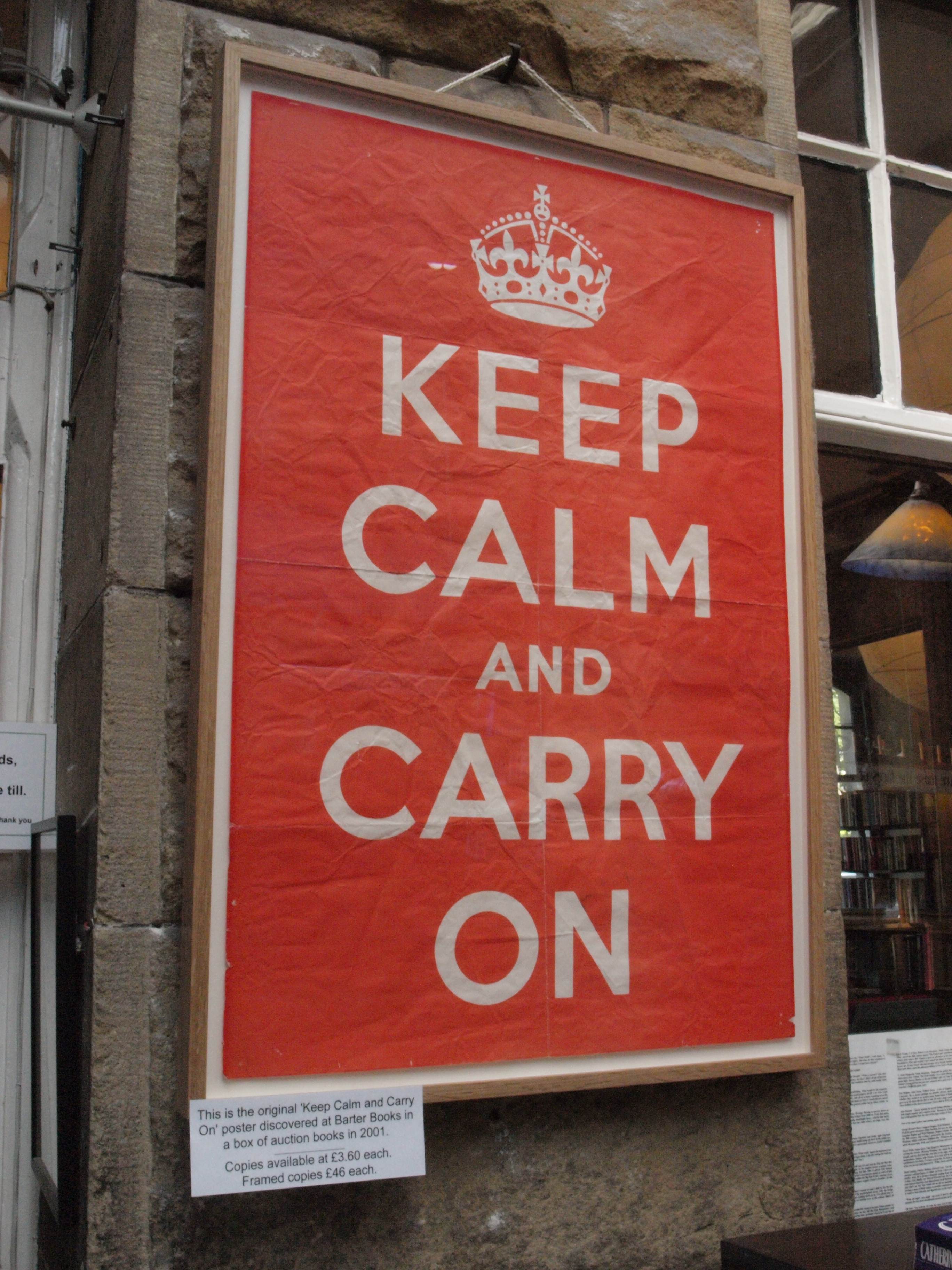
Conversation is important. Nonversation is not. This slight change makes a big difference. In graphic design terms, this reminds me greatly of how the keep calm and carry on poster has been stripped of it's integrity as something that was once of great importance to something that is now as meaningless yet big a part of society as nonversation itself.
Christmas is coming up, a time where family is forced upon one another and meaningless small talk is in no short supply. Over the next few weeks I'll be documenting pointless things that have been said by people I'm close too, and I intend to use these to create a series of posters that reduce the idea of conversation to nonversation, using the way that the keep calm and carry on poster has been reduced from something that once provided national optimism to nothing more than pastiche as inspiration.


The examples are seemingly endless...
OUGD504 - Studio Task 11 - Project Rationale
Currently my website exists as a resource containing various different pancake toppings that are more interesting than the traditional toppings. Other than this, it does nothing else. Because of this, the only reason people would have to visit the site would be for ideas for toppings when they’re making pancakes, the problem being that people very rarely make them in the first place, which, in turn means that few people will visit my website.
My printed campaign should address this issue by encouraging people to make pancakes, focussed mainly on the following two reasons:
- Pancakes are a great way to experiment with eating things you wouldn’t eat because they are generally eaten with a topping.
- Making pancakes is a fun process and can be a good way to get children interested in cooking and food in general, potentially helping and encouraging them try new foods.
Because of the potential difference between a mum with young children and a young-middle-aged person who’s interested in trying something new, it will be difficult to produce three things that cater to both of these audiences. Because of this, I will aim to produce one piece of printed media that is aimed at each market, and then another piece that will work with either of the other two because the other will put it in context.
I would suggest that possibly the best way to encourage people to eat more pancakes would be to give out samples, and the printed media for this campaign would probably be used in conjunction with free samples. Because of the expense involved with samples, it is important that the materials and processes used in the printed campaign be kept simple in order to keep costs down.
It is important that the two audience-specific pieces of the campaign should have a clear indication of who their audience is, but at the same time they shouldn’t be too stereotypical to the point where they make the person think, “Oh, I’ve only be given this because…”
Saturday, 6 December 2014
OUGD504 - Augmented Design - Problems With Targeting Mums as an Audience
Feminism
Feminism: The advocacy of women’s rights on the ground of the equality of the sexes.
"The issue of rights for women first became prominent during the French and American revolutions in the late 18th century. In Britain it was not until the emergence of the suffragette movement in the late 19th century that there was significant political change. A ‘second wave’ of feminism arose in the 1960s, with an emphasis on unity and sisterhood; seminal figures included Betty Friedan and Germaine Greer"
http://www.oxforddictionaries.com/definition/english/feminism?searchDictCode=all
Feminism isn't something I'm very clued up on in all honesty. I understand, accept, and respect the premise of it, but that's about it. We seem to hear about it more than we should be doing given we live in a developed democratic and civilised country. Weather this is an argument for or against the need for feminism is unclear.
I know it to be quite a touchy subject, and people are easily offended when talking about it. I remember being after the first lecture we had this year (The Gaze and The Media), when I got back to the studio a few people on our course were talking about feminism (a mixture of males and females), I was asked my opinion on it but didn't say anything out of fear of offending anyone given my lack of knowledge on the subject, whereas I normally say what I think about things.
All I know, is that with feminism being a big thing at the moment, any sort of public campaign needs to be careful and make sure it's politically correct, because it's very easy to be accused of being sexist, especially when your target audience is female.
Mumsnet
Building on the feminism thing are groups such as mumsnet, which is an online forum for mums to talk to each other. Again, it's something that I have very little knowledge on, other than from when it's been ridiculed on TV programmes that I watch such as Have I Got News For You and Mock The Week.
Below is a screenshot of their homepage, and it seems like a useful and sensible site, which I'm sure it is in the vast majority of situations. When you've got articles that talk about talking to your children about politics, it suggests a useful and credible site.

But then at the same time, the site produces things like the image below (full article here), which are potentially why they get such a hard time from the media. Some members of mumsnet are involved with it for the political element, not it's primary use as a resource for parenting advice/tips/help. This sort of thing stops you from using groups like mumsnet as an endorsement, which make it initially harder to target a market.

Teenage/Young Single Mums
In stark contrast to things like mumsnet, teenage mums (and dads) tend to be a lot less interested in politics, and tend to need all the help they can get. These aren't the sort of people who're going to have time to be making pancakes.
These sort of mums aren't the ones that I should be including in the target audience, as it's going to take a different message to communicate to these people what I want to communicate, one that would deter the more realistic audience because of the bad press given to teenage/young single mums.
On a personal level, one of my closest friends has recently become a young single mum, and I know for a fact that interacting with the sort of project I'm looking at doing wouldn't be anywhere near the top of her priorities, despite her being well-supported by her job and family.
Conclusion
Targeting mums as an audience is going to be difficult to make obvious, because in this day and age, using stereotypical cliches that apply to mum will get you jumped on for sexism, and rightly so, the same as it would do for racism or homophobia.
Because of this I'll need to make sure my designs are feminine more in their nature than in their message.
Feminism: The advocacy of women’s rights on the ground of the equality of the sexes.
"The issue of rights for women first became prominent during the French and American revolutions in the late 18th century. In Britain it was not until the emergence of the suffragette movement in the late 19th century that there was significant political change. A ‘second wave’ of feminism arose in the 1960s, with an emphasis on unity and sisterhood; seminal figures included Betty Friedan and Germaine Greer"
http://www.oxforddictionaries.com/definition/english/feminism?searchDictCode=all
Feminism isn't something I'm very clued up on in all honesty. I understand, accept, and respect the premise of it, but that's about it. We seem to hear about it more than we should be doing given we live in a developed democratic and civilised country. Weather this is an argument for or against the need for feminism is unclear.
I know it to be quite a touchy subject, and people are easily offended when talking about it. I remember being after the first lecture we had this year (The Gaze and The Media), when I got back to the studio a few people on our course were talking about feminism (a mixture of males and females), I was asked my opinion on it but didn't say anything out of fear of offending anyone given my lack of knowledge on the subject, whereas I normally say what I think about things.
All I know, is that with feminism being a big thing at the moment, any sort of public campaign needs to be careful and make sure it's politically correct, because it's very easy to be accused of being sexist, especially when your target audience is female.
Mumsnet
Building on the feminism thing are groups such as mumsnet, which is an online forum for mums to talk to each other. Again, it's something that I have very little knowledge on, other than from when it's been ridiculed on TV programmes that I watch such as Have I Got News For You and Mock The Week.
Below is a screenshot of their homepage, and it seems like a useful and sensible site, which I'm sure it is in the vast majority of situations. When you've got articles that talk about talking to your children about politics, it suggests a useful and credible site.
But then at the same time, the site produces things like the image below (full article here), which are potentially why they get such a hard time from the media. Some members of mumsnet are involved with it for the political element, not it's primary use as a resource for parenting advice/tips/help. This sort of thing stops you from using groups like mumsnet as an endorsement, which make it initially harder to target a market.

Teenage/Young Single Mums
In stark contrast to things like mumsnet, teenage mums (and dads) tend to be a lot less interested in politics, and tend to need all the help they can get. These aren't the sort of people who're going to have time to be making pancakes.
These sort of mums aren't the ones that I should be including in the target audience, as it's going to take a different message to communicate to these people what I want to communicate, one that would deter the more realistic audience because of the bad press given to teenage/young single mums.
On a personal level, one of my closest friends has recently become a young single mum, and I know for a fact that interacting with the sort of project I'm looking at doing wouldn't be anywhere near the top of her priorities, despite her being well-supported by her job and family.
Conclusion
Targeting mums as an audience is going to be difficult to make obvious, because in this day and age, using stereotypical cliches that apply to mum will get you jumped on for sexism, and rightly so, the same as it would do for racism or homophobia.
Because of this I'll need to make sure my designs are feminine more in their nature than in their message.
Thursday, 4 December 2014
OUGD503 - Progress Crit
Today we had a crit on our progress in Responsive. It worked out pretty well for me because it alerted me to few things that I had overlooked.
J2O Brief
Helen showed her work on the J2O brief, and mentioned that they wanted to keep their green colour as an aspect of the brand, something I had clearly missed. I checked the brief and it states
"The J2O brand is synonymous with the colour green that is on all of our packaging. Please make sure that it features in some capacity when coming up with design ideas."
It's been a while since I looked at the brief, and it also states:
"In the past, the depiction of fruit on our packaging has increased taste credentials so although it’s not compulsory to do so, bear this in mind when coming up with design ideas."
These are two considerations that I will take forward with the brief.
Roses Student Awards
Melissa mentioned that she was going to enter a Roses Student Awards brief, which had an entry cost of £15. I'd completely forgotten about entry costs, and had planned on doing two of their breifs, "State of Mind" and "Spread the Word". It seemed a bit unnecessary to pay £15 twice, so it's made me re-think this, and I'm only going to be doing the "Spread the Word" brief.
Pantone
I spoke about how someone had told me about the Pantone brief. I didn't read it initially having automatically wrote it off as being probably boring. I spoke about how where I live has an odd name (Halfway), and how that gives me quite a lot of scope to do something quite interesting with the brief. This was met with quite heavy approval, so this is something I'll look into further.
Wednesday, 3 December 2014
Design For Print - Workshop 2
Colour Modes In Photoshop
It is important to always make sure that before you send off any work to be printed that you make sure it's in CMYK, as the default colour mode for Photoshop is RGB, which will make some colours such as bright greens go duller as they lie outside the CMYK gamut.

You can use the Gamut warning in photoshop to show you what areas of your screen won't print in CMYK by turning them grey. This feature can be accessed in the View Menu. You can edit the image by altering the Hue/Saturation, Levels, and Curves in the Adjustments menu. When there are no large grey areas, the image is ready for print after it has been converted to CMYK.
If you change the colour mode from RGB to CMYK without doing this, Photoshop will choose the nearest CMYK colour to use in place of any colour that is used that can't be reproduced. To preview what this would look like you can use the Proof Colours option in the View menu.

Using the colour picker shows you if a colour can't be reproduced in CMYK via an exclamation mark within a triangle next to the little swatch. Clicking on the tiny square below it automatically moves the colour picker to the closest CMYK colour. The little cube underneath it does the same thing to indicate a web-safe colour.
Using Spot Colours
Method 1
Image -> Mode -> Greyscale
Image -> Mode -> Duotone
-> Click on the colour box
-> Choose the Pantone colour box you want to use
-> Alter curves
-> File -> Save as
-> Format
-> Photoshop

Method 2
Image -> Mode -> Greyscale
Channels -> Menu -> New Spot Channel
-> Coloured Square
-> Colour Libraries
-> Choose Colour
The new channel acts like a layer mask, double click on the channel to change the colour
-> Save as
-> Ensure "Spot Colours" box is ticked
-> TIFF or Photohop

Subscribe to:
Posts (Atom)