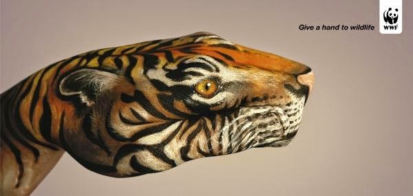
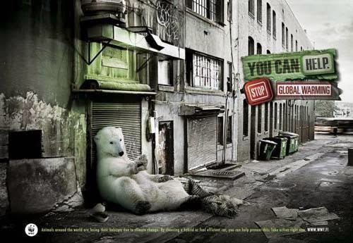
I looked into previous WWF campaigns, which is something that I didn't feel the need to do before, as regardless of what the previous campaigns have looked like, this project is about what Beth wants. Hopefully I can change the images to be more continuous while Beth still likes them.
The below four work as a set because of how the backgrounds have a consistent background style despite having different coloured content. Because of the nature of what I've been doing, the closest thing I've been able to get to a consistent background is the grey bar at the bottom of the posters.


It's obvious that these two are part of the same campaign due to the consistency between them both. I think it's particularly important to note how the logo and text are in the same place on both, something which I tried to do but couldn't manage it because of the nature of the photographs I was using.
These three have the same sort of grungy editing on the images. When you look at the images themselves that I've used I didn't consider this, I edited them all separately to get what I considered to be the "best" result for that photo, and didn't consider how the way you edit things can help the continuity.


These are my favourite WWF campaign posters. Again the text is all placed in the exact place, with content of the posters being altered slightly for each variation. The lighting is also the same in each of them, which allows for a slight variation in the background itself.


No comments:
Post a Comment