The Brief
"Colour is brave. Colour is bold. Colour is real. And it’s, well, colourful. Pantone supports the creative community to deliver, execute, and live that fact. Pantone sets the standard for colour. Nothing else comes close to the diversity or reality of colour of Pantone. And colour is vital. It matters. It’s colour that tells you when to go and when to stop. It’s how you know which tap to turn on, and the reason you know when to be wary of something.
But it’s not just instructional. Colour is emotional, personal, and evokes our deepest and sincerest feelings. The same colour can mean a myriad different things to a million different people, and everyone has their favourite. In the physical, real world colour is a massive part of everything, from which sports team you follow, the political party you support, to your personal or even national identity – whether the colour’s on your flag or just your favourite mug.
But because of its ubiquity, people can take colour for granted. And that’s not good
news for creativity.
Reimagine your hometown through a new colour scheme. Think about everything that this identity could include, physical and digital: logo, transport, wayfinding, etc."
My Thoughts
I love reading this brief. In the second paragraph it talks about how our relationships with colour are something that are personal, and how that in the real world that colour has to try and distance itself from these relationships. I love where I live in Sheffield, the area in particular is called Halfway. I've lived there all my life and I don't think I'd choose to live anywhere else, and so this brief looks perfect for me.
Sheffield is known as the green city, which is an excellent starting point given that this brief is about colour and it's connotations. I also notice how the colour green is the one that has the biggest area in a gamut to exploit when it comes to using Pantone colour systems, because so little of the visible spectrum of green is printable in CMYK, which makes this even more relevant.
Further from this, the fact that I live in a place that is actually called Halfway, draws obvious links with colour diagrams such as gamuts, as you can use various points on the gamut to find a colour that's half way between two colours, so I'm expecting to have a very strong conceptual side to this project.

First Steps
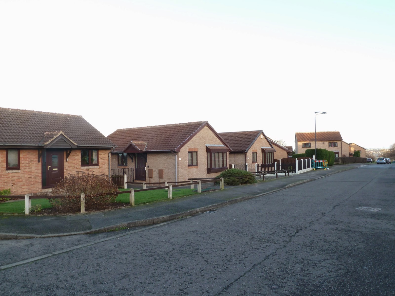
Given that I will be living in Leeds while doing this project, I thought it probably a good idea to take some photos of where I live that I can use if needed. Having photo's will also give other people a slight idea of where I live so that I can use them for reference in a crit and things like that.
I tried to take photos that were particularly relevant to the phrase "green city", as that's the start of the concept that I'll be going with. These are the best ones. Clearly some of them aren't as green as they would be in the summer time, but they're still pretty green.


No comments:
Post a Comment