Wednesday 29 April 2015

OUGD505 - Covered - Crit Ideas

I spoke today about how some key points in the book are; 


  • Christian morality still dictates wrong and right, even though "God is dead". 
  • Suffering is made contagious by pity.
  • Pity thwarts evolution.

Given that Nietzsche lived most of his life in pain and suffering there needs to be some dark undertone to the cover that communicates this. This dark undertone also lends itself well to the generally pessimistic style of writing.

The cover of the version of the book I'm reading is below. It seems that whoever 'designed' this cover felt the same, although wasn't very discrete with getting this dark undertone.


Nietzsche's contempt for Christianity started when he was young, questioning why God would punish his father (who was a priest) by causing him to die early at the age of 35, and his brother to die early at the age of 2. My questioning of Christianity comes from my grandfather (also a priest) and his obsession with Christianity which runs his life in a way which I would suggest is unhealthy. Using blood (or a blood-like substitute) as one of the two colours for my cover would not only give the cover the dark undertone it requires, but also has the connotations of family that are appropriate to both my own and Nietzsche's questioning of humanity. For this reason blood will only be used to print Nietzsche's name and the title of the book.

I also mentioned that the book was written day by day, chapter by chapter, which explains why the chapters are so short. Given that the cover of a book holds the book together, I feel like this needs to be made clear in the cover. However this is done, it will be done in a slightly lighter colour than the stock I use to represent how Christian morality shines above all else. The similarity in the colour will represent how embedded Christian morality is into our society.

Tuesday 28 April 2015

OUGD505 - Methodology

Methodology Evaluation

Before attempting to start a project I spend a while clarifying to myself why I’m doing it and what I’m hoping to achieve by doing it, this gives my work a purpose, which makes any decisions further down the line much easier to make. This is possibly the most important part of my methodology, as illustrated by the few times I’ve rushed into a project and forgone it such as my J2O Responsive brief and to some extent my COP practical work. 

From this I move on to researching things that perform a similar role to what I’ll be designing to give me an idea of how the form and function of what I design currently relate to each other and if I need to alter the balance in one way or another. Starting my research in this way is very functional in terms of pointing my thoughts and ideas in the direction of a suitable outcome, but the rigidity of this often leaves a lack of room for creativity in the outcomes function, which naturally makes it a struggle to implement creativity and originality in the form. I only abandon this approach if I innately have an initial idea that I really want to follow up such as the WWF condoms, which would never have arisen through a rigid and logical methodology like mine.

Due to my methodical working style I struggle to find a starting point in most project, and for this reason the initial stages of my designing are very time consuming and show very little productivity for the time, which is annoying. I need to be braver and more confident when starting work in order to have a more efficient process as a whole. That said, my current methodology is working well for me as shown by the improvement in my work, and attempting to change any of it may be counter-productive. My good time management skills tend to mean that needing a lot of time for one particular stage of a project isn’t so much of an issue as it could be for other people.


When approaching the end of a project I sometimes try and take shortcuts where possible, so I can internally label the project as ‘finished’ as soon as possible, which gives me great satisfaction. This is the part of my methodology that most needs working on because it’s completely needless, and is just driven through my natural instincts to want a completed project. I have good enough time management to not have to need to take shortcuts, and I don’t realise that I’m doing it because it’s instinctive, which is very irritating retrospectively. Labelling a project as finished helps me to organise myself. While this is important, it does somewhat draw a line under the project which stops me from revisiting it, making it harder to learn from my own mistakes that it otherwise would be.

Feedback From OUGD503 and OUGD504

Tutor's Comment: 'A nice collection of work that comes together best when you seem to be more sold on the project. Subsequently, I’d suggest using what you’ve learned from this module to help determine what kind of projects you’ll undertake in future.'

My Response: The fact that this was brought up highlights my sometimes questionable attitude towards graphic design. I know I'm not always going be able to work on a project that I find engaging or I'm interested in on a personal level, and when I'm in a situation where I'm doing a project I'm not enjoying, I need to take a more professional stance on it rather that a personal one.

Tutor's Comment: 'Your blogging and development could benefit greatly from more critical depth and broader research'

My Response: I have been making sure that all my development is shown and discussed critically on my blog, explaining my decisions and commenting critically on why I didn't go down other routes.

Tutor's Comment: 'The limited primary and secondary source material has hindered your ability to critically evaluate your research' 

My Response: I've started to broaden my research after the initial process of looking at existing things that serve a similar purpose. This has allowed me to take more influence from outside sources into my work as well as being able to critically evaluate their relevance.

Saturday 25 April 2015

OUGD505 - Product, Range, Distribution - Zoo Tycoon Implementation

I worked on the title screen, menu screen, photography mode screen, and overworld mode screen, having taken some screen shots from Zoo Tycoon to use as a placeholder for the content of the game.


Screenshots from Zoo Tycoon

I used the mechanics of Zoo Tycoon as a tool to develop a small in-game world similar to the one proposed for my game. I then used the various game modes in Zoo Tycoon to take screenshots from different positions. Because the pandas move around in the game, as well as displaying various emoticons in thought bubbles, it was very difficult  and time consuming to get even these 5 screen shots, hence why I don't have many.


I had to brighten them up a bit in Photoshop because of the screenshot mechanics on the computer I used, as my macbook wasn't compatible with the games. also had to crop them down to a similar ratio to the screen size I was designing for, which left me with these.


Title Screen and Menu

I chose to use this screenshot for the title screen because the darker sky set it aside from the others. The positions of the pandas meant that I couldn't have the text placed centrally, so I placed it in a position and size that mirrored the pandas in order to balance the screen.


I looked at how the grey and the brown text and buttons would look and decided that the grey was more appropriate because of how it was a similar colour to the pandas fur.


I then realised that the text needed to be centrally aligned to fit with the menu screen, so I changed this, keeping the position and colour the same.


I continued to use the grey on the menu screen because of its similar colour to pandas, but couldn't get the title text to look right after trying with numerous colours.


Because of this I decided to use another of the screenshots as the background, and this worked fine. It gives a much more positive look to the game, which is an important vibe to give off at an early stage.


I found that the menu screen seem considerably more positive than the title screen, and the central text made the screen look more balanced, so I decided to change the background of the title screen to one where I could use centred text and keep the menu button in the place where it is on the loading screens for consistency. Whilst this variation of the menu screen is better than the old one, I'm not overly happy with the image, and so will probably get a new one at a later date.


Photography Mode

I used the last screenshot to illustrate how the icons and buttons would sit on the photography mode. The only issue I've found here from my storyboarding is that it isn't obvious that the camera icon at the top is the active one because there's no colour in it.


I decided that the simplest and most effective way to solve this issue was to give the active icon the light brown background, as I've already shown there's noticeable contrast between the light brown and light grey.


Overworld Screen

The one screenshot I got of the overworld worked well. Despite, having various things sitting on top of the overworld, there is still plenty of exposure of the screen, which is something I was worried about potentially being an issue form my storyboard. The background of the globe icon is brown for consistency with the photography mode screen.


The shape of the pointer above the pandas is taken from the map icon, and the colours are taken from the male and female symbols, both of these aid consistency. The number in the the pointer refers to the number in the message box.


I tried using tints of the blue and pink as I felt that they were slightly garish. Seeing the alternatives I realise that firstly, the garish colour is more functional as it helps the user locate the pandas, and secondly, the very slight difference it makes doesn't merit adding more colours to an already extensive colour palette.

Thursday 23 April 2015

OUGD505 - Studio Task 3

Task
Using provided text, information and images, create a simple text-based 10 page A5 concertina leaflet and a simple image-based A5 leaflet for Disobedient Objects North Exhibition at the People's History Museum in Manchester based on our visit to the V&A Museum and our own influences in design.

Leaflet

I started with the leaflet because I was expecting there to be more issues in terms of fitting content to a grid over a 10 page leaflet than there would be doing a single page flyer, which turned out to be the case.

I chose to use Resolution Sans as the heading font because it's lack of straight edges suggests disobedience, and its heavy weight has the same sort of hard working class connotations that come with the North. I kept to this them when aligning text, the way it is aligned suggests a 'rough around the edges' feel despite being well maintained in the centre, which reflects many northern cities when compared to London. I tried to stick to a 40:60 ratio in terms of column width for text to try and suggest an imbalance of power that wasn't immediately obvious, but has to stick to 50:50 on some pages where the body of text didn't fit the 40:60 layout.

I used the photo of the umbrella on the cover because I think the message written on it sums up the exhibition better than any of the other photographs. I used the logo over the images to try and lessen the contrast between the white background and the black logo, which I think has been successful. 

This is what my final document looked like.


This is how it would be read.


Leaflet

Like previously mentioned, the umbrella photo was the one that summed up the 
exhibition best, which is why I chose to use it as the image on the flyer. Because the flyer is a single page I centrally aligned the title rather than left aligning it because it didn't need to be as easily consistant. I kept everything else similar from the booklet, which shows how flexible the booklet is in terms of being adaptable to different medias.


Wednesday 22 April 2015

OUGD505 - Product, Range, Distribution - Birds Eye View Screen

I worked on the birds eye view screen and all of its states next because I knew this would be the most work in terms of problems arising in positioning and aligning everything, and tackling it early will give me more time to fix any issues that arise with it.


On my storyboard I mentioned using an isometric grid as the basis for being able to buy and sell land. In practice I found that at a small size the triangles were a bit overpowering and confusing on the eye because of all the shapes they make within each other. I looked into other tessellating shapes and decided to use hexagons because they're pretty versatile in that they can create better diagonal lines than squares and rectangles.


In terms of adding a colour coding system to the grid, I decided to stick to the 3 colours used for coding the map on the level select screen, with the dark green representing the areas that are protected, light green ares representing unprotected public land, and the brown areas representing privately owned land. Whilst the key doesn't show this immediately, when the option is toggled by pressing it on the key, the hexagons that are available to buy or sell are highlighted with an orange outline. When the option is highlighted in the key, it is coded with a coloured highlight behind it. Lighter tints are used for this as the colours used in the map had too high a saturation contrast with with icons as shown below.


In the same way that you can toggle the buy and sell options on and off, you can toggle the panda locations and food levels on and off too, which may be necessary in order to choose a hexagonal area to buy or sell that was previously impeded by one of the icons. This could also be useful if an older player wanted to play strategically as it could help them identify areas with many male or female pandas quickly, as well as to help someone see which areas are most important to link in terms of food source. The cross than indicates if something has been toggled off was made by rotating the '+' from the WWF Regular font in order to keep it within similar proportions with the heading fonts, which aids consistency.


I was able to place everything where I wanted too from the storyboard, which highlighted the usefulness of storyboarding. I used the same brown for the background to try and suggest a stained map background typical of one you'd see in a cartoon where X marks the spot. The key has a white background as I'd previously learned not to put both the background colours next to each other, the lighter background also brings out the colours in the icons more, making them look brighter, suitable for a young audience. I then added the same black line and gradient as on the donation screen to make the key sit above the map, this works even better against a coloured background.


OUGD505 - Product, Range, Distribution - Loading Screens, Level Select Screens, and Donation/More Information Screen

I chose to start working on the loading screens first because of their simplicity, and then the level select screen because of its potentially more complex. Doing this would allow me to highlight any problems with the grid/layout at a very early stage.

Loading Screens

In the storyboarding stage I'd specified three different loading screens, I decided to cut out 'Panda Fact' because having two seems like the informed thing to do. I specifically used two different coloured backgrounds, as doing this really helps to distinguish between the two variations. The Rhino Raid loading screens had a large difference of hue, as do traditional Monopoly cards. 


I chose to use the colour variations from the buttons in the end because they have a more subtle tonal difference between them than others I tried (below), this also makes the buttons fit in with the designs a lot better. Using lighter shades also opens up the opportunities to use these colours as backgrounds in further developmental stages for the app. Using lighter shades encourages the the use of black text on them rather than white text which is good for consistency throughout the app.


I chose to keep the type centrally aligned rather than with any sort of left alignment as it makes the screen looks more fun, which is what's needed to appeal to a young audience. Using left alignment looked slightly too commercial for me to use it. Keeping the WWF logo central and having it slightly larger than the buttons help it have a strong presence on the screen without being too big, this is particularly the case when the text is centrally aligned.


Level Select Screen

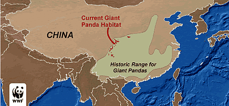
Given that the different levels of the game are going to be based on different areas within China, it made sense that the level select should be a map of the area. I developed this in illustrator from a low quality image I found in the research stage of the project, I had to rotate the map to fit it to he dimensions of the screen size without being too small. The contrast of the red, green and grey that I mentioned in the storyboard was garish.


In an attempt to continue the semi-skeuomorphic approach I've been adopting so far I changed the background to the earthy brown used in one of the loading screens and changed the colours of the selectable areas to earthy tones too, using a darker brown to use for incomplete levels, a lighter green to show completed levels, and a darker green to show the selected level. If the user wanted to work their way from left to right, the screen would progress like this every time they completed a level.


The names of the provinces on the map are 14pt. I initially tried them at 12pt to be consistant with the size of the text in the smaller buttons, but I felt they didn't fill the space on the map enough.

The title is shifted to the left and the buttons are moved from the edges into the middle. These were very noticeable changes made from my storyboarding, but they were necessary because of the layout of the map meant that positioning them where I initial wanted them very heavily compromised the readability of the title and the ease of user interaction, as well as leaving a very large central gap as shown below.


Donation/More Information Screen


I managed to keep the grid almost identical to the grid of the storyboard, which shows the benefits of storyboarding at full size. The only issues I had to resolve were use of colour, and to create a 'Donate' button that I hadn't realised I needed to create when making the buttons yesterday.

To differentiate between the sections I used the different background colours for each part, as well using a fairly thick line. I added a gradient to the left of the line to try and give the impression that the right side was raised above the left, which is another skeuomorphic aspect of the app.


Having both the background colours on the same page was a bit counterproductive in terms of the apps style, especially given that I was trying to make the brown sit above the grey. For this reason I decided to remove the brown and revert it to white, this made the app look a lot cleaner and more in keeping with WWF's image.


The final small change I made was to increase the size of the gradient, as I didn't feel it elevated the right side as much as it could do. I was much more pleased with the outcome as it serves its purpose better now.