Thursday 26 March 2015

OUGD503 - Module Evaluation

General Thoughts On The Module

I found that when I was in the studio working on responsive briefs, the amount of variation in the work that people were doing made it much easier to engage with other people, which benefitted feedback I was given and gave out myself. When everyone is tackling the same brief I sometimes get a bit fed up with seeing and hearing about it. 

The freedom to choose our own briefs was great as well, as it put me in a position where I was only doing work that I specifically wanted to do, which helped my commitment towards the work and ultimately improved the quality of the outcomes. The only possible exception to this was the J2O brief, but even then, I ended up pretty pleased with the outcome.

With the differences in the assessment criteria between Responsive and OUGD504, I’ve found that my research has been much more concise for responsive than it ever has been before. I also think the blogging workshop helped this. Whilst this is something that has made my life easier, it’s lead me a little confused on a few occasions about what direction I should be going in. This was particularly prominent in the Royal Mint brief where my research was more limited and the WWF mock-ups I did for the advertising student, where I hadn’t felt the need to do research before starting the work.

My Performance In The Module

I’ve got mixed feelings about how I did this module. I’m a bit annoyed that I didn’t end up doing the Pantone brief, as I feel that could’ve been a really suitable brief for me to do because of the name of the place where I live (explained further here). That said, the only suitable time for me to have done this would’ve been while I was at home after Christmas, and my poor time management early in the module meant that I didn’t think about this until it was too late, as I spent Christmas working on PPP and OUGD504. This is something I’m disappointed with myself for, as normally time management is something I’m good at.

Looking through my final outcomes for responsive and comparing them to the outcomes from previous briefs I’ve done, I’m happy with the improvement in the quality of my work, in particular the app mock-up, the Nonversation posters, and the WWF Condom branding for the collaborative brief. Like previously mentioned, I was even pretty pleased with the J2O branding when it was physically produced.

The process I went through to make sure all my outcomes were relevant was logical, meaning that the concepts behind the work I produced were solid and the strategy behind them was well thought through, particularly with Nonversation, Secret 7 and the WWF collaboration with Jamie.

Despite all the positives, this module has made me question my ambition slightly, as when I look through my outcomes there’s no fancy print finishes, no foil blocking or embossing, no screen printing or anything that requires any extra effort to produce. I stand by this, as they weren’t appropriate for the briefs I did, but the fact that I chose these briefs without recognising the lack of variation in potential processes is something that makes me question this about myself. 

Working With Other People

As well as the collaborative brief with Jamie, I also worked with/for Beth. I’ve lived with Jamie since last year and have known Beth the same amount of time, so I felt confident that I could enjoy working with them without compromising a personal relationship. This was an important factor in both briefs as it was important that communication was good, epitomised by how smoothly the collaborative brief went as living with Jamie made communication so easy as we spend so much time together.

The concept behind the WWF brief Jamie and I did had existed in my mind for quite a while, and it was something that I felt could work really well with the right set of skills. Jamie and I have very different ways of working, and this comes with having different strengths. Despite the reoccurring argument for a lack of ambition that comes with working with someone that you know well, the way we worked throughout the project capitalised on this, and we really made the most of the opportunity to collaborate.

Wednesday 25 March 2015

OUGD503 (Collaborative) - D&AD - WWF - Outcomes


OUGD503 (Collaborative) - D&AD - WWF - Evaluation

General Comments

The WWF brief was really open ended. It may have seemed quite restrictive in the sense that it had to be aimed at 14-24 year olds and there had to be a digital element, but it's more the arguable that the best way to reach that audience is through a screen rather than print.


I initially came up with the idea we followed for this brief by myself before Christmas, but thought that given the potential for it to become distasteful, it'd need someone else working on it with me so that their were two judges of what was acceptable and what wasn't. Jamie was the perfect person for this as he and I tend to have very different approaches to design, so could see the project from two different points of view. He also is more comfortable with Illustrator and AfterEffects than I am, which will benefit the project greatly.

Successes

I'm really pleased with this project in general, and I've really enjoyed. It has been constantly evolving through conversations between Jamie and I about what we should be doing and how we can make it fit the brief.

We definitely managed to do the project tastefully, there's nothing too obvious about any of the innuendo and none of the imagery was needlessly phallic. When I at the final physical outcomes, they look like they belong to WWF even aside from the obvious use of their custom font and logo. Little details like placing text over images rather than above or below them, and having a fairly minimal layout which places emphasis on the images really help this. This shows a clear influence from our research, as we knew that novelty condoms really imitate the look of their subject, and we knew exactly what WWF's look was.

The strategy behind the promotion was well thought through. We knew a viral video would be appropriate because of the innuendo-based and unorthodox nature of the product, but targeting the younger end of the age range directly was difficult as most of them don't really have a need for condoms. Jamie and I both identified that when we were at secondary school condoms were given out free if you wanted some and were a key focus of sex education. Rather than giving out condoms to schools, the idea to give out vouchers for condoms was really good because it's a lot more commercially viable as vouchers are cheaper to produce than the condoms and packaging (and not many of the vouchers would actually get redeemed), whilst still providing information on the cause on the voucher.

Most importantly, it works. When Jamie and I were in the studio cutting out and folding the physical products, other people on the course, people of our age, the age of the target audience, picked them up to look at them because they take a different approach, which caused them to read the information on the back and interact with WWF.

Changes

Retrospectively, maybe we should have specified on the packaging that it was made from 100% recycled materials to help back up the ethical strength of the project, but given that we only had a small area to work with this would have come at the cost of some of the information about the Living Planet Report, which was clearly more important. This isn't a big issue though, as the recycled packaging is mentioned in the video.

Logistically speaking, I wish we'd booked two print slots rather than one, as this would've allowed me to print my design boards on the recycled stock, which would've been a nice touch to finish this project off with, although at this point this is still a possibility depending on the availability of the digital print resource tomorrow morning.

We found assembling the 6 pack boxes quite tricky because of how thin the tabs were in relation to the weight of the paper. This meant that using super glue proved difficult because it seeped all over the place and dried quickly, and double sided tape wasn't as strong as we wanted it to be. I'd re-think the structure of the box in future for this reason, although I suppose this is more of a prototyping issue, and wouldn't be as big a problem in industry because of the more efficient processes used.

Going Forward

I've found that, by co-incidence, some WWF feature in some part in my work for COP and Design Practice 2, so the confidence of knowing that with really concise research, a professional looking outcome can be realistically reached is great.


Working with Jamie has introduced me to a knew way of working and given me first hand experience of working alongside someone who works less logically and systematically than myself can only prove useful, especially given that most creative people tend to work in this sort of way.

Tuesday 24 March 2015

OUGD503 (Collaborative) - D&AD - WWF - Video Production

Jamie made some vectors for the video, as well as organising the voice-over. We'd discussed what angle the video was going to take on the product and decided that doing it from Durex's perspective makes it more likely to be spread virally than if it was done from WWF's perspective.

When writing the script, I made sure that the Living Planet Report was brought up before any mention of condoms or innuendo to set a serious undertone for the video.

Jamie's vectors were made to look like mobile phone icons and emoticons so that they were immediately recognisable by the audience, as the 14-24 age group tends to be very familiar with technology.


Thursday 19 March 2015

OUGD503 (Collaborative) - D&AD - WWF - Voucher Book

Given that most school classes have about 25 students in them, a book of 32 would ensure that there are plenty for any one class. Printing 32 at a time would also make sense from a logistical standpoint as after a border is left round the page, you can split the page into 4 rows and 8 columns where each is 5cm x 7cm, which is a would fit in a pocket or wallet.

Such a small size means that text will have to be small, but this shouldn't be an issue as the target audience is young and will generally have good eyesight.


I started off with a 5mm border around the edge which gives some room for error when the page is printed on the other side. 

The logos were placed at the bottom so they were the same height with a 5mm gap between them, left a 5mm border above that.

The "Tear Here" text was placed slightly above the border with a small gap between that and the dotted line and left another 5mm gap below it. This gives plenty of room for the voucher book to be bound together.

The remaining space was used for the condom and the text. The redeem text is 8pt Open Sans so that it sits comfortably over two lines, the main text is 14pt as that fits the grid well. The image of the condom is sized and position where it draws your eye from the top text down across the page to the bottom.


The back of the voucher has the logos in the same place for consistency in the grid. 

Text is 6pt in order for it all to fit on. This isn't an issue though as it's still readable for those with good eyesight, which a young audience generally will have.

The bold text is placed on the right rather than the left as the regular text needed the larger column in order for it to all fit on. Despite it making no sense in terms of a logical hierarchy, the fact that their is more of it than the bold text balances this out visually.


As discussed previously they fit well on a 8x4 grid on A3 paper. They'll be printed on the same recycled paper that we ordered for the packaging.

Intern Magazine

We were briefed to come up with an idea for an independent magazine and think about how it would run and what sort of content it would feature.

Concept

We decided to base ours on Beer after Liam and I had a conversation on Sunday about not being able to find Brooklyn Lager on tap in many places in Leeds.


Aesthetic

We decided to call it Brewer based on the idea of making beer and as a reference to my surname. Liam and Jamie did some branding quickly for it and we went for the B in a sticker as a logo with magazine covers that were roughly the colour of different types of beer with white at the top of the page to represent the froth.


Content

Articles about different beers that are hard to find in pub, breweries that make those beers and the pubs that have those beers on tap. This could include interviews.

The adverts would be for alcoholic drinks, gigs and festivals, as this keeps within the cultural realm of the magazine, making the adverts relevant.

We could also use the magazine to give publicity to our own events which, alongside an online presence, could help build a small community around the magazine.


Strategy

We would release three issues a year, in September, December and April to align with when students would be returning to Leeds after Summer, Christmas and Easter.

The magazine would be free as it would be aimed at students, who don't have disposable income, it would be distributed in student pubs such as Dry Dock, The Library, Old Bar, Bierkeller, Brudenell Social Club and Hyde Park Pub.

Money would be made through advertising and merchandising, as we could sell beer mats and glasses with our branding on it. We could also ask some sort of financial donation from the subjects of the articles in return for the exposure.

We could also potentially save money on printing costs by getting it printed at the Eldon pub in return for exposure, as it's currently not a particularly 'studenty' pub. This would also give the magazine the gimmick of being about beer that's printed in a pub.


Tuesday 17 March 2015

OUGD503 (Collaborative) - D&AD - WWF - Durex and WWF Campaigns

With the packaging complete I looked at how Durex and WWF advertise, and found that both use billboards and viral advertising quite prominently. Whilst viral advertising is suitable for a target market of 14-24 year olds, billboards aren't very targeted, and we decided that a voucher that could be used for a free WWF condom in big supermarkets would be much better, as they could be given out at schools during sex education at aged 14-16. 

Billboards

Durex

Whilst still using sexual references in their billboards, they're not explicit at all because of how large scale and public they are, and it could potentially damage the company to get in trouble about their advertising. In order to avoid using overly sexual images, the sexual implications are done through text which finds it's context through the images.


WWF

WWF billboards have a tendency to be a bit different from just a regular flat billboard and tend to have some sort of extra element to them such as changing their appearance throughout the day or being environmentally friendly themselves. This extra dimension they have helps them draw attention to themselves. 


Viral Campaigns

Durex

Due to the nature of the internet, campaigns that are intended to go viral can be a bit closer to the knuckle and more suggestive because the audience tends to be of an age that understand about sex, albeit mainly due to the internet itself. This is the sort of age range that the brief wants to target.


WWF

The below WWF viral campaign highlights innovation and shows how good ideas can spread across the internet, and not all viral adverts, videos and campaigns have to be done through sexual references.


Conclusion

Jamie is going to produce a viral advertising video similar to this PornHub one we found on the Lad Bible, a popular viral website.


I'm going to produce a voucher booklet using the same sort of design that's been used in the packaging. It makes sense doing it this way round as Jamie is much more comfortable with motion graphics than I am, and I've been leading the print design to this point, so there is little reason to change this.

OUGD503 (Collaborative) - D&AD - WWF - Packet Packaging Development

Based on the style of the 6 pack box and the visual identity of WWF's website, I developed the individual packets for the 6 pack box. The size of the text is taken forward from the box, and the text on top of the images is white with a black border round it like on the website. The border is the only way the text can be somewhat readable whilst on top of the vectors because of the variety of colours across them. The black box on the inside shows where the condom packet would fit, showing that the images would clearly fit on the condom packets.


I then realised then realised that the packets that go on individual sale would need a bar code on, which the current layout doesn't have room for. I had to make the logos smaller to make room for this, as shown below. 

They layout is much better without the bar code because it isn't as crowded, but necessity dictates that individual packets would need a bar code. In the same way the ones that go in the box now say "not for individual re-sale" on the spine.


It then dawned on me that the way the packets were currently going to work would mean that they're thinner at the bottom than at the top, which gives them room to move, meaning that the images might not necessarily sit in the window of the box. There are potentially 2 ways round this. 

The first would be to alter the packaging to put the staple at the top so the flat side is at the bottom, making it more stable. The other way would be to make the packet more like a small box itself. 

The nets for the first option would look like this.


The second option would look like this.


From an idealistic standpoint it would seem that the second option is better because it will make the box of 6 sturdier when they're inside, but it would be very fiddly to glue such small flaps. I got hold of some stock of a similar weight to our paper to test these nets.


I found that the box-like net was a bit bulky, and because of the thickness of the paper, the folds didn't align perfectly, which compromised the quality of the production.

The stapled packets worked much better and were much more elegant. Having two behind one another would stop them from moving inside the box, so this is the net we're going to go with.

OUGD503 - YCN - J2O - Final Packaging

I mocked-up the packaging without the green because it looks better, and there's still an argument to be made that the green is still included via the bottle cap.


Monday 16 March 2015

OUGD505 - Product, Range, Distribution - National Zoo Conservation Exercise and Zoo Tycoon 2

National Zoo Conservation Exercise

Whilst I was looking into how much money is spent on Panda conservation, I stumbled across this school exercise that is aimed at children in their early teens in an attempt to make them understand issues of conservation. The exercise can be found here. It's particularly about, habitat fragmentation, food resources, human needs, and how these issues affect budgets. The idea of the exercise is for students to plan how they would spend the budget to protect Panda territory while still balancing out the needs of local people.


By simplifying this sort of model and digitising it would make it much more appealing and appropriate to a slightly younger audience (8-14). Changes to simplify the exercise could include: 

  • Automatically taking money out of the budget for the extra housing, all the player needs to do is place the houses. 
  • Add a colour scheme to show protected areas, unprotected areas, and privately owned areas to give a visual overview.
  • Display the map on a grid so that areas can be bought and sold on the basis of how much land is wanted.
  • Simplify how land is bought, rather than buying a new reserve or buying a habitat corridor, you just by land in general, making it less complicated.
  • Differentiate between panda genders and bamboo types through use of colour as well as through symbols.
Different levels could represent different provinces of China where Pandas live, and as you move from one level to another, you have to protect more land and achieve a greater increase in the number of wild pandas starting with the same amount of money.

Zoo Tycoon 2

When I was younger I played a game called Zoo Tycoon on the computer. I got my mum to post me the game so I could assess how the visuals and layout of the game could help me with my app.


The menu screen displays it's options through images, with only the selected option having text shown. The space that the text is displayed in stays the same regardless of what option is selected, which saves space on the screen. The loading screen is pretty dull in comparison to how bright and interactive the menu screen is, and this is something that they game doesn't capitalise on. When you compare this loading screen to the loading screen of Rhino Raid, you realise how useful the loading screen can be.


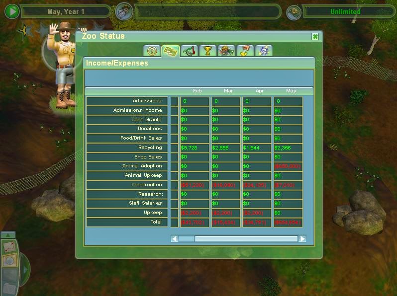
The game is time-based (top left corner), with it cycling through months and years as you spend more time playing, although you can pause time if you want to. The middle box in the top displays messages advising you what to do, and the right box shows you how much money you have available. These are features that I intend to take forward into my game as they will all help the player. 

You can rotate around the world or zoom in or out using the arrows and the plus and minus sign in the bottom corner. These tools are useful for seeing the world at different angles, however, you have to navigate using the arrow keys on the keyboard, so a way round this would need to be found.


The world is viewable from a birds eye view as well (left) which allows you to see what is going on where and allows you to jump quickly from one area to another. Their is also a photography mode which allows you to explore the world in a first person view and take photos. This is useful for if you get a bit bored of the game as it provides you with a different angle to explore it from. 

Implementing Zoo Tycoon 2 Mechanics to the Exercise

Colour Scheme


Using the terrain editing mechanics you can create a colour scheme within the world, for example, unprotected land would be shown in brown (dirt), privately owned land in bright green (gras), and protected land would look like a natural forest floor being a mix of different shades of dark brown and green. The privately owned areas and protected areas would also be differentiated by the fencing that surrounds them. The privately owned areas would have low stone walls around them to give a rustic feel to them, and the protected areas would have metal fences around them to show a serious nature.

Time, Money and Messages


Keeping a running total of the budget available to the player makes the game easier as they can play as they go along, which means that they don't necessarily have to plan how they're going to go about the game at the beginning of each level.

Time is an important factor as well, as the game needs to show that if isolated pandas stay isolated for too long in areas that can't support them, they'll die. If a month were to pass every 5 minutes it keeps the game moving at a fairly fast paced rate which will stop the user from getting bored. Playing through time can also bring it's rewards, such as gaining extra money every 12 months from WWF funding and through Zoos if the player has chosen to loan out a panda from their reserve.

The messages can keep players up to date on the important issues that need tackling. For example, if is in an isolated area and it's food source is running out, the message board would alert the player to this so they could do something about it.


Clicking on the money display or message board would bring up screens like the above ones, which automatically pause time and allow you to assess the situation of your budget and your pandas.

Photography Mode


If the player got bored or ran out of money, they could switch to photography mode, allowing them to have a more first person view of the world. The player would be rewarded for photo's they took by getting extra money put in their budget as the photographs would create publicity and encourage donations. Photo's including multiple pandas or baby pandas would result in larger amounts of money being added to the budget.

Birds Eye Map


By overlaying an isometric grid onto the map, land would be bought and sold through individual triangles, with each triangle having the same price, giving the user an easy way to buy an area of land quickly whilst being able to view the cost. The triangles would be fairly small, and so it would be necessary to be able to zoom in and out of the map. The key on the right would be replaced with options like "Buy Private Land", "Buy Unprotected Land", "Sell Protected Land", and "Loan Panda", which would allow you to loan one your Pandas to a foreign zoo for a year in return for an increased budget.

The human housing, represented above with a present and in the exercise as little squares, wouldn't fit the grid, so they will need to be changed to triangles. They can be placed anywhere on the map every by clicking them. This would be done every December after a cycle of 12 months and would be a screen that is brought up automatically so the user is forced to consider the needs of people.

The triangle would be coloured in the appropriate colour of brown, green, or a darker mix of the colours to represent which area they currently were. 

The location and number of Pandas would remain the same as above, but they would be against either a pale blue or pink background depending on their gender. There would also be icons to indicate the levels of food supply in each area. These two features would indicate to the user what areas needed to be connected.