Friday 31 October 2014

OUGD504 - Study Task 6 - Notions of the Empowered User.

Text

I looked at the idea of the user of the relationship of power between the technology and it's user, specifically the internet. I used pages 22-24 of the book "The Body and The Screen: Theories of Internet Spectatorship", by Michele White (2006).

Alain J-J. Cohen

The spectator of the internet has now been replaced with a "hyper-spectator", who, using their ability to create their own numerous online identities, can view the internet and its content from infinite positions.

New technologies reconfigure peoples thoughts on their current online identity, which allows them to constantly be escaping their real world identities, which is held back by things such as age, gender and race. Online this doesn't exist, you can be who you want to be, or at least who you think the internet wants you to be.

The idea of using verbs in relation to the doing things online gives us the idea that we have some physical power over the internet. A good example of this is the use of the term "surfing" when referring to using the internet, as this makes us think of the ease of which a surfer can negotiate waves, which in turn makes us think we have that sort of ease and power when negotiating the internet.

Justine Cassell and Harry Jenkins

From a young age it is innately suggested that technology is more of a male thing than a female thing, despite studies showing that women use the internet more than men. This is because we associate womens interaction with the internet with shopping and instant messaging etc, whereas the stereotypical image of a computer program is a "fat middle-aged man", which suggests that men have the power over technology, whereas to women it's more of a novelty. 

The unbalanced nature of the programmer-user power balance makes us question or right to have or want control over our own technology, which shows in the blind way in which people upgrade their apple products, even if they're more than happy with their current one, they accept the programmers word that the new one is better.

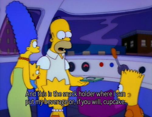
Both these points will continue to be the case as long as society continues to be scared or confused about technology, as "women's and abjectly figured men's lack of control is contrasted with the programmers skill", and this is exemplified by the stereotypical story of a technophobe mistaking a CD-ROM try for a cup holder. This sort of issue very much reminds me of an episode of the Simpsons where Homer becomes the driver for the Springfields Monorail (Season 4, Episode 12).


Similarities and Differences

Whilst both theories imply some sort of balance of power between the spectator and the technology, Cohen's theory suggests that people are much happier to embrace and challenge this balance than Cassell and Jenkins' does, with Cohen suggesting that people want to master technology rather than submitting to it, which is what the latter theory seems to be suggesting. 

I also notice that both theories look upon the spectators from different points of view. Cohen looks at it in the sense that the spectator fully decides their own identity, whereas Cassell and Jenkins look it in the sense that the spectator is using their real world identities. This is why the the theories differ in my opinion, as the spectator that appreciates their ability to chose their own identity has a basic understanding of technology anyway, which explains their willingness to want to master it. This is in direct contrast to someone who approaches technology from the point of view of their real world self.

Applications to Graphic Design

I suppose the biggest thing that should be taken from this is to understand your target market when doing digital design. These two theories suggest two extreme groups of people, the technology nerds and the technophobes. Whilst this isn't the be all and end all of peoples relationship with technology, it's important to understand your target markets relationship with technology, as this should inform your approach to communication through such things as wording and iconography. For example, it's no use using an envelope as a symbol for e-mail if your audience is an older generation who might see the use of an envelope more literally. In the same way it's probably not suggestible to use lots of specialist or unfamiliar terms, cache and cookies for example.

Thursday 30 October 2014

OUGD503 - Study Task 2 - Working With Briefs

Yahoo!

Make Yahoo! the world’s most popular homepage

Objectives

In numbers: To increase the percent of Yahoo! users to set Yahoo! as their homepage. 
In perception: I’m inspired to make Yahoo! the place I start my internet journey every day.

My Response

I started linking together the things that Yahoo wanted to do with their homepage, they wanted to make it fun, aimed at teenagers, and to be not Google. At that age, young people are very much trying to be their own person, have their own interests, and tend to ignore the things they're not interested in, as well as using social media pretty constantly.

This is a mock of what I came up with. In terms of sticking to Yahoo's tradition, all the necessary things are still visible. The background would be a set scene, although the weather in the scene would change to reflect the days forecast. The six sections across the bottom of the screen can be clicked on, the clicked on option moves to the left, and the 5 biggest stories of the day in that topic are displayed in the bar on the left hand side. For example, if shopping was selected, all the options would move across to the right, apart from sport, which would go back to the very left. Using the familiar hashtag shape and the them that Yahoo has of having lots of videos on their homepage, the video in the centre will auto play and the user can scroll up and down to watch a different video in the category. The category chosen is the same as the category in the side panel, this can be changed by either changing the news category in the panel, or by swiping the videos left or right. I also added quick links to the main social media sites, which, once the user has logged into them once, show them how many notifications they have. I changed the Yahoo logo as a concept as I felt that given that it was being used against a background, it needed to be simpler.


I'm pretty happy with what I came up with, as it fits all the requirements and with a little work, I think it could look pretty nice.

Wednesday 29 October 2014

OUGD504 - Study Task 7 - User Experience Design (UXD)

Examples and Techniques

UXD is not only how usable a product and it's interface is, but also the role that the product plays within someones day to day life, the emotional attachment the person has to the product, and the identity of the company that makes the product. 

A good example of this is the iPhone, which became a lot more popular than the BlackBerry because a lot more thought was given to the UXD. It's also happened with Facebook over MySpace.

Techniques for good UXD are.

  • User Research - Questionnaires and focus groups etc.
  • Personas - Using the ideal user of your website to identify how your website should be. What are the users goals, what is their behaviour like, and how does that affect what your website should and shouldn't do?
  • Content Strategy - Based on the previous two things, what content is needed for the website to succeed, and how should the hierarchy work?
  • Task Flow - How does someone do something?
  • Wireframe - How will the content be structured?
  • A/B Testing - Testing a variation of a system against the original system.

Specific Applications

The persona of the type of person that my website would be most useful to would be that of a younger middle aged person hosting a dinner party who was wanting ideas for food, most likely a woman, or a mum looking for ideas for unique and interesting toppings for pancakes. Something like below.


The task flow  of someone like this would be something like:

  • Enter the website
  • Find the appropriate blog for their needs
  • Scroll until they find a post that they like the look on
  • Click on the post for more information


Garrett's Model of UXD

We also considered how Garrett's model of UXD could be applied to our own websites.
In my instance, it can be applied this way:

Strategy - Make people hungry
Scope - Big pictures and endless scrolling
Structure - Images should be the main thing on the website, and the layout should be consistent throughout the site to make users feel more familiar.
Skeleton - Use the golden ratio for it's "natural" connotations. Make all pages link up.
Surface - Clean, natural, and mainly unbranded, to keep attention on the images.


OUGD503 - Royal Mint - Evaluation

General Comments

This was a brief which was really attractive to take on from the beginning because of the freedom it gave you to express yourself and do something that you find relevant. The cash prize and exposure was also an incentive given what happened to Matt Dent with the last Royal Mint competition, although this is obviously something that is far beyond my expectations and, in all honesty, my aspirations. I really can't see myself winning any National competitions any time soon.

Successes

On a personal level, the main success was not being deterred from entering in the first place on the basis that it is a National competition. My attitude towards my chances of winning things like this is generally very pessimistic, and this may have deterred me from entering the competition, despite having nothing to lose.
I think this came from the fact that I'm genuinely proud of both the final outcome and the concept behind it, which isn't always the case in my work unfortunately.

Changes

Despite being happy with the outcome in general, when I was coming up with potential concepts and developing the chosen idea, I didn't take into account the scale of which the design would be reproduced in. This was a really daft mistake to make given that we only recently did a project on logos, where consideration of scale is vital. I can't help but wonder how this consideration could've improved the outcome, but by the time I'd realised this I was really happy with my concept and had spent too much time on it to consider changing it.

Going Forward

The king thing I'll take from this brief is that when there's nothing to lose by entering a competition, there's no point in not entering it. I also think that the issues I had with scale are an indicator that I need to consider the restrictions of a brief a bit more before moving onto developing an idea

Tuesday 28 October 2014

OUGD504 - A Brief History Of... Website - Web Design Workshop 1

Terms

HTML - The main language used for coding
CSS - The language used for coding the aesthetics of the HTML

SEO - Search Engine Optimisation - Helps the page get to be found in a search engine.
FTP - File Transfer Protocol - The process of the website going live.
URL - Uniform Resource Locator - Web address.

HTTP - Hyper Text Transfer Protocol - The system that gets the page from server to screen.
UI - User Interface
UX - User Experience

Colour

There are 216 web-safe colours that will be reproduced exactly the same on every screen. These originate from the 256 colours that were capable of being displayed on 8-bit screens. The 216 colours are expressed in hexadecimal code, which is a hashtag followed by a series of six numbers or letters.

Using CSS allows you to specify an RGB colour using the colour codes from photoshop and illustrator etc etc, but if you choose a non-web-safe colour and the page is displayed on an older device, the colour may not appear the same.

Fonts

You should use standard, web-safe fonts so that the page will look consistent across all devices. Choosing a font family gives you a first choice font to use, then if that font isn't installed on a particular device, it uses the font you specify as second choice, and so on and so on. 

CSS allows you to upload fonts on your website so your first choice font will always be available for use. This font must have a free distribution licence though, as uploading it to your site makes it downloadable. 

Important Default Lines of Code

<html> and </html>

Tells the browser what coding language is being used.

<head> and </head>

The space between is where you put the coding for things you don't want to physically appear on the page, but is where you put the information that the browser needs to read certain functions, such as the use of CSS and SEO.

<title> and </title>

Goes within the previous coding to specify the name of the individual page.

<body> and </body>

The area to code the contents of the website.

/*      */

An area to include notes within CSS code that won't have any influence on the outcome

Monday 27 October 2014

OUGD503 - Royal Mint Competition - Development

I decided that I'd base my design around the signs of the Zodiac, because their connotations of optimism, hope and history are something that reflect Britain.

I started out by using this diagram to get the basic shapes for the star symbols. I only used lines with the angles of the coin to give the design a stronger concept.


When I was experimenting with the patterns at full scale, I found that they bunched up too much and they looked blotchy because of the circles. After a while of experimenting I decided that in order to make this concept work visually I'd have to bunch them together and remove the circles.

This was the outcome.


Whilst it's not what I initially had imagined, I feel like it's the sort of abstract design that would work well on a coin, and reflects the sort of modern and conceptual stuff that seems popular at the moment. The text is in Gill Sans because of it being the definitive British font. I've also made it so that the line thickness of the text was the same thickness of the lines in the remainder of the design.

This is how the coin looked at full size.

I was happy with the line width of the design, but noticed that the text was too small to read.


I decided to put the text on the edge of the coin instead of it running over the design. I kept it straight rather than bending it, which was the way Matt Dent incorporated his text. I thought that it would be more appropriate to keep the text straight given how geometric the design and the coin is.


I then imposed my coin in place of the blank coin on the downloadable PDF from the competition website, and sent the altered PDF to the entrance address.


Saturday 25 October 2014

OUGD503 - Royal Mint Competition - What England Means To Me

Sport

Britain has a big history in sport, especially in cricket and football. When you consider the strength and status of the Premiership amongst worldwide football, the seemingly constant stream of world class cricketers that England produces, the notorious rivalries between the home nations rugby teams, sport would definitely be a valid route to go down. I think given the recent success of the London Olympics, there would definitely be room to incorporate some patriotism in this as well.

Patriotism

I think that possibly my favourite thing about Britain is the relationship we have with the country. You're stereotypical American is always talking about the American dream and how it's the best country in the world. You don't get that with Britons, however, whenever I've been abroad and seen other Britons abroad, there's always a sense of national pride in the clothes we wear, our attitudes to various things, and the way we interact with foreigners when England is the subject of conversation. The fact that people tend to get so passionate when talking about Britain implies that this sense of national pride is there, and the fact that we don't actively show it suggests that it's something that we, as a country, are comfortable with, which is why this could be a good concept to run with.

 British Summer

From an English point of view, one of the most synonymous things I associate with being British is the bad summers. Despite it happening every year, we always get excited about the idea that "it might be different this year". I think this sort of optimism and almost blind hope sums up the people of Britain pretty well, no matter how bad things are, we think there'll always be a way out.

History

Obviously Britain has a long history with various breakthroughs in western society coming from Britain, such as the light bulb, the steam engine, the telephone and the TV. Going down the route of putting an image of something that's notoriously British that's helped the world might be a good route to go down.

OUGD503 - Royal Mint Competition - Ment Dent Coin Design

The last time the Royal Mint held a competition such as this, the winner was Matt Dent. The competition was split into 7 different categories, one for each of the 1p, 2p, 5p, 10p, 20p, 50p and £1 coin, although Matt Dent decided to consider them all as one brief, and consequently won them all.


The fact that a design such as this won the competition shows that the people at the royal mint are fans of conceptual designs and innovative approaches to design, which is something I'll consider when thinking about my design.

I think it also shows how this sort of national competition can provide massive exposure for an unknown designer, as well as providing the government with a quality solution, and it shows how graphic design can benefit everyone involved in it.

OUGD503 - Royal Mint Competition - Brief

I've decided that the first brief I will do for the responsive module is the Royal Mint competition brief, where a design is needed for the tails side of a new one pound coin.

I feel like this brief is very unique, and the I like the idea of patriotism behind it, as well as the exposure and cash prize on offer to the winner.


The shape of the coin is shown below.


The requirements of the brief are:
  • The government expects that the coin will be 12-sided and bi-colour, with a gold-coloured outer ring and a silver- coloured centre. Designs should be based on the specification of the proposed coin, on which the government is currently consulting. The Royal Mint will work with the winning entrant to ensure that their design fits the final specification.
  • A portrait of Her Majesty The Queen will be used for one side of the coin. Entrants will need to provide a design for the tails, or reverse side, only.
  • The denomination ONE POUND must appear as part of the overall design but it is left up to you precisely where it is placed within the design.
  • The expected diameter of the coin will be between 22.5mm and 24.5mm. For design purposes you may like to assume the midpoint of this range, however the final specification will only be announced following the completion of the public consultation process.
  • Your design should be orientated with a point of the proposed 12-sided shape at the base. Designs must not include a recognisable likeness of a known person, whether living or dead.
  • Your design must be your own work, must not be copied from someone else and must not contain any third-party materials and/or content that you do not have permission to use.
  • All designs submitted should be presented on the supplied template, which can be downloaded from The Royal Mint website.
  • Designs can be submitted in pencil, ink, paint or using computer drawing or design software. We cannot accept 3D entries, including collages or models.
  • To ensure the competition is fair, please do not include any initials or identifying marks on your designs. The winner will be identified via their unique reference code, and it is therefore very important that the registration process is completed correctly.
  • Three-dimensional models will be made of the designs that are short-listed towards the end of the selection process. A fee of £1,000 per model will be paid to those invited to prepare models of their designs. This payment will be reduced to £250 per model if the models, by agreement, are prepared by The Royal Mint.

Friday 24 October 2014

OUGD504 - A Brief History of... Website - Canons and More Grids

We started off by applying the Muller-Brockmann grid to the Van De Graaff grid as an exercise in how you can combine and refine grid systems. I like the Muller-Brockmann grid a lot because of how technical it is. I've been using it for a while now myself without knowing it.


We then tried to identify grid systems in magazines in newspapers that we'd brought in. I found that in the magazine, the system was column based, and didn't really have any sort of repeating pattern in terms of their rows, although I did notice some rows that had a slight look of the golden ratio about them, which I think is odd given the columns are of equal width.


I notice in this spread however, that the page was very roughly split into 3, or arguably 6 rows, but this wasn't in the same sort of neatness that the Muller-Brockmann grid would've resulted in, which leads me to suggest that this was more of a coincidence than anything else.


In the newspaper, I found a seemingly much more complicated grid system, as the two examples below show. Both pages use a 4 column spread for text, however the on on the left seems to use a 3 column system for images, whereas the one on the right uses a 5 column system for images. This suggests that either the newspaper weren't using a grid at all for images and just putting them where they wanted, or they were using a 60 column system, which is ridiculous. I don't approve of this. Again, on the left spread there is something that's slightly reminiscent of the golden ratio.


There was a page which had a pretty interesting system of rows. The layout of the text at different heights within 3 columns automatically creates rows visually. When further investigated, when you consider either the two columns on the left, or the two columns on the right, the rows where either column doesn't have text are the same width. This leaves you with a pattern where the first 3 rows have different heights, and then the pattern is repeated.


This session has been interesting because it's given me an idea of how using grids and canons can be used in various situations without becoming repetitive, predictable or lazy. It's also given me a few ideas of how to merge different grids together.

OUGD504 - A Brief History of... Website - Numiko

Numiko spoke to us about a few key principles of web design. They said that you don't need to know any coding to be a successful web designer, because in industry you'd be working closely with someone who would be very good at coding, all you have to do is understand what the internet is there for and what is capable of being translated onto screen, as well as have a strong understanding of grid systems, branding, iconography, typography and illustration, which you need to be a graphic designer anyway.

They said that understanding the internet was key to their success as a company, as they started up before the web is a big thing, but anticipating that it would get big, they approached big companies and convinces them that having a website would be beneficial, and so they've done work for organisations such as the BBC, Channel 4, Blue Cross, Water Aid and Cancer Research UK.

They said a lot of design agencies don't consider how branding will look on screen, only in print, and so being in digital design can sometimes be difficult and require you to negotiate a re-brand with the client.

Other points they raised were:

  • Animation or interactivity on a website should tell a story.
  • Responsive web design works best when it's considered at every stage of development, not just in the final product.
  • The content of the website is the most important thing, and should always dictate how the website works.
  • Technology and trends change so often that no-one truly knows what they're doing.
  • When designing website you should consider how easy it would be for the client to add their content after your contract is over.
  • Communication between yourself and the client is important, as it can avoid potential problems with the website.
  • Websites with a specific use can have a looser grid because the content will be more obvious, and therefore need less organising.


Wednesday 22 October 2014

OUGD504 - A Brief History Of... Website - The Golden Ratio and Canons

Golden Ratio

The golden ratio is the idea that a specific proportion (1:1.618) looks natural and is the most visually appealing proportional split, and so it is used a lot in graphic design. It creates the golden spiral, which will continue to spiral endlessly regardless of scale.


The golden ratio is used in the National Geographic Logo for the yellow rectangle. The height of the rectangle is 1.618 times the width of the rectangle.


Toyota used it more complexly in their logo, mirroring the proportion sizes to use as guides for the placing and sizes of the concentric circles. 


The golden ratio can also be used in text in terms of the heading to body copy size ratio.


Canons

Canons are grid systems that designers use to aid their design. They consistantly produce visually pleasing design, but because of this it can promote lazyness and reduce creativity in designers.

The Van De Graaf grid is used to position text on double page spreads, and considers the single page in relation to the double page size. Van De Graaff suggested that the grid works best with a width:height ratio of 2:3 on each single page.


The Romek Marber Grid is used for the covers of a lot of penguin books, and allows for easy customisation within it, whilst still retaining the consistency of a grid system.


My Thoughts

I suppose subconsciously I've always tried to use grids and canons when working, but I've just done it pretty badly. What this session as taught me is that it's important to consider weather you're doing a double or single page spread, as that my affect your grid, as shown by the irregular margins when you consider the Van De Graaff grid on a single page. 

With regards to the golden ratio, I'm not sold on the idea of it having any sort of links to perfection or anything like that, but the proportions of it do look nice and it does seem like a good way to come up with a visually appealing grid system, although it is quite limiting at times. 


Tuesday 21 October 2014

OUGD504 - A Brief History Of... Website - Food Blogs

The Broken Bread

This particular blog is very minimalist in it's layout, and is largely image-based. Food is judged primarily through your senses rather than what anyone says about it, so I suppose that it makes sense for it to be primarily image based given that sight is the only sense you can use on the internet. Using different typefaces gives it an old fashioned and more rustic feel, especially with the use of full capitals. I don't like the use of a serif typeface for body copy as I feel that a sans serif typeface would aid the clean look of the site more. Other than that, this blog looks really nice and is something that I can definitely take inspiration from.

The Pastry Department

In contrast to the last blog, The Pastry Department is hugely text based. The amount of text is pretty intimidating, and I don't think it suits the topic of food. I do like the branding though, as it's light and quirky which reflects "foodie" culture. I'm not sure how I feel about the greyish background, I think it's too dull compared to the yellowy colour they used in their branding. 


Breadtopia

I really hate the design of Breadtopia. It doesn't look clean at all, which is something I'd have thought you'd have to have as a food-based website given the connotations of cleanliness etc. The background colour doesn't just not look clean, but it actively looks dirty, and I think the typography for the top of the page is disgusting. Whilst I applaud it's efforts to encourage interaction with social media, this is the sort of thing I want to stay away from.


Top With Cinnamon

There's not much I can say about Top With Cinnamon because of how similar it is to The Broken Bread. The general page looks quite clean and uses large images to appeal to our senses. There is slightly more colour on this page though, which I'm not sure if I like, the turquoise seems a bit garish for me and not subtle enough. The body is in a serif typeface as well, which I don't thing is the right way to go, especially when used alongside such bright colours, as I feel the colour is quite a modern thing, which doesn't sit well with the more old fashioned style text.


My Name Is Yeh

This is my favourite of the blogs. The only colour used is delivered through the use of bright images with high contrast that generally consist of natural colours such as greens browns and creams etc. The layout is more complex, using a three column grid, where two columns are evenly sized, and those two together look like they have a relationship of the golden ratio to the smaller column. All the communication is image based, only using text as headings. I think that this blog works so well because of the photography, which isn't something I particularly focussed on in my summer brief, so while I'd like to take some inspiration from this blog, I'm not overly sure if a style of website that's as image heavy as this is will work for me. 


The Vanilla Bean

I'm really unsure what sort of look Vanilla Bean was going for, and I'm not sure they were either. They use large images, but they're not particularly attractive images, and there seems to be no particular attention to text layout. This is a shame because I think their logo is really appropriate and has a very rustic feel to it. 


OUGD504 - A Brief History Of... Website - Crit

This mornings crit was pretty useful. I spoke about how I'd considered that my project could potentially be put into two different formats of website, the spoof-like website similar to Compare The Meerkat or a community driven blog based around food, similar in concept to the Vanish Tip Exchange. I commented on the blog was probably the way to go given that the meerkat thing is only successful because it has a useful site to contextualise it. They agreed with me that because of this, the way to go was with the blog style site.

A few good ideas for content were suggested. Video guides to accompany some of the posts would make the interaction between the site and the user more personal. Promoting a hashtag would help promote the site on Twitter. Doing a feature something like "365 Days of Pancakes" would encourage people to eat pancakes more often, rather than just once a year.

I talked about how I'm going to research food blogs to inform my websites look after showing my initial sketches from my grid, and it was suggested that I look at https://www.laduree.com/en_fr/ to see an example of how food can become trendy.

Monday 20 October 2014

OUGD504 - A Brief History Of... Website - Mock-Up

In preparation for tomorrows crit I mocked up what the homepage of my website would look like on a screen. 

I started off with some drawings, which made it more obvious to me where extra lines were needed in my grid. I converted the grid from my screen to my paper by physically measuring the distances between the lines on my screen, and then scaling those distances onto the graph paper I had. I then overlayed some plain paper on top of that. I produced sketches for how a longer blog format would look and how the homepage would look.


I then produced the grid a lot more accurately in photoshop. I did it down to the pixel, which retrospectively may not have been necessary given that I'm not sure how the grid will be transferred into coding. 


I made sure I used web-safe colours and a website font. I chose the colours because of their relation to pancakes, and I chose Century Gothic as the font because it's light with rounded characters, which again relate to pancakes.